Lab 06 Rehearse 1 Version 2
 Important
This is Version 2 of Lab 6 Rehearse 1. If you need the original version, it is here
Comparing One and Two means
Lab 06 Set Up
RStudio/Posit Cloud Set Up
Just as in previous labs, you will need to follow this link to set up Lab 6 in your Posit Cloud workspace:
Link to Set up Lab 6 Hypothesis Tests Part 1 Means
 Important
After you have set up Lab 6 using the link above, do not use that link again as it may reset your work. The set up link loads fresh copies of the required files and they could replace the files you have worked on.
**Instead use this link to go to Posit Cloud to continue to work on lab 6: Link
RStudio Desktop Setup
Link to download the Lab 06 materials to RStudio Desktop
Note that you will do all your work for this Rehearse 1 in the Lab-6-Rehearse 1 worksheet, so click on that to open it in the Editor window in your RStudio/Posit Cloud Lab 6 Exploring Data workspace.
Comparing One Mean to a Point Value
By “one sample - one mean” our intent is to test whether the mean of a numerical variable in our sample is different from a standard or stated value.
Attribution: The one-sample one mean example is based upon the explanation of the Infer Package update: Infer
**see more examples using Infer Examples
Load Packages
 CC1
CC1
library(tidyverse)
library(infer)
Get Familiar with the Data
In this example, we are using the gss data set which is included in the Infer package. It is derived from the General Social Survey. You can find information about the GSS here.
Because the gss data set is included in Infer package which we have already loaded into the session library, we do not need to load it separately. But we need to create a data object from the gss for consistency with our process.
 CC2
CC2
gss <- gss
# Use the glimpse () function to display the data object.
glimpse(gss)
## Rows: 500
## Columns: 11
## $ year <dbl> 2014, 1994, 1998, 1996, 1994, 1996, 1990, 2016, 2000, 1998, 20…
## $ age <dbl> 36, 34, 24, 42, 31, 32, 48, 36, 30, 33, 21, 30, 38, 49, 25, 56…
## $ sex <fct> male, female, male, male, male, female, female, female, female…
## $ college <fct> degree, no degree, degree, no degree, degree, no degree, no de…
## $ partyid <fct> ind, rep, ind, ind, rep, rep, dem, ind, rep, dem, dem, ind, de…
## $ hompop <dbl> 3, 4, 1, 4, 2, 4, 2, 1, 5, 2, 4, 3, 4, 4, 2, 2, 3, 2, 1, 2, 5,…
## $ hours <dbl> 50, 31, 40, 40, 40, 53, 32, 20, 40, 40, 23, 52, 38, 72, 48, 40…
## $ income <ord> $25000 or more, $20000 - 24999, $25000 or more, $25000 or more…
## $ class <fct> middle class, working class, working class, working class, mid…
## $ finrela <fct> below average, below average, below average, above average, ab…
## $ weight <dbl> 0.8960034, 1.0825000, 0.5501000, 1.0864000, 1.0825000, 1.08640…In the glimpse, we can see that the gss data object has 500 rows or observations of the variables. The variables are stored in the columns and we can see we have 11 variables.
Some are categorical, those with a
Our variable of interest is the ‘hours’ variable which is quantitative. It represents the number of hours worked each week by the individuals who participated in the GSS survey.
Our research question: Does the GSS survey provide sufficient evidence to conclude that the mean number of hours worked each week by Americans is different from the traditional 40 hour week.
Exploratory data analysis
Calculate the Mean
 CC3
CC3
mean <- gss %>%
 summarize(hours = mean(hours))
#display the mean
mean
## # A tibble: 1 × 1
## hours
## <dbl>
## 1 41.4Visualize the data
We got a bit fancy here by showing both the mean and median - a box plot only shows the median (the line in the “middle” of the box) usless you add the mean.
 CC4
CC4
library(ggplot2)

# Calculate mean and median
mean_hours <- mean(gss$hours)
median_hours <- median(gss$hours)

# Assuming 'gss' is your data frame or data object with the 'hours' variable
ggplot(gss, aes(y = hours)) +
  geom_boxplot() +
  geom_point(aes(x = 0, y = mean_hours, color = "Mean"), shape = 18, size = 3) +
  geom_point(aes(x = 0, y = median_hours, color = "Median"), shape = 20, size = 3) +
  labs(title = "Boxplot of Hours", y = "Hours per week") +
  theme(axis.text.x = element_blank(), axis.ticks.x = element_blank()) +
  scale_color_manual(values = c("Mean" = "red", "Median" = "blue")) +
  guides(color = guide_legend(title = "Statistics")) +
  scale_y_continuous(breaks = seq(0, ceiling(max(gss$hours) / 5) * 5, by = 5))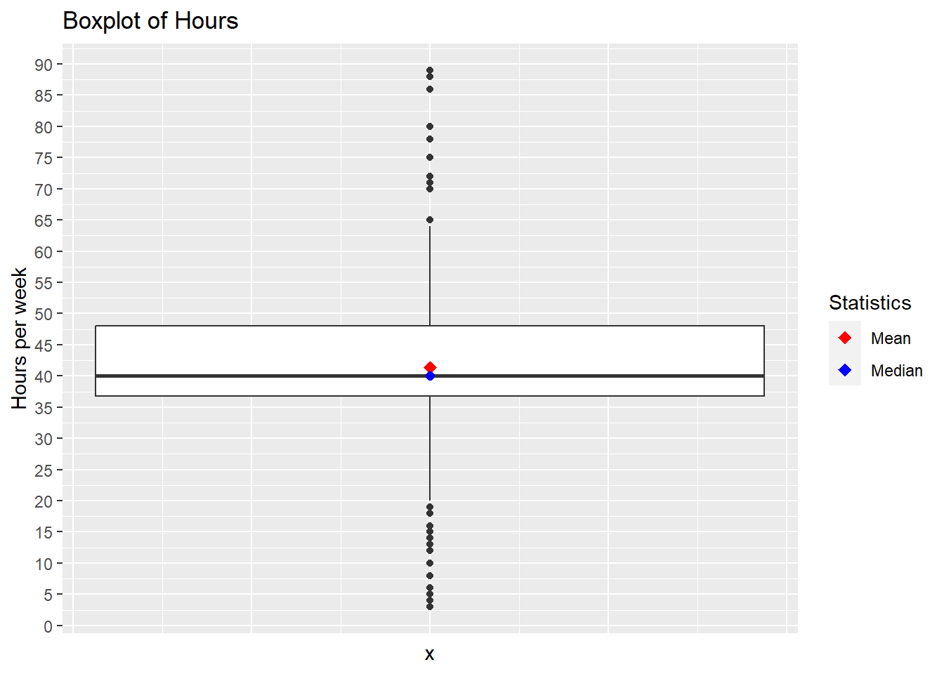
We can see that the mean is slightly greater than the median which appears to be about 40 hours per week. But the black dots which we call ‘outliers’ indicate that there is quite a lot of variation in the hours worked. The box tells us that the majority of people worked from about 36 to 48 hours per week.
To answer our research question, we are using the Downey/Infer process.
State the Null and Alternative hypotheses
Null Hypothesis Ho: The mean hours per week worked by Americans is 40. Alternative Hypothesis Ha: The mean hours per week worked by Americans is not 40.
State the Significance Level
It’s important to set the significance level “alpha” before starting the testing using the data.
Let’s set the significance level at 5% ( i.e., 0.05) here because nothing too serious will happen if we are wrong.
Testing the hypothesis
Step 1: Calculate the observed statistic
Calculate the observed statistic and store the results in a new data
object called mean_obs.
 CC5
CC5
mean_obs <- gss %>%
  specify(response = hours) %>%
  calculate(stat = "mean")
Step 2: Generate the Null Distribution
Generate the null distribution of the mean.
 CC6
CC6
set.seed(123)

null_dist <- gss %>%
  specify(response = hours) %>%
  hypothesize(null = "point", mu = 40) %>%
  generate(reps = 1000)
Step 3: Calculate the Null statistic
 CC7
CC7
# create a new data object `null_mean` to hold the mean hours worked
# in the Null world.

null_mean <- null_dist %>%
  calculate(stat = "mean")
Step 4: Visualize the Null and the Observed Mean
 CC8
CC8
visualize(null_mean) +
  shade_p_value(obs_stat = mean_obs, direction = "two-sided")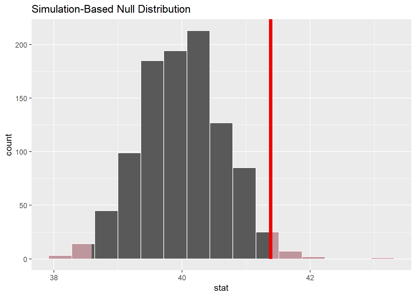

Reflection Question: Why is the observed mean unlikely?
Answer here:
Notice that infer has also shaded the regions of the null distribution that are as (or more) extreme than our observed statistic (sometimes called the “point estimate”). The red bar looks like it’s slightly far out on the right tail of the null distribution, so observing a sample mean of 41.382 hours would be somewhat unlikely if the mean was actually 40 hours.
Step 5: Calculate the p-value
Calculate the p-value (“area” under the curve beyond
mean_obs) from the Null distribution and the observed
statistic mean_obs.
 CC12
CC12
null_mean %>%
  get_p_value(obs_stat = mean_obs, direction = "both")
## # A tibble: 1 × 1
## p_value
## <dbl>
## 1 0.03Step 6: Results and Conclusions
It looks like the p-value is 0.03 which is pretty small—if the true mean number of hours worked per week was actually 40, the probability of our sample mean being this far (1.382 hours) from 40 would be 0.03.
Because we set the significance level alpha to 0.05, the p-value is less that alpha. There is a statistically significant difference between the observed mean of 41.382 and the “standard” 40 hours per week.
Step 7: Calculate confidence interval
The following code chunk creates a percentile confidence interval around the mean hours using the bootstrap method.
 CC13
CC13
boot_dist <- gss %>%
   specify(response = hours) %>%
   generate(reps = 1000, type = "bootstrap") %>%
   calculate(stat = "mean")

ci <- get_ci(boot_dist)
# display the CI
ci
## # A tibble: 1 × 2
## lower_ci upper_ci
## <dbl> <dbl>
## 1 40.1 42.7
Reflection Question: State what the confidence interval tells us about the likely mean?
Your Answer here:
Step 8: Traditional hypothesis test
 CC14
CC14
gss %>%
  t_test(response = hours, mu = 40)
## # A tibble: 1 × 7
## statistic t_df p_value alternative estimate lower_ci upper_ci
## <dbl> <dbl> <dbl> <chr> <dbl> <dbl> <dbl>
## 1 2.09 499 0.0376 two.sided 41.4 40.1 42.7The results of the traditional test are similar to the Infer results. The p-value in this test is larger than the 0.03 in Infer, but still less than the significance level of 0.05.
Remember there are assumptions required for the t-test that should be checked and verified before the results can be used. We will not do that here.
Comparing Two Means
This can be either using one sample which has a categorical variable with just two levels which can be used to form two groups for which we can calculate a mean for a numeric variable for each group.
Or it could be the situation in which we have two separate samples for which we can compare the mean of a numeric variable.
Attribution: Modern Dive Problem Set 09
Question: Do people identifying as males and females have different mean first year GPAs?
Load Packages
First load the necessary packages:
 CC1b
CC1b
library(tidyverse)
library(infer)
Get Familiar with the Data
Explore data
Load the data and use the glimpse function to inspect it and find our variables of interest.
 CC2b
CC2b
sat_gpa <- read.csv("./data/sat_gpa.csv")

glimpse(sat_gpa)
## Rows: 1,000
## Columns: 7
## $ X <int> 1, 2, 3, 4, 5, 6, 7, 8, 9, 10, 11, 12, 13, 14, 15, 16, 17, …
## $ sex <chr> "Male", "Female", "Female", "Male", "Male", "Female", "Male…
## $ sat_verbal <int> 65, 58, 56, 42, 55, 55, 57, 53, 67, 41, 58, 45, 43, 50, 54,…
## $ sat_math <int> 62, 64, 60, 53, 52, 56, 65, 62, 77, 44, 70, 57, 45, 58, 66,…
## $ sat_total <int> 127, 122, 116, 95, 107, 111, 122, 115, 144, 85, 128, 102, 8…
## $ gpa_hs <chr> "high", "high", "high", "high", "high", "high", "low", "hig…
## $ gpa_fy <dbl> 3.18, 3.33, 3.25, 2.42, 2.63, 2.91, 2.83, 2.51, 3.82, 2.54,…We can see in the glimpse that the data set has 1000 rows or observations. And it has 7 variables - the columns. Note that the first “variable” X is just a number for the row of data.
Although you may need to dig further to confirm what the names mean from the original source of the data, we can safely assume that our first variable of interest is “sex”, which has two levels: “Male” and “Female”.
And the second is “gpa_fy” which stands for GPA first year which is a numerical variable showing the GPA with two decimal places.
Calculate the Means
 CC3b
CC3b
mean_gpa_sex <- sat_gpa %>%
  group_by(sex) %>%
  summarize(gpa_fy = mean(gpa_fy))
#display the means
mean_gpa_sex
## # A tibble: 2 × 2
## sex gpa_fy
## <chr> <dbl>
## 1 Female 2.54
## 2 Male 2.40Visualize the data
#using the original data, sat_gpa, and setting the aesthetic x-axis to be the "sex" variable; and y-axis to be the "gpa_fy" variable.
ggplot(sat_gpa, aes(x = sex, y = gpa_fy)) +
  geom_boxplot(fill = "light blue") +
  #we title the graph and label the x and y axes.
  labs(title = "Median Grade Point for first year college students",
       x = "Gender", y = "GPA score")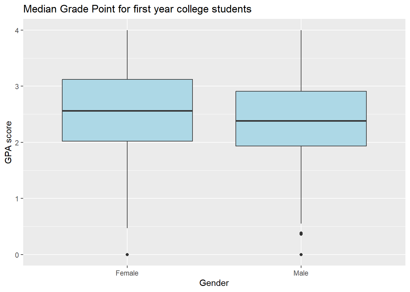
We can see that there is some difference in the median gpa’s for the two groups. The median GPA for females appears to be higher than that for males.
Note the standard boxplot displays the medians which are the black lines near the “middle” of the two boxes.
State the Null and Alternative hypotheses
Null Hypothesis Ho: The mean first year GPA for Females and Males are the same - there is no difference. Alternative Hypothesis Ha: The mean first year GPA for Females and Males are not the same - there is a difference.
State the Significance Level
It’s important to set the significance level “alpha” before starting the testing using the data.
Let’s set the significance level at 5% ( i.e., 0.05) here because nothing too serious will happen if we are wrong.
Testing the hypothesis
Step 1: Calculate the observed statistic
Calculate the observed statistic and store the results in a new data
object called obs_diff.
 CC5b
CC5b
obs_diff<- sat_gpa %>%
  specify(gpa_fy ~ sex) %>%
  calculate(stat = "diff in means", order = c("Female", "Male"))
# Display the observed difference
obs_diff
## Response: gpa_fy (numeric)
## Explanatory: sex (factor)
## # A tibble: 1 × 1
## stat
## <dbl>
## 1 0.149Step 2: Generate the Null Distribution
Generate the null distribution of the GPAs.
 CC6b
CC6b
null_dist <- sat_gpa %>%
  specify(gpa_fy ~ sex) %>%
  hypothesize(null = "independence") %>%
  generate(reps = 1000, type = "permute")
Note we use the hypothesize function to set our null
hypothesis to be “independence”. If the two variables “sex” and “gpa_fy”
are independent of each other, we should see no difference in the mean
GPAs.
Step 3: Calculate the Null statistic
 CC7b
CC7b
null_diff <- null_dist %>%
  calculate(stat = "diff in means", order = c("Female", "Male"))
#show the first five observations of the difference.
null_diff %>%
  slice(1:5)
## Response: gpa_fy (numeric)
## Explanatory: sex (factor)
## Null Hypothesis: independence
## # A tibble: 5 × 2
## replicate stat
## <int> <dbl>
## 1 1 0.0515
## 2 2 0.0646
## 3 3 -0.0401
## 4 4 -0.0961
## 5 5 0.0392Step 4: Visualize the Null and the Observed Mean
 CC8b
CC8b
visualize(null_diff) +
  shade_p_value(obs_stat = obs_diff, direction = "two-sided")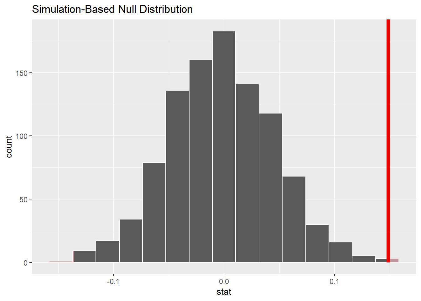
Step 5: Calculate the p-value
Calculate the p-value (“area” under the curve beyond
obs_diff) from the Null distribution and the observed
statistic obs_diff.
 CC9b
CC9b
null_diff %>%
  get_p_value(obs_stat = obs_diff, direction = "both")
## # A tibble: 1 × 1
## p_value
## <dbl>
## 1 0.002Remember the p-value is not exactly 0, but is very, very small, much less that the typical significance level alpha of 0.05.
Step 6: Results and Conclusions
Because the p-value of approximately 0 is less than the significance level of 0.05, we must reject the Null of no difference. There is a difference between the first year GPA’s of female and male students.
Step 7: Calculate confidence interval
The following code chunk will allow us to calculate a 95% confidence interval for the difference between mean first year GPA scores for females and males.
 CC10b
CC10b
ci_diff <- sat_gpa %>%
  specify(gpa_fy ~ sex) %>%
  generate(reps = 1000, type="bootstrap") %>%
  calculate(stat = "diff in means", order = c("Female", "Male")) %>%
  get_confidence_interval(level = 0.95)

#print the CI upper and lower limits
ci_diff
## # A tibble: 1 × 2
## lower_ci upper_ci
## <dbl> <dbl>
## 1 0.0534 0.233The Null value of 0 is not contained in the confidence interval. This supports the conclusion that there is a significant difference in first year GPA for female and male students.
Step 8: Traditional hypothesis test
Complete all the above tasks with a t-test. Note that all the above steps can be done with one line of code if a slew of assumptions like normality and equal variance of the groups are checked and verifed.
 CC11b
CC11b
t.test(gpa_fy ~ sex, var.equal = TRUE, data = sat_gpa)##
## Two Sample t-test
##
## data: gpa_fy by sex
## t = 3.1828, df = 998, p-value = 0.001504
## alternative hypothesis: true difference in means between group Female and group Male is not equal to 0
## 95 percent confidence interval:
## 0.05695029 0.24009148
## sample estimates:
## mean in group Female mean in group Male
## 2.544587 2.396066
Reflection Question:
What are your conclusions from the two-sample mean comparison methods? Are they the same or different?
Answer here:
Lab Assignment Submission
 Important
When you are ready to create your final lab report, save the Lab-06-Rehearse1-Worksheet.Rmd lab file and then Knit it to PDF or Word to make a reproducible file. This image shows you how to select the knit document file type.
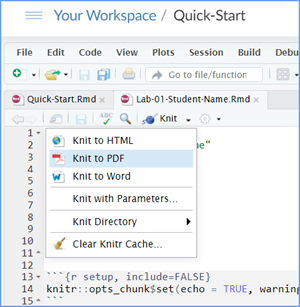
Note that if you have difficulty getting the documents to Knit to either Word or PDF, and you cannot fix it, just save the completed worksheet and submit your .Rmd file.
Ask your instructor to help you sort out the issues if you have time.
Submit your file in the Canvas M6.3 Lab 6 Rehearse(s): Hypothesis Tests Part 1 - Means assignment area.
The Lab 6 Hypothesis Tests Part 2 Grading Rubric will be used.

Congrats! You have finished Rehearse 1 of Lab 6. Now go to Rehearse 2!

This
work was created by Dawn Wright and is licensed under a
Creative
Commons Attribution-ShareAlike 4.0 International License.
v1.1.3, 6/30/23
Last Compiled 2023-10-15

