Lab 6 Rehearse 2
Test for Multiple Means
Comparing Multiple Means - ANOVA
One Quantitative Variable and one Categorical variable with more than two levels.
The analysis of variance is not a mathematical theorem, but rather a convenient method of arranging the arithmetic. —R. A. Fisher
Attribution: This lab is modified and extended from Full infer Pipeline Examples ONE NUMERICAL, ONE CATEGORICAL (>2 LEVELS) - ANOVA
Link to Posit Cloud
- Log into your Posit Cloud account.
- Open the Lab 6 Hypothesis Tests Part 1 Means project.
- Open the Lab-6-Rehearse2-Worksheet.Rmd.
 IMPORTANT!
Remember to rename this file to include your name in place of “Student-Name” at the top of the page.
Other than entering your name to replace Student Name and changing the date to the current date, do not change anything in the head space.
Example 1
Load Packages
First load the necessary packages:
 CC1
CC1
library(tidyverse)
library(infer)
library(data.table)
For this rehearse we will work with the gss data set
that is included in the infer package.
For this analysis, we are presuming that this data set is a representative sample of a population we want to learn about - American adults.
The following code chunk will read in the data and create a data frame:
CC2
gss <- gssYou should see the gssdata object in the
Environment.
Inspect the Data

There are many ways to inspect your data frame using R. Perhaps the easiest is to just click on the name of the data frame in the Environment so that it opens in the Source Editor window. There it will be displayed as a typical spreadsheet.
We can also use the head function to see the first six rows of data.
CC3
head(gss)## # A tibble: 6 × 11
## year age sex college partyid hompop hours income class finrela weight
## <dbl> <dbl> <fct> <fct> <fct> <dbl> <dbl> <ord> <fct> <fct> <dbl>
## 1 2014 36 male degree ind 3 50 $25000… midd… below … 0.896
## 2 1994 34 female no degree rep 4 31 $20000… work… below … 1.08
## 3 1998 24 male degree ind 1 40 $25000… work… below … 0.550
## 4 1996 42 male no degree ind 4 40 $25000… work… above … 1.09
## 5 1994 31 male degree rep 2 40 $25000… midd… above … 1.08
## 6 1996 32 female no degree rep 4 53 $25000… midd… average 1.09To better understand what these variables are about, we can use the
? function. Depending upon your R setup, this may open the
Help tab in the Files window pane or
in your browser. Or both.
CC4
?gssThe data frame gss has eleven columns and 500 rows. Each
row in this data frame is a person. The columns are the variables which
include:
year- a numerical variable - theyear the respondent was surveyed.age- a numerical variable - age at time of survey.sex- a categorical variable representing the respondent’s sex (self identified)college- a categorical variable representing whether on not respondent has a college degree, including junior/community college.partyid- a categorical variable representing the respondent’s political party affiliation.homepop- a numerical variable representing the number of persons in the respondent’s household.hours- a numerical variable representing the number of hours worked in the week before the survey.income- a numerical variable representing the total family income in dollars US.class- a categorical variable representing the subjective socioeconomic class.finrela- a categorical variable representing the opinion of the family income.weight- a numerical variable representing a technical weighting for special purposes in analyzing the survey.
We will focus on two variables: age and
partyid. age is a numerical variable so we can
calulate a mean.
CC5
mean_age <- gss %>%
  summarise(mean_age = mean(age))
mean_age
## # A tibble: 1 × 1
## mean_age
## <dbl>
## 1 40.3So, the mean age of all the respondents in our sample is about 40.3.
Let’s take a look at the partyid to see how many levels
there are.
CC6
unique(gss$partyid)## [1] ind rep dem other
## Levels: dem ind rep other DKIt seems the survey had 5 levels, but no one on our sample used the “DK” level. So, we have four levels to work with.
State the research question
We will use hypothesis testing to answer the following question:
Is there an association between the age of a respondent and their stated party affiliation?
Exploratory data analysis
Examine the data to gather information related to the research question. Start by looking at the variables of interest.
Visualize the Data
Let’s look at a box plot of the levels of the partyid
variable and the associated distribution of age. Note the
“dark” line in the box is the median age and the red diamond is the mean
age.
CC7
ggplot(gss, aes(x = partyid, y = age)) +
  geom_boxplot(fill = "lightblue") +
  stat_summary(fun = "mean", geom = "point", shape = 23, size = 3, fill = "red") +
  labs(title = "Age of Survey Respondents",
       x = "Party Afiliation", y = "Age at time of survey") +
  theme_light()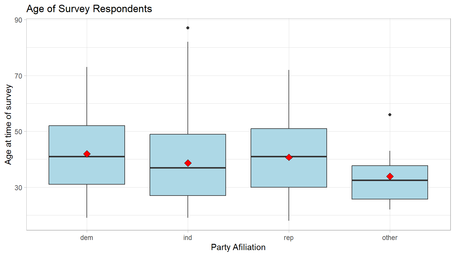
Note: the black bar near the middle of the boxes is the median age. The red dot is the mean age. We can see that the mean ages differ somewhat and that the respondents choosing “other” seem a bit younger.

Question: Make a guess: Do you think these
differences are large enough to be statistically significant?
Your answer here:
Calculate Means
Calculate the mean age for each party_id group, using
the group_by and summarize function from the
dplyr package. (Note: the dplyr package is
included in the tidyverse package previously loaded.) Then
store the results in a new data object named means.
CC8
means <- gss %>%
  group_by(partyid) %>%
  summarize(mean_age = mean(age))

#print the two means
means
## # A tibble: 4 × 2
## partyid mean_age
## <fct> <dbl>
## 1 dem 41.9
## 2 ind 38.7
## 3 rep 40.7
## 4 other 33.9
Question: Are any of the mean ages of the four groups significantly different from the other groups?
Your answer:
State the Null and Alternative hypotheses
We will now test the Null hypothesis that there’s no relationship between the age of the respondent and their age at the population level.
Ho: There is no difference in the mean age of the
party_idgroups.Ha: There is a difference in the mean age of the
party_idgroups.

Important Concept: Unlike the means tests we have been running, the significance test for an ANOVA is always a right-tail test even though the wording of the Null is “no difference,” which seems to be a non-directional test. This is due to the type of test statistic used in an ANOVA, the F statistic. The F distribution is heavily skewed to the right with a very long tail. [If you would like to dig deeper into the theory behind this, here is a chance to have a discussion with an AI tool like ChatGPT or Google Bard.] For our purposes, just remember the ANOVA is always a right-tail test.
Specify the level of significance (alpha)
We will use the “standard” value of 5% for significance level for this analysis.
Test the hypothesis - Downey Method
Here’s how we use the Downey method with
infer package to conduct this hypothesis test:
Step 1: Calculate the observed statistic
Calculate the observed difference delta and
store the results in the data object called delta_obs.
In this example, we are comparing four means using an ANOVA. So we need a test statistic that will help us do that. We can use the F statistic which is explained in Section 7.3 of our textbook.
CC9
# When reusing this code chunk in a Remix assignment, edit only the source data object and the new variable names.

# This code will calculate the delta and create a new data object `delta_obs`

delta_obs <- gss %>%
  specify(age ~ partyid) %>%
  hypothesize(null = "independence") %>%
  calculate(stat = "F")

# Print out the results
delta_obs
## Response: age (numeric)
## Explanatory: partyid (factor)
## Null Hypothesis: independence
## # A tibble: 1 × 1
## stat
## <dbl>
## 1 2.48Step 2: Generate the Null Distribution
Generate the null distribution of the difference delta.
This step involves generating simulated values under the assumption
there’s no relationship (association) between the variables
age and party_id.
Going back to the idea of permutation, and tactile sampling, this is akin to shuffling the ages between the four groups in order to break up any association between the two variables.
CC10
# When reusing this code chunk in a Remix assignment, edit this code for your new data object and new variable names.

#set seed for reproducible results
set.seed(123)

# create a new data object `null_dist` to hold the results
null_dist <- gss %>%
  specify(age ~ partyid) %>%
    #independence means there is no relationship between
   #the two variables.
  hypothesize(null = "independence") %>%
  generate(reps = 1000, type = "permute") %>%
    calculate(stat = "F")

glimpse(null_dist)
## Rows: 1,000
## Columns: 2
## $ replicate <int> 1, 2, 3, 4, 5, 6, 7, 8, 9, 10, 11, 12, 13, 14, 15, 16, 17, 1…
## $ stat <dbl> 0.7374595, 0.8599440, 1.5811827, 1.7818197, 1.6240389, 0.254…
Questions:
What was the size of the “shuffled” (permuted) sample in each run? Hint: how many rows were in the original data file?
Your answer here:How many times did we “shuffle” (permute) the sample? Hint: How many rows are in the `null_dist` data object?
Your answer here:
Step 3: Visualize the Null and the Delta
Visualize how the observed difference delta_obs compares
to the null distribution of delta.
The following plots the delta values we calculated for each of the different “shuffled” replicates. This is the null distribution of delta.
The red line shows the observed difference delta 2.482 which
is the obs_stat which is the value of
delta_obs from CC9.
Important Concept: When using the F distribution, we are always conducting a right-tail test, which is the “greater” direction.
CC11
# When reusing this code chunk in a Remix assignment:
# change only the title and subtitle

visualize(null_dist) +
  shade_p_value(obs_stat = delta_obs, direction = "greater") +
  labs(x = "F statistic", y = "Count",
       title = "Null distribution of F statistic",
       subtitle = "Actual statistic observed (delta_obs) in the data is marked in red"
       )+
  theme_light()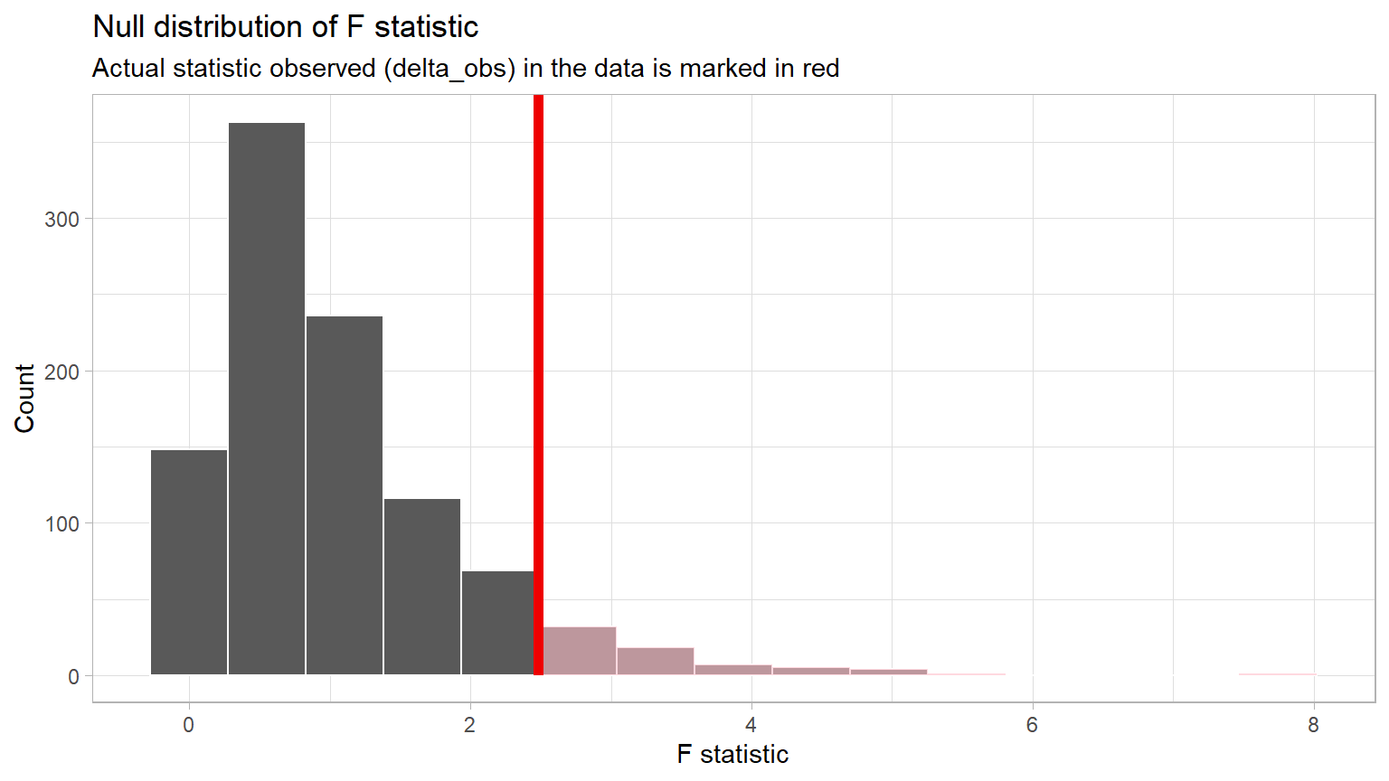
Important concept: Because the red line
delta_obs is not in an extreme tail of the
distribution, it does occur often in the Null
world.
Question: If the delta_obs does happen often in the Null world, do you think the p-value will be small or large. Explain your thinking.
Your answer here:
Step 4: Calculate the p-value
Using the null_dist data object, we can calculate the
p-value from the observed statistic, obs_stat. Recall we
stored the difference observed in the original data in
delta_obs.
CC12
# When reusing this code chunk in a Remix assignment, nothing should be changed.

p_value <- null_dist %>%
  get_pvalue(obs_stat = delta_obs, direction = "greater")

p_value
## # A tibble: 1 × 1
## p_value
## <dbl>
## 1 0.068
Important Concept: If your p-value is stated as 0, it just means that the probability is very, very small. It is impossible to have a p-value of exactly 0. Accepted practice is to report “p-value < 0.001” when the calculated p-value appears to be 0.
Step 5: Decide if delta_obs is statistically significant
Compare the p-value with the significance level alpha. If the p-value is less than alpha, the Null hypothesis must be rejected.
CC13
# When reusing this code chunk in a Remix assignment:
 # Replace the value for alpha with your significance level

alpha <- 0.05

if(p_value < alpha){
  print("Reject the Null Hypothesis")
} else {
    print("Fail to reject the Null Hypothesis")
}
## [1] "Fail to reject the Null Hypothesis"Here, the p-value is shown to be 0.068, which is greater than our Significance Level of 0.05.
This result indicates that there is a 0.068 or 6.8% chance that we would see an F statistic as or more extreme than 2.482 if in fact there was no relationship between age and political party affiliation in the population.
Question: If the p-value is greater than the significance level (alpha), statisticians state the result of the analysis is “Fail to reject the Null” instead of declaring the Null to be true. Explain why you think they do this.
Your answer here:
Results and Conclusions
Here is one way to write up the results of this hypothesis test:
An ANOVA was conducted to determine if there was a relationship between a survey respondent’s age and their political party affiliation. The results of the test were not statistically significant at alpha = 0.05, (p = 0.068).
Given this, we cannot reject the Null hypothesis of no relationship, and thus conclude that there is no relationship between age and party affiliation at the population level.
Question: Explain what is meant by the phrase “at the population level” in the conclusion statement above.
Your answer here:
Confidence interval method
CI Method 1
Another way to test the Null hypothesis is to calculate a confidence interval surrounding the observed test statistic.
The following code will allow us to calculate a 95% confidence
interval for the test statistic F. A new data object
ci_diff is used to hold the results.
CC14
#set seed to make the results reproducible.
set.seed(123)

ci_diff <- gss %>%
  specify(age ~ partyid) %>%
  generate(reps = 1000, type="bootstrap") %>%
  calculate(stat = "F") %>%
  get_confidence_interval(level = 0.95)

#display the CI
ci_diff
## # A tibble: 1 × 2
## lower_ci upper_ci
## <dbl> <dbl>
## 1 0.613 8.19If the Null hypothesis is true in an ANOVA test, the observed test
statistic F will be approximately 1. The theory behind this being true
is beyond the scope of this course, but you can look here if you want to see the math behind this.
The Null F value of “1” does fall within the bounds of the confidence
interval. That indicates the Null hypothesis of no relationship cannot
be rejected.
CI Method 2
Another method of using confidence intervals to test the Null hypothesis is to look at a plot showing the 95% confidence intervals around each of the group means.
If any of the CIs do not overlap with at least one of the other CIs, the ANOVA is significant and the Null hypothesis is rejected.
The following code will calculate and display the four confidence intervals.
CC15
# Calculating means and confidence intervals for age across partyid levels
# if you are resuing this code for a new data set or new variables,
  # change every instance of `gss' to your data object name;
  # change every instance of `partyid` to your categorical variable name
  # change every instance of `age` to your numerical variable name
summary_data <- gss %>%
  group_by(partyid) %>%
  summarise(
    mean_ = mean(age),
    sd_ = sd(age),
    n = n()
  ) %>%
  mutate(se_ = sd_ / sqrt(n),  # Standard error
         ci_ = 1.96 * se_)     # 95% CI

# plotting the CIs

ggplot(summary_data, aes(x = partyid, y = mean_)) +
  geom_errorbar(aes(ymin = mean_ - ci_, ymax = mean_ + ci_),
                width = 0.3, position = position_dodge(width = 0.9)) +
  # Edit the graph title and lables as needed
  labs(x = "Party ID", y = "Mean Age",
       title = "Mean Age across Party IDs with 95% Confidence Intervals") +
  theme_light()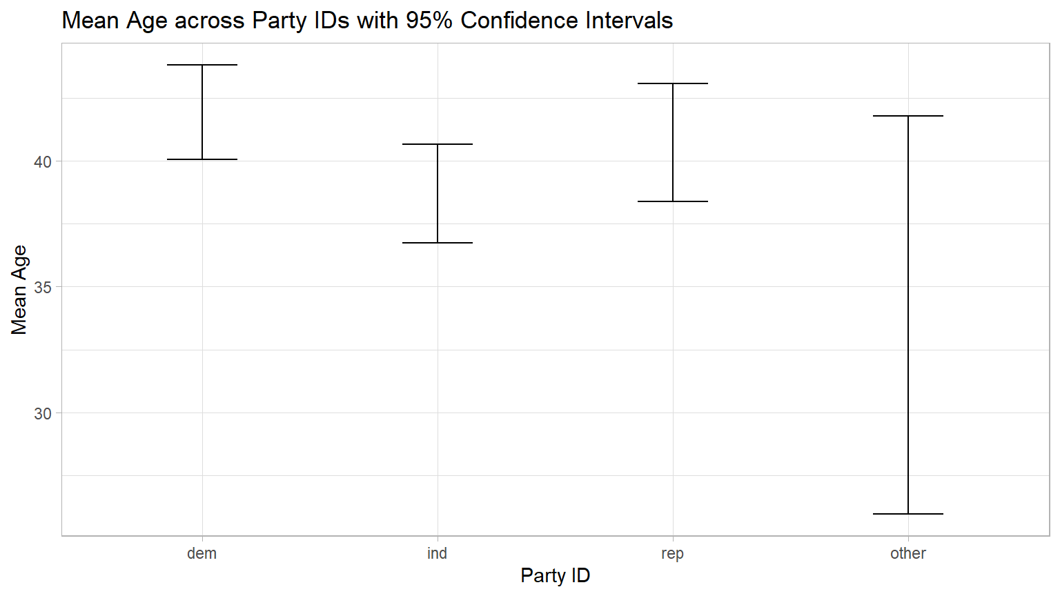
By visual inspection of the graph, you should “see” that all of the CIs overlap with at least one other CI. But the CIs for “dem” and “ind” barely overlap. Could they be significantly different?
Granted this is an “eyeball” approach, but we could calculate the end points and put them in a table. The code below creates such a table.
CC16
# Calculating means and confidence intervals for age across partyid levels.
# if you are resuing this code for a new data set or new variables:
  # change every instance of `gss' to you data object name;
  # change every instance of `partyid` to your categorical variable name
  # change every instance of `age` to your numerical variable name
summary_data <- gss %>%
  group_by(partyid) %>%
  summarise(
    mean_ = mean(age),
    sd_ = sd(age),
    n = n()
  ) %>%
  mutate(se_ = sd_ / sqrt(n),  # Standard error
         ci_ = (1.96 * se_))    # 95% CI

# Extracting upper and lower endpoints of the confidence intervals
ci_table <- summary_data %>%
  mutate(lower_CI = mean_ - ci_, upper_CI = mean_ + ci_) %>%
  dplyr::select(partyid, lower_CI, upper_CI)

# View the created table
print(ci_table)
## # A tibble: 4 × 3
## partyid lower_CI upper_CI
## <fct> <dbl> <dbl>
## 1 dem 40.0 43.8
## 2 ind 36.7 40.7
## 3 rep 38.4 43.1
## 4 other 26.0 41.8Again, by inspection, you should see that each of the four CIs has at least one endpoint that falls within at least one of the other CIs, though the upper end of the “ind” group at 40.656 is not much greater than the lower end of the “dem” group at 40.049.
So this supports our earlier finding that the Null hypothesis of no relationship can not be rejected.
As you will see in the next section, we have a traditional test to do this more precisely if we think there is need. We call this type of test a “post hoc” test which is a test that is conducted after a study has been concluded.
Unfortunately, we do not at present have a Downey/Infer function to do this post hoc test.
Traditional ANOVA
CC17
# Compute the analysis of variance
res.aov <- aov(age ~ partyid, data = gss)
# Summary of the analysis
summary(res.aov)
## Df Sum Sq Mean Sq F value Pr(>F)
## partyid 3 1310 436.8 2.484 0.0601 .
## Residuals 496 87217 175.8
## ---
## Signif. codes: 0 '***' 0.001 '**' 0.01 '*' 0.05 '.' 0.1 ' ' 1By inspection, you should notice the results of the two methods (Infer and traditional) are relatively similar. Both have similar F statistics and p-values. Both indicate that the Null of no association between age and party affiliation cannot be rejected.
Follow-on test
Although we did not find a significant result in the basic ANOVA, we can use a “post hoc” or follow-on” test to provide us additional information about the pairs of means. We will use the Tukey “Honestly Significant Difference test to conduct multiple pairwise comparisons of the means.
Normally, if the ANOVA is not statistically significant, there is no need to conduct a post hoc test. We do it here to illustrate the process.
In essence, the Tukey conducts a series of two-sample difference in mean tests comparing each pair of levels of the categorical variable.
CC18
TukeyHSD(res.aov)## Tukey multiple comparisons of means
## 95% family-wise confidence level
##
## Fit: aov(formula = age ~ partyid, data = gss)
##
## $partyid
## diff lwr upr p adj
## ind-dem -3.223429 -6.785304 0.3384468 0.0920519
## rep-dem -1.194846 -5.207431 2.8177386 0.8690310
## other-dem -8.051554 -20.406960 4.3038528 0.3354385
## rep-ind 2.028582 -1.919216 5.9763802 0.5476590
## other-ind -4.828125 -17.162643 7.5063932 0.7442252
## other-rep -6.856707 -19.328845 5.6154304 0.4891742By looking at the individual p-values, we can see that none of the pairs are significantly different - all have a p-value greater than the significance level of 0.05.
Important Concept: You may have noticed the p-value column is labeled “p adj” which stands for “p adjusted”. The Tukey HSD test does adjust the p-values to account for the multiple t-tests that are run. For our purposes, we can just consider them to be “p-values”.
Although it appears that many of the above Downey/Infer steps can be done with one line of code, and we have this neat follow-on Tukey HSD test, this method only can be used if a slew of assumptions like normality and equal variance of the groups are met.
Additional tests to verify that the assumptions are met must be conducted before the results can be used. Check assumptions and tests here.
Example 2
This example will illustrate an ANOVA which has a statistically significant result. As you will learn, a statistically significant result in an ANOVA just tells us at least one pair of means is different. But it does not tell us which pair or pairs are different. We will have to conduct additional tests to make that final determination. We will again use the Tukey HSD post hoc test to tell us which pairs are significantly different.
Load Packages
CC19
library(tidyverse)
library(infer)
library(data.table)
Inspect the Data
For this example we will work with the interest_rates
data set that is taken from Consumer Reports in 1985. [Granted this is
old but given the current financial situation, these rates are not far
off from what a person with a average FICO score might pay.]
For this analysis, we are presuming that this dataset is a representative sample of a population we want to learn about - American new car interest rates. from large banks.
The following code chunk will read in the dataset and create a data frame:
CC20
rates <- read.csv("./data/interest_rates.csv")

head(rates)
## city rate
## 1 Atlanta 13.75
## 2 Atlanta 13.75
## 3 Atlanta 13.50
## 4 Atlanta 13.50
## 5 Atlanta 13.00
## 6 Atlanta 13.00You should see the `rates` data frame in the environment.
The data frame rates has two columns and 55 rows. Each
row in this data frame is a rate from one of large banks in each of the
cities. The columns are the variables:
city- a categorical variable with six levels- the name of the city.rate- a numerical variable of the interest rate at the time of survey.
State the research question
We will use hypothesis testing to answer the following question: Is there a difference in the mean interest rate for new cars in the six cities?
We could also phrase the research question as about a relationship: Is there a relationship between which city the bank is located in and the new car load interest rate?
Exploratory data analysis
Examine the data to gather information related to the research question.
Start by looking at the variables of interest.
Visualize the Data
Generate a data visualization that displays the new car interest rates charged by the major banks in the six cities.
Note the “dark” line in the box is the median rate and the red diamond is the mean rate.
CC21
ggplot(rates, aes(x = city, y = rate)) +
  geom_boxplot(fill = "lightblue") +
  stat_summary(fun = "mean", geom = "point", shape = 23, size = 3, fill = "red") +
  labs(title = "New Car Loan Interest Rates charged by Major Banks",
       x = "City", y = "Interest Rate") +
  theme_light()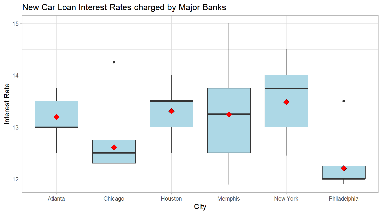
We can see that the mean interest rates in four of the cities are similar but that two of the cities rates appear to be lower with Philadelphia having the lowest mean rate.
Calculate Means
Calculate the mean rate for each city group, using the
group_by and summarize function from the
dplyr package. (Note: the dplyr package is
included in the tidyverse package previously loaded.) Then
store the results in a new data object named means.
CC22
means <- rates %>%    group_by(city) %>%
  summarize(mean_rate = round(mean(rate),2))
#print the six means means

means
## # A tibble: 6 × 2
## city mean_rate
## <chr> <dbl>
## 1 Atlanta 13.2
## 2 Chicago 12.6
## 3 Houston 13.3
## 4 Memphis 13.2
## 5 New York 13.5
## 6 Philadelphia 12.2
Question: Are any of the mean interest rates of the six cities significantly different from the other cities?
Your answer:
State the Null and Alternative hypotheses
Ho: There is no relationship between new car interest rates and the
city.
Ha: There is a relationship between new car interest rates and the
city,
Specify the level of significance (alpha)
We will use the “standard” value of 5% for significance level for this analysis.
Test the hypothesis - Downey Method
Step 1: Calculate the observed test statistic
Calculate the observed difference delta and
store the results in a new data object called
delta_obs.
In this example, we are comparing six means using an ANOVA. So we need a test statistic that will help us do that. We will use the F statistic which is explained in Section 7.3 of our textbook.
CC23
# This code will calculate the delta and create a new data object `delta_obs`

delta_obs <- rates %>%
  specify(rate ~ city) %>%
  hypothesize(null = "independence") %>%
  calculate(stat = "F")

# Print out the results
delta_obs
## Response: rate (numeric)
## Explanatory: city (factor)
## Null Hypothesis: independence
## # A tibble: 1 × 1
## stat
## <dbl>
## 1 5.18Step 2: Generate the Null Distribution
Generate the null distribution of the correlation coefficient.
Here we need to generate simulated values as if we lived in a world where there’s no relationship between new car interest rates and the city your are in.
CC24
#set seed for reproducibilty
set.seed(1)

null_dist <- rates %>%
  specify(rate ~ city) %>%
  # our null is no relationship between the two variables
   # which we model by assuming they are independent
  hypothesize(null = "independence") %>%
  generate(reps = 1000, type = 'permute') %>%
  calculate(stat = "F")

null_dist
## Response: rate (numeric)
## Explanatory: city (factor)
## Null Hypothesis: independence
## # A tibble: 1,000 × 2
## replicate stat
## <int> <dbl>
## 1 1 0.559
## 2 2 0.879
## 3 3 1.00
## 4 4 1.50
## 5 5 2.95
## 6 6 0.716
## 7 7 0.952
## 8 8 1.52
## 9 9 2.00
## 10 10 0.883
## # ℹ 990 more rowsStep 3: Visualize the Null and the “Delta”
Visualize how the observed difference delta_obs compares
to the null distribution of delta.
The following code plots the delta values we calculated for each of the different “shuffled” replicates. This is the null distribution of delta.
The red line shows the observed difference delta 5.1816
which is the obs_stat which is the value of
delta_obs from CC20 in Step 1.
When using the F distribution, we are always interested in the right tail, which is the “greater” direction.
CC25
visualize(null_dist) +
  shade_p_value(obs_stat = delta_obs, direction = "greater") +
  labs(x = "F statistic", y = "Count",
       title = "Null distribution F statistic",
      subtitle = "Actual F observed in the data is marked in red") +
  theme_light()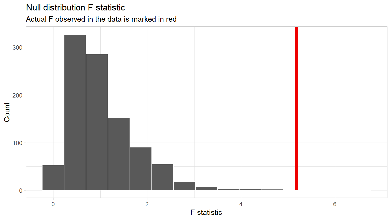
Step 4: Calculate the p-value
The p-value is the area “under the distribution curve” to the right of the observed delta. This requires the direction to be “greater”.
CC26
p_value <- null_dist %>%
  get_pvalue(obs_stat = delta_obs, direction = "greater")

p_value
## # A tibble: 1 × 1
## p_value
## <dbl>
## 1 0.002Step 5: Decide if delta_obs is statistically significant
Compare the p-value with the significance level alpha. If the p-value is less than alpha, the Null hypothesis must be rejected.
CC27
# When reusing this code chunk:
 # Replace the value for alpha with your significance level

alpha <- 0.05

if(p_value < alpha){
  print("Reject the Null Hypothesis")
} else {
    print("Fail to reject the Null Hypothesis")
}
## [1] "Reject the Null Hypothesis"
Important Concept: If your p-value is stated as 0, it just means that the probability is very, very small. It is impossible to have a p-value of exactly 0. Accepted practice is to report “p-value < 0.01” when the calculated p-value appears to be 0.
Here, the p-value is shown to be 0.002, which is less than our Significance Level of 0.05.
Results & Conclusions
Here is one way to write up the results of this hypothesis test:
An ANOVA was conducted to determine if there was a relationship between the city and the mean new car interest rate. The results of the test were statistically significant at alpha = 0.05, (p = 0.002).
Given this, we reject the Null hypothesis and thus conclude that there is a relationship between new car interest rate charged by major banks the city they are in at the population level.
But does this method tell us which mean interest rates are different? Unfortunately no. The ANOVA is an omnibus test which is just looking at the entire data set to see if any pairs of interest rates are significantly different. Getting a statistically significant result just tells us that at least one pair is different, but does not tell us which pairs.
Confidence Interval
CI Method 1
Another way to test the Null hypothesis is to calculate a confidence interval surrounding the observed test statistic.
The following code will allow us to calculate a 95% confidence
interval for the test statistic F. A new data object
ci_diff is used to hold the results.
CC28
# set seed to make results reproducible
set.seed(123)

ci_diff <- rates %>%
  specify(rate ~ city) %>%
  generate(reps = 1000, type="bootstrap") %>%
  calculate(stat = "F") %>%
  get_confidence_interval(level = 0.95)

# display the confidence interval around the correlation coefficient
ci_diff
## # A tibble: 1 × 2
## lower_ci upper_ci
## <dbl> <dbl>
## 1 2.35 16.7If the Null hypothesis is true in an ANOVA test, the observed test
statistic F will be approximately 1. The theory behind this being true
is beyond the scope of this course, but you can look here if you want to see the math behind this.
The Null F value of “1” does not fall within the bounds
of the confidence interval. That indicates the Null hypothesis of no
relationship must be rejected.
CI Method 2
Another method of using confidence intervals to test the Null hypothesis is to look at a plot showing the 95% confidence intervals around each of the city means.
If any of the CIs do not overlap with at least one of the other CIs, the ANOVA is significant and the Null hypothesis is rejected.
The following code will calculate and display the four confidence intervals.
CC29
# if you are resuing this code for a new data set or new variables,
  # change every instance of `rates' to your data object name;
  # change every instance of `city` to your categorical variable name
  # change every instance of `rates` to your numerical variable name
summary_data <- rates %>%
  group_by(city) %>%
  summarise(
    mean_ = mean(rate),
    sd_ = sd(rate),
    n = n()
  ) %>%
  mutate(se_ = sd_ / sqrt(n),  # Standard error
         ci_ = 1.96 * se_)     # 95% CI

# plotting the CIs

ggplot(summary_data, aes(x = city, y = mean_)) +
  geom_errorbar(aes(ymin = mean_ - ci_, ymax = mean_ + ci_),
                width = 0.3, position = position_dodge(width = 0.9)) +
# Edit labels and title as appropriate if reusing code
  labs(x = "City", y = "Interest Rate",
       title = "Car Loan Interest Rates in Cities with 95% Confidence Intervals") +
  theme_minimal()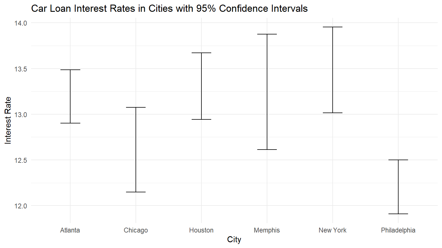
By visual inspection of the graph, you should “see” that all of the CIs overlap with at least one other CI. With the exception of Philadelphia. It overlaps only with Chicago.
Granted this is an “eyeball” approach, but we could calculate the end points and put them in a table. The code below creates such a table.
CC30
# if you are resuing this code for a new data set or new variables,
  # change every instance of `rates' to your data object name;
  # change every instance of `city` to your categorical variable name
  # change every instance of `rates` to your numerical variable name

summary_data <- rates %>%
  group_by(city) %>%
  summarise(
    mean_ = mean(rate),
    sd_ = sd(rate),
    n = n()
  ) %>%

  mutate(se_ = sd_ / sqrt(n),  # Standard error
         ci_ = 1.96 * se_)    # 95% CI

# Extracting upper and lower endpoints of the confidence intervals
ci_table <- summary_data %>%
  mutate(lower_CI = mean_ - ci_, upper_CI = mean_ + ci_) %>%
  dplyr::select(city, lower_CI, upper_CI)

# View the created table
print(ci_table)
## # A tibble: 6 × 3
## city lower_CI upper_CI
## <chr> <dbl> <dbl>
## 1 Atlanta 12.9 13.5
## 2 Chicago 12.1 13.1
## 3 Houston 12.9 13.7
## 4 Memphis 12.6 13.9
## 5 New York 13.0 14.0
## 6 Philadelphia 11.9 12.5Again, by inspection, you should see that Philidelphia’s upper endpoint falls only in Chicago’s CI. It does not overlap any of the other cities CI.
But Chicago’s CI does over lap the other four CIs.
So, does this support our earlier finding that the Null hypothesis of no relationship must be rejected?
As you will see in the Traditional Method in the next section, we have a test to do this more precisely if we think there is need.
Question: Based on the Confidence Interval Method 2, are any of the mean interest rates of the six cities significantly diffent from the other cities?
Your answer:
Traditional Method
Use a traditional ANOVA test to determine if there is a statistically significant difference in the mean interest rate for new cars in the six cities at the population level.
CC31
# Compute the analysis of variance
res.aov <- aov(rate ~ city, data = rates)
# Summary of the analysis
summary(res.aov)
## Df Sum Sq Mean Sq F value Pr(>F)
## city 5 11.51 2.3011 5.182 0.000679 ***
## Residuals 49 21.76 0.4441
## ---
## Signif. codes: 0 '***' 0.001 '**' 0.01 '*' 0.05 '.' 0.1 ' ' 1Again, the traditional ANOVA test produces essentially the same results but they should not be used until the required assumptions are checked and verified.
Follow on test
Remember the ANOVA is an “omnibus” type of test. It just tells us, if signficant, that at least one pair of means are different. It does not tell us which pairs are different. So we need to conduct a follow-on or post hoc test.
Because we are comparing means, we could use a series of two-sample means-tests that we did in to tell us where the significant differences are. But that would require a lot of t-tests.
We can use the Tukey HSD test.
CC32
TukeyHSD(res.aov)## Tukey multiple comparisons of means
## 95% family-wise confidence level
##
## Fit: aov(formula = rate ~ city, data = rates)
##
## $city
## diff lwr upr p adj
## Chicago-Atlanta -0.58333333 -1.51490436 0.34823769 0.4402538
## Houston-Atlanta 0.11222222 -0.81934881 1.04379325 0.9991879
## Memphis-Atlanta 0.05000000 -0.88157103 0.98157103 0.9999848
## New York-Atlanta 0.28888889 -0.64268214 1.22045992 0.9395904
## Philadelphia-Atlanta -0.98944444 -1.89742757 -0.08146132 0.0253005
## Houston-Chicago 0.69555556 -0.23601547 1.62712658 0.2500451
## Memphis-Chicago 0.63333333 -0.29823769 1.56490436 0.3483497
## New York-Chicago 0.87222222 -0.05934881 1.80379325 0.0785413
## Philadelphia-Chicago -0.40611111 -1.31409423 0.50187201 0.7691257
## Memphis-Houston -0.06222222 -0.99379325 0.86934881 0.9999551
## New York-Houston 0.17666667 -0.75490436 1.10823769 0.9929864
## Philadelphia-Houston -1.10166667 -2.00964979 -0.19368354 0.0091808
## New York-Memphis 0.23888889 -0.69268214 1.17045992 0.9727995
## Philadelphia-Memphis -1.03944444 -1.94742757 -0.13146132 0.0162670
## Philadelphia-New York -1.27833333 -2.18631646 -0.37035021 0.0016146What we are most interest in is the p-value of the individual pair-wise test. It is labeled “p adj”. Note: when we run many tests on the same data, we have to adjust the p-value a bit. The reason for this is beyond the scope of this class. But we can use “p adj” the same as we would an ordinary p-value.
Inspecting the column of p-values, we can see that only when Philadelphia is involved do we have a significant result (p < 0.05). And of those five comparisons with Philadelphia, four have a p-value < 0.05.
Thus we can conclude that the mean interest rate for new car loans in Philadelphia is different from the rate in Atlanta, Houston, Memphis, and New York. The rates in the other pairs of cities do not differ significantly.
Lab Assignment Submission
Important
When you are ready to create your final lab report, save the Lab-6-Rehearse2-Worksheet.Rmd lab file and then Knit it to PDF or Word to make a reproducible file. This image shows you how to select the knit document file type.

Note that if you have difficulty getting the documents to Knit to either Word or PDF, and you cannot fix it, just save the completed worksheet and submit your .Rmd file for partial credit.
Submit your file in the Canvas M6.3 Lab 6 Rehearse(s): Hypothesis Tests Part 1 Means assignment area.
The Lab 6 Hypothesis Tests Part 1 Grading Rubric will be used.

Congrats! You have finished Rehearse 2 of Lab 6. Now go to Remix and Report!
 Previous: Lab 6 Rehearse 1

This
work was created by Dawn Wright and is licensed under a
Creative
Commons Attribution-ShareAlike 4.0 International License.
Version 2.2, Date 7/31/24
Last Compiled 2024-07-31