Quick Start Debrief
Business Data Literacy

Image by Gerd Altmann from Pixabay
Lab 1 Rehearse 2: Quick Start Debrief
Congrats! You just created a R Markdown lab report!
You used data to answer some questions by producing a data visualization!
Explore the Code Chunks
You used some Packages
R packages are probably the most important factor driving the adoption of R as the prime tool to do data analysis. In his book, R Packages, author Hadley Wickam explains:
Packages are the fundamental units of reproducible R code. They include reusable R functions, the documentation that describes how to use them, and sample data.
One way to think of R packages is they are like the apps you get for your smartphone which greatly extend the many things you can do with your phone. To use a new app for your phone, you must first download it from an “app store” and then install it on your phone. The app stays permanently on your phone and you can use it when it is needed. But to use an app, you must open it by tapping its icon.
To use a package, we must first install it on our computer from the “package store” which is usually CRAN, the Comprehensive R Archive Network. Both RStudio desktop and RStudio/Posit Cloud make package installation relatively easy, and will usually remind us if we have a code chunk that needs a package we don’t yet have installed. Then we use the library code to open the packages for use, much like clicking on an app’s icon.
We used the tidyverse, lubridate, and scales packages for data wrangling and visualization, and the DT package for interactive display of tabular output, and the unvotes package for the data. Data wrangling is the process of cleaning and unifying messy and complex data sets for easy access and analysis.
library(tidyverse)
library(lubridate)
library(scales)
library(DT)
library(unvotes)
You used some Data
The data we used comes from the unvotes package originally developed by David Robinson in 2017, but our data does go through 2019. In the code chunk below we modify the data by joining the various data frames provided in the package to help you get started with the analysis.
For more info on the unvotes package and also on how joining / merging the data tables works, see the explanation on https://bus-data-lit-lab.netlify.app/unvotes.html
unvotes <- un_votes %>%
  inner_join(un_roll_calls, by = "rcid") %>%
  inner_join(un_roll_call_issues, by = "rcid")
OK, just what is a “data frame”? If you are familiar with Excel’s typical data layout, a data frame is similar, particularly when it is “tidy.”
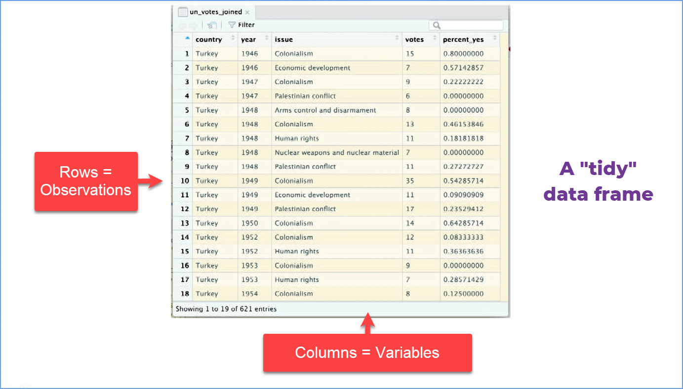
The “join” merges two tables or data frames and makes them into one by connecting the same variable in both, here the “rcid” variable. The “rcid” variable is the short name in the original data set for the issue being voted on, e.g. “Palestinian Conflict”. Note that the image above does not show the “rcid” variable’s column, but it is in our data. See Intro to the unvotes packagefor more info.
UN voting patterns chart
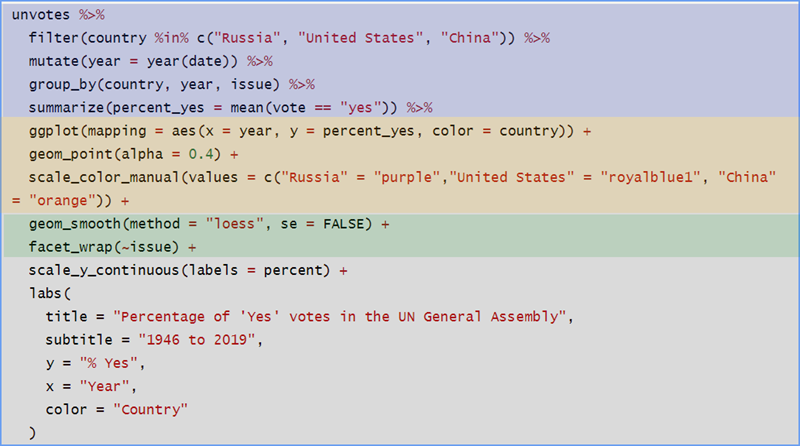
You created a data visualization using the big code chunk below that displays how the voting record of the US changed over time on a variety of issues, and compares it to two other countries: the Russia and China. Note that whenever you Knit a document, R runs all the code in it and will insert the output it generates in your R Markdown document.
To make the chart, we use a graphing package called ggplot2 which is included within the tidyverse package we loaded. ggplot uses something called “the grammar of graphics” to build in a logical, consistent manner data visualizations - charts and graphs. Although we will explore this in more detail in the second module, we think getting an introduction to the concepts now is important.
 Important
Please watch this 6-minute video by David Keyes The Grammar of Graphics gives a good summary of the grammar of graphics applied to an R graph.
unvotes %>%
  filter(country %in% c("Russia", "United States", "China")) %>%
  mutate(year = year(date)) %>%
  group_by(country, year, issue) %>%
  summarize(percent_yes = mean(vote == "yes")) %>%
  ggplot(mapping = aes(x = year, y = percent_yes, color = country)) +
  geom_point(alpha = 0.4) +
  scale_color_manual(values = c("Russia" = "#1B9E77", "United States" = "#D95F02", "China" = "#7570B3")) +
  geom_smooth(method = "loess", se = FALSE) +
  facet_wrap(~issue) +
  scale_y_continuous(labels = percent) +
  labs(
    title = "Percentage of 'Yes' votes in the UN General Assembly",
    subtitle = "1946 to 2019",
    y = "% Yes",
    x = "Year",
    color = "Country"
  )+
theme_light()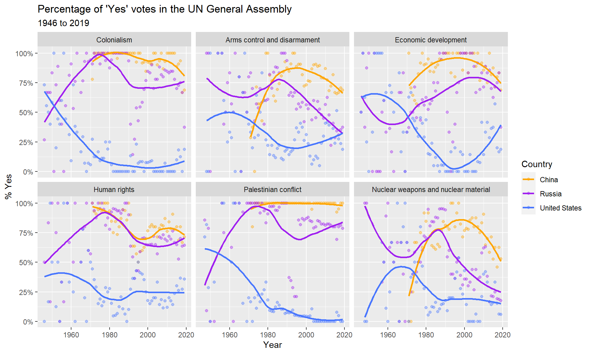
Let’s break this down a bit to help you recognize what is going on. We have color-coded some parts of the big chunk.
Again, you will not have to create code blocks like this for this course, but you need to understand how to “read” them so you know where to edit when necessary.
You probably noticed a lot of these symbols in the code chunk:
 Remember this pipe operator
symbol! You will see it often.
Remember this pipe operator
symbol! You will see it often.
%>%. This is called the “pipe operator” which takes the output of one function and passes it to another function as an argument. One way you can think of what the pipe operator does is to substitute the phrase “and then” for it.
A function has this form:
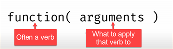
Think of this as a factory with many machines in the production line. The output of one machine is directed to the next machine using a conveyor belt. The pipe operator works something like the conveyor belt, moving the output of one function to the next for further processing.
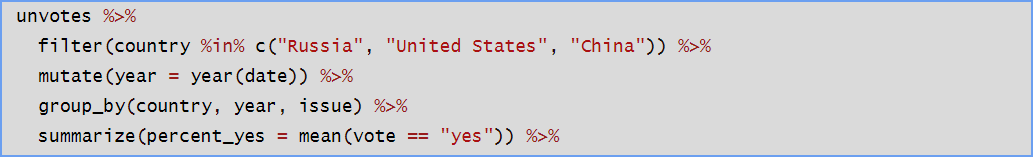 In this first chunk, we
are wrangling the data, getting it into the form we
need for our analysis and data viz. First, we filter the unvotes data
for the three countries we are interested in. This is using the
filter function on the country
variable as its argument. Here is where you could edit to select other
countries.
In this first chunk, we
are wrangling the data, getting it into the form we
need for our analysis and data viz. First, we filter the unvotes data
for the three countries we are interested in. This is using the
filter function on the country
variable as its argument. Here is where you could edit to select other
countries.
Next we use the mutate function on the data to create a new variable, “year.” We take the complex date in the unvotes data, which includes day, month, and year, and just pull out the year and store that value in the new variable “year”.
The group_by function takes our filtered data and groups (another word would be “sorts”) it first by country, then by year, and then by issue. That way we can more easily use the summarize function to calculate the mean (i.e. average) percent of a country’s votes each year on each issue that were “Yes”.

In this chunk, we are setting up our graph using the ggplot function. The first line says we want year on the x-axis and percent_yes on the y-axis. And we are going to use color to distinguish the countries.
Heads Up!
Note in these next two chunks we are now in ggplot where functions are linked together using a + symbol. The + is something like the pipe operator %>% we use in Tidyverse. You can again think of the words “and then” as the output of one function/operation is passed to the next.Those + symbols are critical to getting the code to run, so don’t delete or forget them.
With the geom_point function, we use the “alpha” setting to make the individual data points more transparent so the line we plot stands out more. The “0.4” value means we want the data point’s color to be 40% opaque, or 1 - 40% = 60% transparent.
Then we specify the colors we want for the countries using the scale_color_manual function. Note that R has standard names for colors and packages for special purposes such as providing safe colors for color-blind folks. Note we are using color-blind safe colors here.

In the first line of code, we tell R we want the line through the data points to be smooth and not rigidly connecting the dots. This makes it easier to see trends in the data. Finally, we tell R to create several individual plots, called facets, one for each issue in the data set. Note in the UN Votes data set, the author picked six issues to focus on, so we have six facet plots.
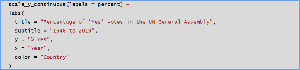
The last section deals with formatting of the graphs. We tell R we want the y-axis scale to be continuous as a percent in the first line. In the “labs” (which stands for labels) section we specify the title of the overall graph as well as a subtitle. And specify that y-axis and x-axis are labeled the way we want. And we add a legend giving the country name and its color. All of the code in red can be edited to suit.
So there you have it. Again, you will not have to create such code chunks from scratch in this course, but you will learn to “read” the code and see how to edit it to suit your needs.
Heads Up!
Remix & Report
You have a short report to do and then you will have lab 1 completed.
Lab Assignment Submission
There is nothing you need to submit in Canvas for this Lab 1 Rehearse 2 Debrief.
 Previous: Lab 1 Rehearse 1
Quickstart
Previous: Lab 1 Rehearse 1
Quickstart

Appendix
Below is a list of countries in the dataset:
Attribution: This lab is largely based on one developed by Mine Çetinkaya-Rundel of Duke University. The code chunks are essentially hers, save for my changing the countries initially included in the analysis and changing to a color-blind safe color scheme.
References
- David Robinson (2017). unvotes: United Nations General Assembly Voting Data. R package version 0.2.0.
- Erik Voeten “Data and Analyses of Voting in the UN General Assembly” Routledge Handbook of International Organization, edited by Bob Reinalda (published May 27, 2013).
- Much of the analysis has been modeled on the examples presented in the unvotes package vignette.

This
work was created by Dawn Wright and is licensed under a
Creative
Commons Attribution-ShareAlike 4.0 International License.
Date 11/4/25
Last Compiled 2025-11-04