Lab 2 Rehearse 1
Graphing Data
Attribution: This lab is an adaptation of Chapter 6 of Learning Statistics with R by Danielle Navarro; Chapter 2 in ModernDive by Chester Ismay and Albert Y. Kim; and Answering questions with data Lab Manual by Matt Crump and his team.
Above all else show the data.
–Edward Tufte
One of the most helpful things you can do to begin
to make sense of data is to look at them in graphical form. By
visualizing data, we gain valuable insights we couldn’t initially obtain
from just looking at the raw data values. We’ll use the
ggplot2 package we used in the Quick Start, as it provides
an easy way to customize your plots. ggplot2 is rooted in
the data visualization theory known as the Grammar of Graphics
, developed by Leland Wilkinson.
References:
Wickham, Hadley (March 2010). “A Layered Grammar of Graphics” (PDF). Journal of Computational and Graphical Statistics. 19 (1): 3–28. doi:10.1198/jcgs.2009.07098. S2CID 58971746
Wickham, Hadley (July 2010). “ggplot2: Elegant Graphics for Data Analysis”. Journal of Statistical Software. 35 (1).
 TDL
TDL
This 6 minute video by David Keyes The Grammar of Graphics gives a good summary of the grammar of graphics applied to an R graph.
At their most basic, graphics/plots/charts (we use these terms interchangeably in this course) provide a nice way to explore the patterns in data, such as the presence of outliers, distributions of individual variables, and relationships between groups of variables. Graphics are designed to emphasize the findings and insights you want your audience to understand. This does, however, require a balancing act. On the one hand, you want to highlight as many interesting findings as possible. On the other hand, you don’t want to include so much information that it overwhelms your audience.
As we will see, plots also help us to identify patterns and outliers in our data. We’ll see that a common extension of these ideas is to compare the distribution of one numerical variable, such as what are the center and spread of the values, as we go across the levels of a different categorical variable.
 Important
1 Lab 2 Set Up
Watch this Lab 2 Rehearse 1 “Walk Thru” video first: Lab 02 Rehearse 1 Walk Thru
If you have not already set up Lab 2, you will need to follow this link to set up Lab 2 in your RStudio/Posit Cloud workspace: Link to Set up Lab 2 Exploring Data
Also Important
Remember to save the “temp” workspace as “permanent.”
If you have already set up Lab 2, do not use the Set Up link again as it may reset your work. The set up link loads fresh copies of the required files and they could replace the files you have worked on.
Instead use this link to go to Posit Cloud to continue to work on Lab 2:
Link to Posit Cloud login page
We will use this same process for all future labs. Use the special Set Up link to create your workspace and then use the simple link https://posit.cloud/ to log back into your account on subsequent work sessions.
 Caution
Don’t get confused by the multiple R Markdown (.Rmd) files in your RStudio/Posit Cloud Lab 2 Exploring Data workspace. There are three .Rmd “Worksheets,” one for each Rehearse tutorial and one for the Remix/Report.
We use R Markdown in our labs in order to make it easier to create reproducible work.
Not required, but if you want to learn more about the capabilites/How to of R markdown, check this out: 40 Reports with R Markdown.
The Lab2-Rehearse1-Graphing-Data-Worksheet is correct for working through the Graphing Data Rehearse. There is a similar worksheet, Lab2-Rehearse2-Describing-Data-Worksheet for the second Rehearse. And the Remix & Report template, which is called Lab2-Remix-Student-Name.Rmd.
2 Let’s get started!
2.1 Load the Packages!
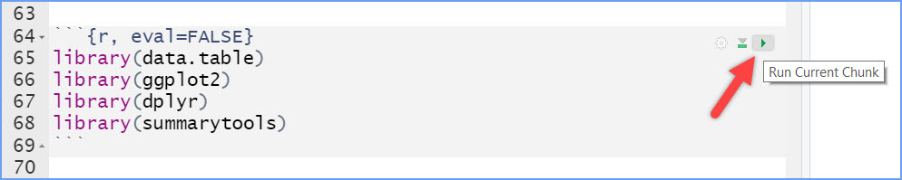
Run this code chunk which is already in your worksheet to load the required packages:
 CC1 = Code Chunk 1
library(data.table)
library(ggplot2)
library(dplyr)
library(summarytools)
library(knitr)
library(readr)
Hint
Hint
To run a code chunk, click on the “run” button in the upper right corner of the r code space. Note, just as you do not see the line numbers on the left in a webpage, the run button only shows when your worksheet is open in RStudio/Posit Cloud.
Note that you may get a message about objects being masked. You can ignore it.
Then you can follow along with the steps and use the code chunks to replicate the graphs in this lab tutorial.
3 Get some data.
In order to graph data, we need to have some data first…Actually, with R, that’s not quite true.
Important
Remember you will need to copy/paste the code chunks from this page to your worksheet when you see an empty R code space. Recall you can click on the small green copy icon in the upper left of the code chunk in this webpage and it will be copied for you. Then just click into the* middle of the empty R code space in your worksheet where you can right-click and paste it.
Copy, paste, and run this bit of code and see what happens:
CC2 = Code Chunk 2
hist(rnorm(100, mean=50, sd=25))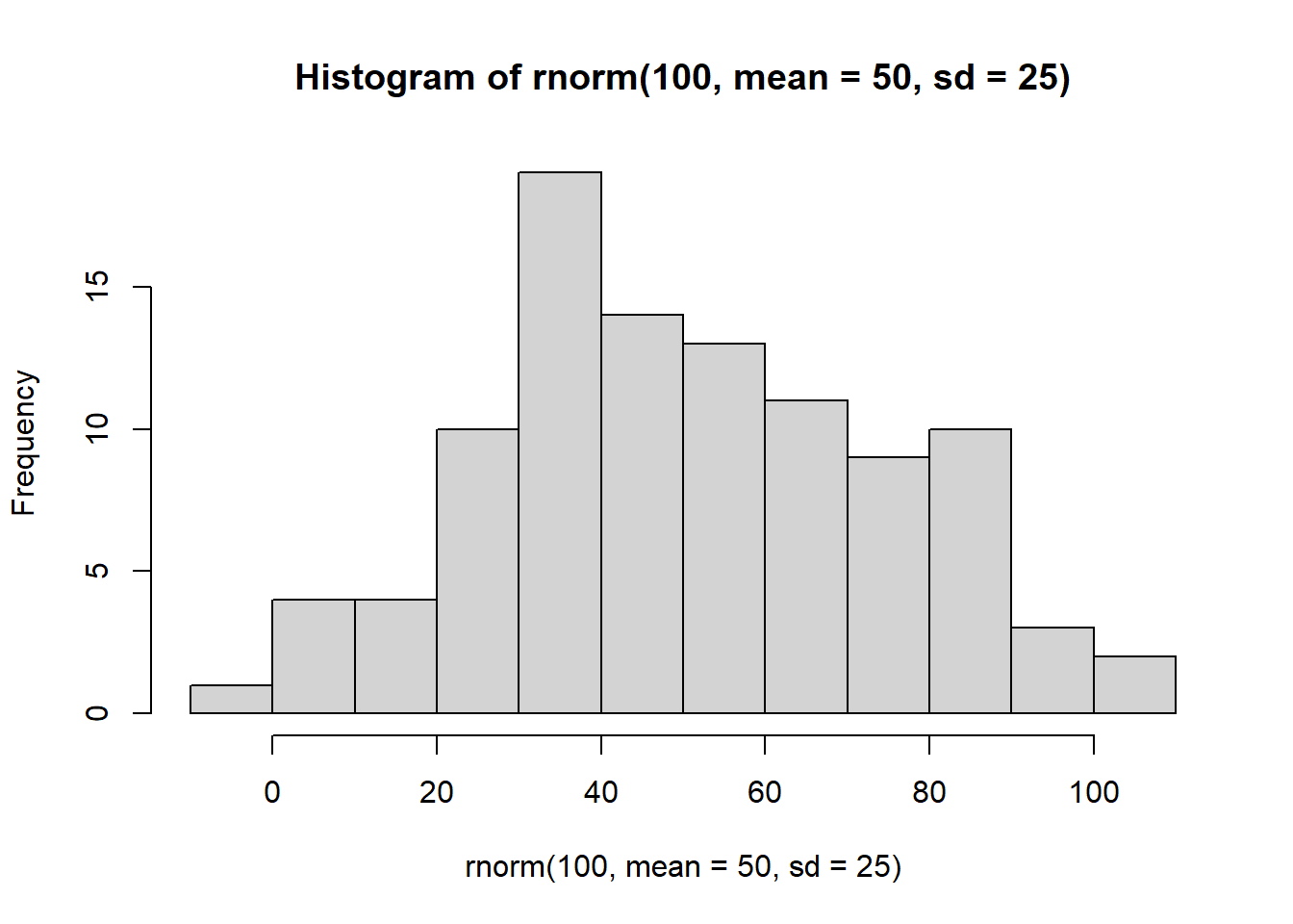
You just made R sample 100 random numbers, and then plot the results in a histogram. Pretty neat. We’ll be doing some of this later in the course, where get R to make fake data for us, and then we learn to think about how data behaves under different kinds of assumptions.
For now, let’s do something that might be a little bit more interesting…what movies are going to be filming in NYC? It turns out that NYC makes a lot of data about a lot of things open and free for anyone to download and look at. This is the NYC Open Data website: https://opendata.cityofnewyork.us.
We searched through the data, and found a data file that lists the locations of film permits for shooting movies all throughout the Burroughs. There are multiple ways to load this data into R. But we have the data file already in the lab data folder. So, we just need to run this code chunk:
 Reminder!
Whenever you see the green copy icon in a code chunk, you need to copy/paste it into your worksheet and then run it.
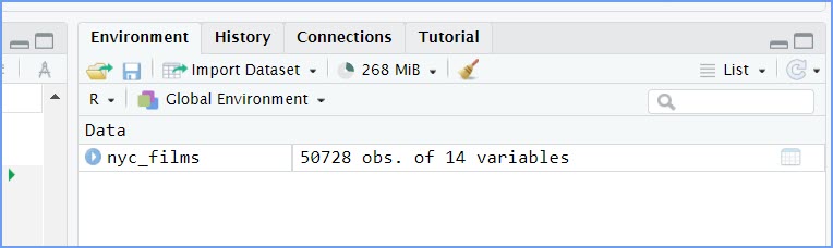
CC3
library(readr)
nyc_films <-read_csv("./data/Film_Permits.csv")
When it runs, you should see the “nyc_films” Data object show up in the Environment window.
4 Look at the data!
You will be downloading and analyzing all kinds of data files in this course. We will follow the very same steps every time. The steps are to load the data, then look at it. You want to see what you’ve got.
In R-studio, when you load data, you will now see data objects in the
Environment window like nyc_films. We call this type of
object “Data”. If you single click your cursor on the name of the data
object in the Environment, R will show you the contents of the data
object in a new tab that opens in the Source/Editor window area.
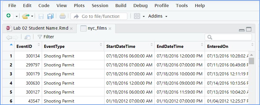
The data is stored in something we call a data frame.
Recall we briefly discussed a data frame in the Quick Start exercise
debrief. “Data frame” is the R term for the thing that contains the
data. Notice it a rectangle, with rows going across, and columns going
up and down. It looks kind of like an Excel spreadsheet if you are
familiar with Excel.
It’s useful to know you can look at the data frame this way if you need to. But, this data frame is really big, it has 50,728 rows of data. That’s probably too much data to comprehend just by looking at it this way.
4.1 Use Summary Tools to explore data.
The summarytools packages give a quick way to summarize all of the data in a data frame. Here’s how. When you run this code you will see the summary in the Viewer tab in the Files window on the bottom right hand side. (see example image below)
CC4
library(summarytools)
view(dfSummary(nyc_films))
# add a hash tag in from of the 'view(dfSummary) line above when you are ready to knit.
# it should look like this:
#view(dfSummary(nyc_films))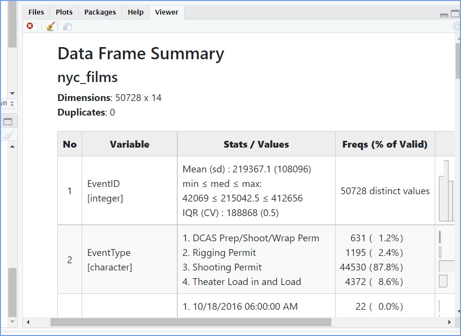 This Data Frame Summary table
is large, so you will likely have scroll bars on the right-hand side and
the bottom. You can use these to see more of the summary table.
This Data Frame Summary table
is large, so you will likely have scroll bars on the right-hand side and
the bottom. You can use these to see more of the summary table.
And when it is run, code chunk CC4 will also try to open the Data Frame Summary table in a new HTML window which we have recreated here: https://bus-data-lit-lab.netlify.app/lab-02-dfsummary
That is super helpful, but it’s still a lot to look at. Because there is so much data here, it’s pretty much mind-boggling to start thinking about what to do with it.
 Important!
When you finish this rehearse, you will need to knit it to a PDF or Word document. And that causes a conflict - an error- because there is no popup window in a document. So, we need to not use the ‘view(df_summary)’ function in our knitted documents. To do that go back into CC4 and “comment out” that last line of code. We use a hashtag # symbol in front of code we do not want to run. Go back to CC4 and add that hash tag as shown.
5 Make Plots to answer questions.
Let’s walk through a couple of questions we might have about this
data. Looking again at the nyc_films data frame in the Environment, we
can see that there were 50,728 film permits (observations) made. In the
tab in the Editor window, we can also see that there are different
columns telling us information about each of the film permits. For
example, the Borough column lists the Borough for each
request, whether it was made for: Manhattan, Brooklyn, Bronx, Queen’s,
or Staten Island. Now we can ask our first question, and learn how to do
some plotting in R.
5.1 Where are the most film permits being requested?
Do you have any guesses? Is it Manhattan, or Brooklyn, of the Bronx? Or Queen’s or Staten Island? We can find out by plotting the data using a bar plot. We just need to count how many film permits are made in each borough, and then make different bars represent the counts.
5.1.1 Count
First, we do the counting in R. Run the following code.
Load the library dplyr if you have not already done so.
CC5
library(dplyr)

counts <- nyc_films %>%
          group_by(Borough) %>%
          summarize(count_of_permits = length(Borough))
Note you may get some messages when you load the dplyr package but they are normal.
The above grouped the data by each of the five Borough’s, and then
counted the number of times each Borough occurred (using the
length function). The result is a new data object called
counts. I chose to name this object counts. We
use the “assignment” operator <- to create the object.
You can see that it is now displayed in the top-right hand corner in the
environment tab. If you gave counts a different name, like
muppets, then it would be named what you called it.
Here is how I would suggest thinking of this code chunk:
Create data object ‘counts’ from the nyc_films data frame And Then
group by the ‘Borough’ variable And Then
summarize the permit count in each borough by using the length (number of each borough’s names) of the Borough variable column.
Each “And Then” is due to the use of the pipe operator %>% at the end of the code lines.
If you click on the counts data object, you will see the
five boroughs listed in a new tab in the Editor window, along with the
counts for how many film permits were requested in each Borough. These
are the numbers that we want to plot in a graph.
Hint
We can also see the counts data frame object by calling it in an R code chunk.
This creates a tibble of summary information. 5 rows and 2 columns in the tibble.
counts# A tibble: 5 × 2
Borough count_of_permits
<chr> <int>
1 Bronx 1406
2 Brooklyn 15389
3 Manhattan 25373
4 Queens 7934
5 Staten Island 6265.1.2 ggplot2
We do the plot using a fantastic package called ggplot2.
It is very powerful once you get the hang of it, and when you do, you
will be able to make all sorts of interesting graphs. Here’s the code to
make the plot,
CC6
library(ggplot2)

ggplot(counts, aes(x = Borough, y = count_of_permits )) +
  geom_bar(stat="identity")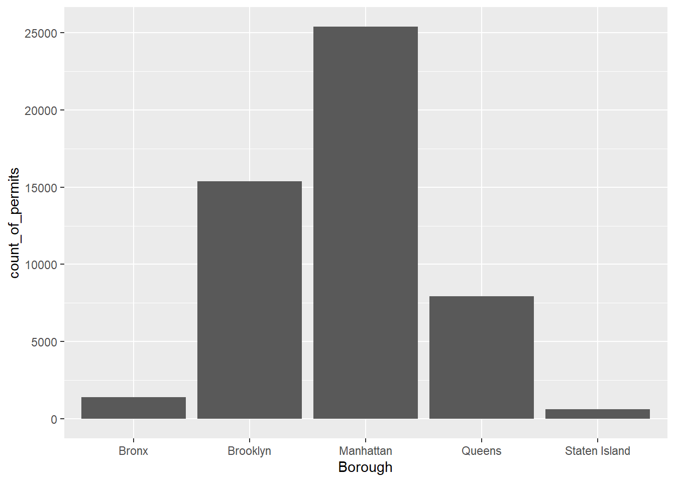
There it is, we’re done here! We can easily look at this graph, and answer our question. Most of the film permits were requested in Manhattan, followed by Brooklyn, then Queen’s, the Bronx, and finally Staten Island.
5.2 What kind of “films” are being made, what is the category?
We think you might be skeptical of what you are doing here, copying
and pasting things. Soon you’ll see just how fast you can do things by
copying and pasting, and make a few little changes. Let’s quickly ask
another question about what kinds of films are being made. The column
Category gives us some information about that. Let’s just
copy paste the code we already made, and see what kinds of categories
the films fall into. See if you can tell what we changed in the code to
make this work, we’ll do it all at once:
CC7
counts2 <- nyc_films %>%
          group_by(Category) %>%
          summarize(count_of_permits = length(Category))

ggplot(counts2, aes(x = Category, y = count_of_permits )) +
  geom_bar(stat="identity")+
  theme(axis.text.x = element_text(angle = 90, hjust = 1))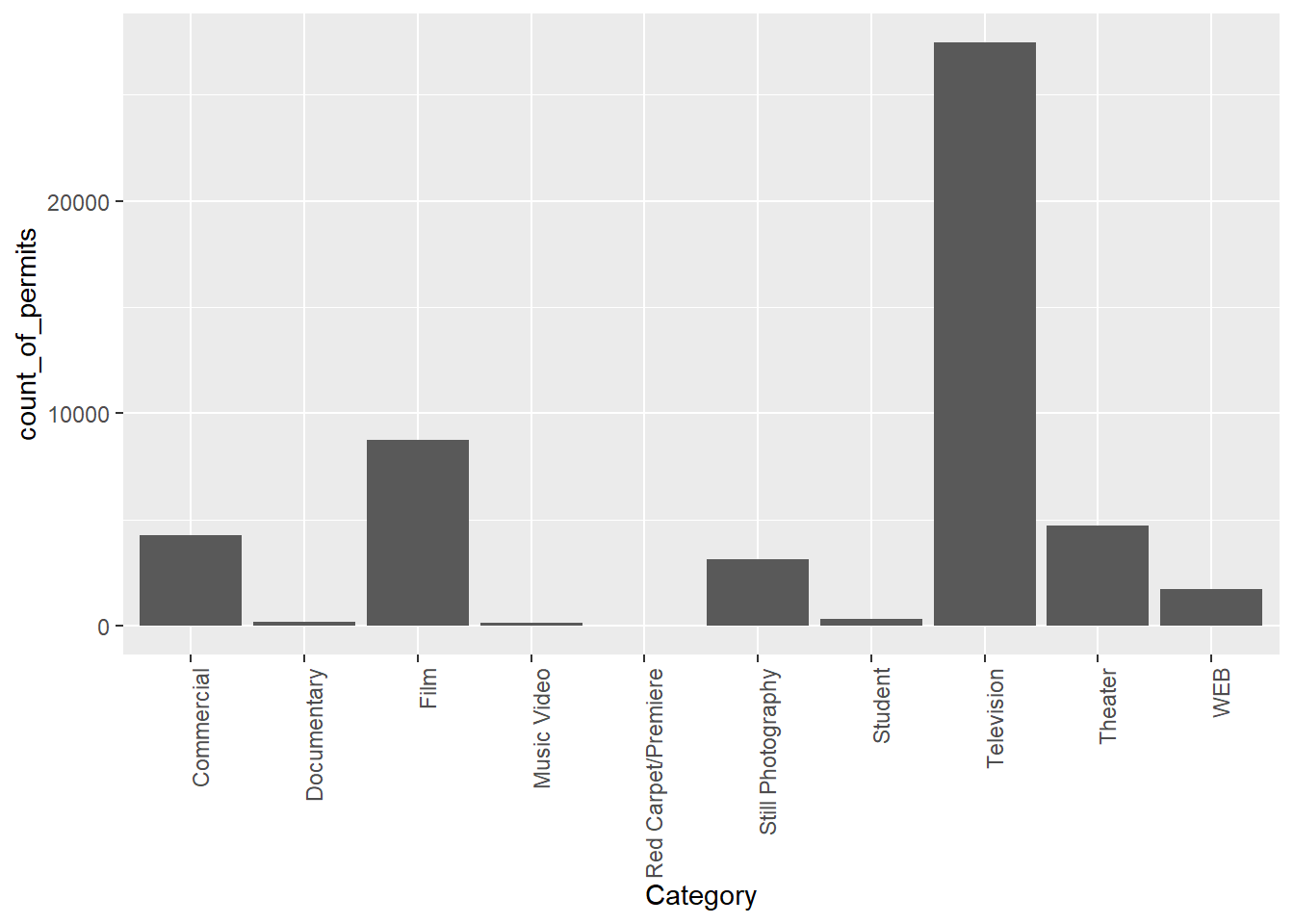
OK, so this figure might look a bit weird because the labels on the bottom are vertical and a bit hard to read. We’ll fix that in a bit.
First, let’s notice the changes.
- We changed
countstocounts2. This let me keep my original data for the counts by borough. I could have just let the new code below overwrite the old data if I did not want to save it. - We changed
BoroughtoCategory. That was the main thing to get the different perspective. - We left out a bunch of things from before. None of the
library()commands are used again, and I didn’t re-run the very early code to get the data. R already has those things in its memory, so we don’t need to do that first. If you ever clear the memory of R, then you will need to reload those things. First things come first.
Fine, so how do we fix the graph? Good question. To be honest, I didn’t know right now. I totally forgot how. But, I know ggplot2 can do this, and I Googled it, r. The googling of your questions is a fine way to learn. It’s what everybody does these days….[goes to Google…].
5.3 The Fix
Found it, actually found a lot of ways to do this. All I need to do is to change the angle in the last line from 90 to 45 and rerun the chunk. I just copy-pasted it from the solution I found on stack overflow (you will become friend’s with stack overflow, there are many solutions there to all of your questions)
CC8
ggplot(counts2, aes(x = Category, y = count_of_permits )) +
  geom_bar(stat="identity")+
  theme(axis.text.x = element_text(angle = 45, hjust = 1))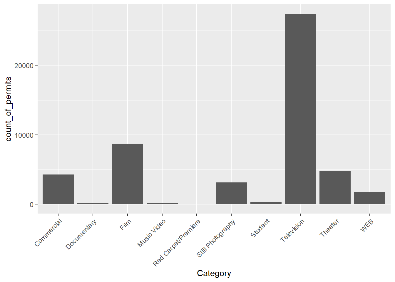
6 ggplot2 basics
Before we go further, We want to point out some basic properties of ggplot2, just to give you a sense of how it is working. This will make more sense in a few weeks, so come back here to remind yourself. We’ll do just a bit a basics, and then move on to making more graphs, by copying and pasting.
The ggplot function uses layers. Layers you say? What are these layers? Well, it draws things from the bottom up. It lays down one layer of graphics, then you can keep adding on top, drawing more things. So the idea is something like: Layer 1 + Layer 2 + Layer 3, and so on. If you want Layer 3 to be Layer 2, then you just switch them in the code.

Reflect
Here is a way of thinking about ggplot code
ggplot(name_of_data, aes(x = name_of_x_variable, y = name_of_y_variable)) +
    geom_layer()+
    geom_layer()+
    geom_layer()
What we want you to focus on in the above description are the + signs. What we are doing with the plus signs is adding layers to plot.
Important
The layers get added to the plot in the order that they are written.
If you look back to our previous code, you will see we added a
geom_bar layer, then we added another layer (“theme”) which
controls the display and thus the rotation of the words on the x-axis.
This is how it works.
BUT WAIT? How am I supposed to know what to add? This is nuts!
We know. You’re not supposed to know just yet, how could you? We’ll give you lots of examples where you can copy and paste, and they will work. That’s how you’ll learn. If you really want to read the ggplot2 help manual you can do that too. It’s on the ggplot2 website.
This will become useful after you already know what you are doing, before that, it will probably just seem very confusing. However, it is pretty neat to look and see all of the different things you can do, it’s very powerful. Check out the R Graph Gallery for examples and code chunks of the many types of graphs/charts you can make with R and ggplot2.
For now, let’s get the hang of adding things to the graph that let us change some stuff we might want to change. For example, how do you add a title? Or change the labels on the axes? Or add different colors, or change the font-size, or change the background? You can change all of these things by adding different lines to the existing code.
6.1 ylab() changes y label
The last graph had count_of_permits as the label on the
y-axis. That doesn’t look right. ggplot2 automatically took the label
from the column, and made it be the name on the y-axis. We can change
that by adding ylab("what we want"). We do this by adding a
\(+\) to the last line, then adding
ylab()
CC9
ggplot(counts2, aes(x = Category, y = count_of_permits )) +
  geom_bar(stat="identity") +
  theme(axis.text.x = element_text(angle = 90, hjust = 1)) +
  ylab("Number of Film Permits")
6.2 xlab() changes x label
Let’s slightly modify the x label too:
CC10
ggplot(counts2, aes(x = Category, y = count_of_permits )) +
  geom_bar(stat="identity") +
  theme(axis.text.x = element_text(angle = 90, hjust = 1)) +
  ylab("Number of Film Permits") +
  xlab("Category of film")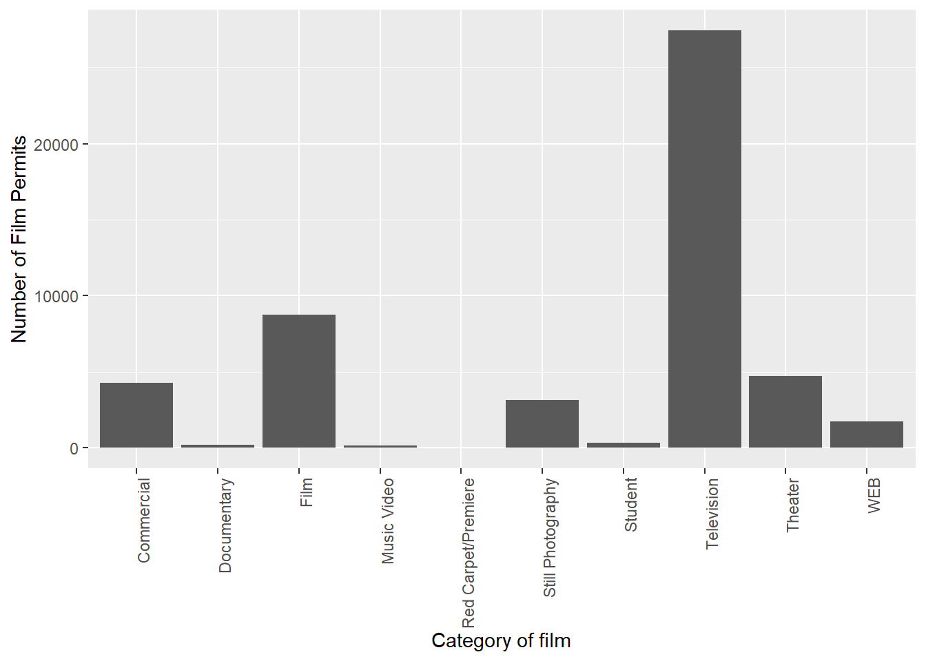
6.3 ggtitle() adds title
Let’s give our graph a title
CC11
ggplot(counts2, aes(x = Category, y = count_of_permits )) +
  geom_bar(stat="identity") +
  theme(axis.text.x = element_text(angle = 90, hjust = 1)) +
  ylab("Number of Film Permits") +
  xlab("Category of film") +
  ggtitle("Number of Film permits in NYC by Category")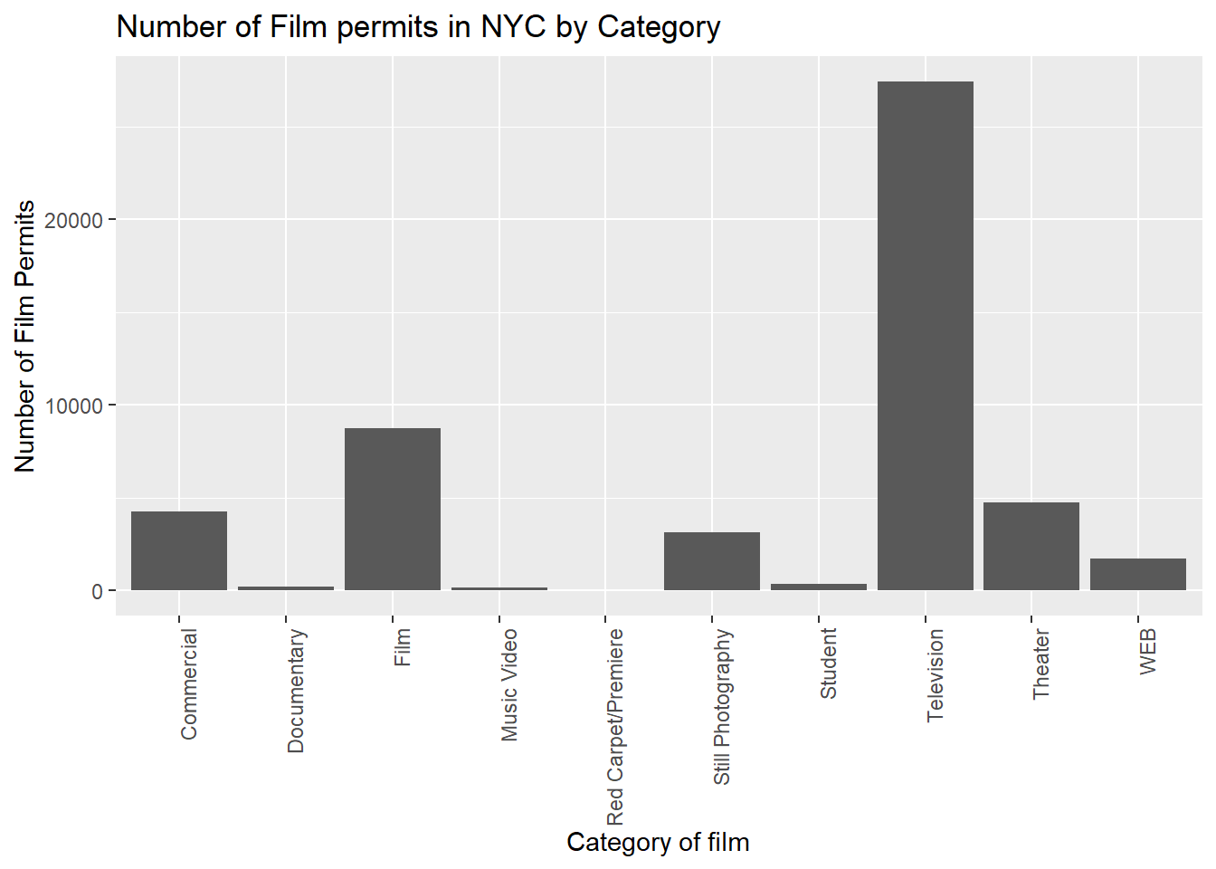
6.4 Color adds color
Let’s make the bars different colors. To do this, we add new code to
the inside of the aes() part:
CC12
ggplot(counts2, aes(x = Category, y = count_of_permits, color=Category )) +
  geom_bar(stat="identity") +
  theme(axis.text.x = element_text(angle = 90, hjust = 1)) +
  ylab("Number of Film Permits") +
  xlab("Category of film") +
  ggtitle("Number of Film permits in NYC by Category")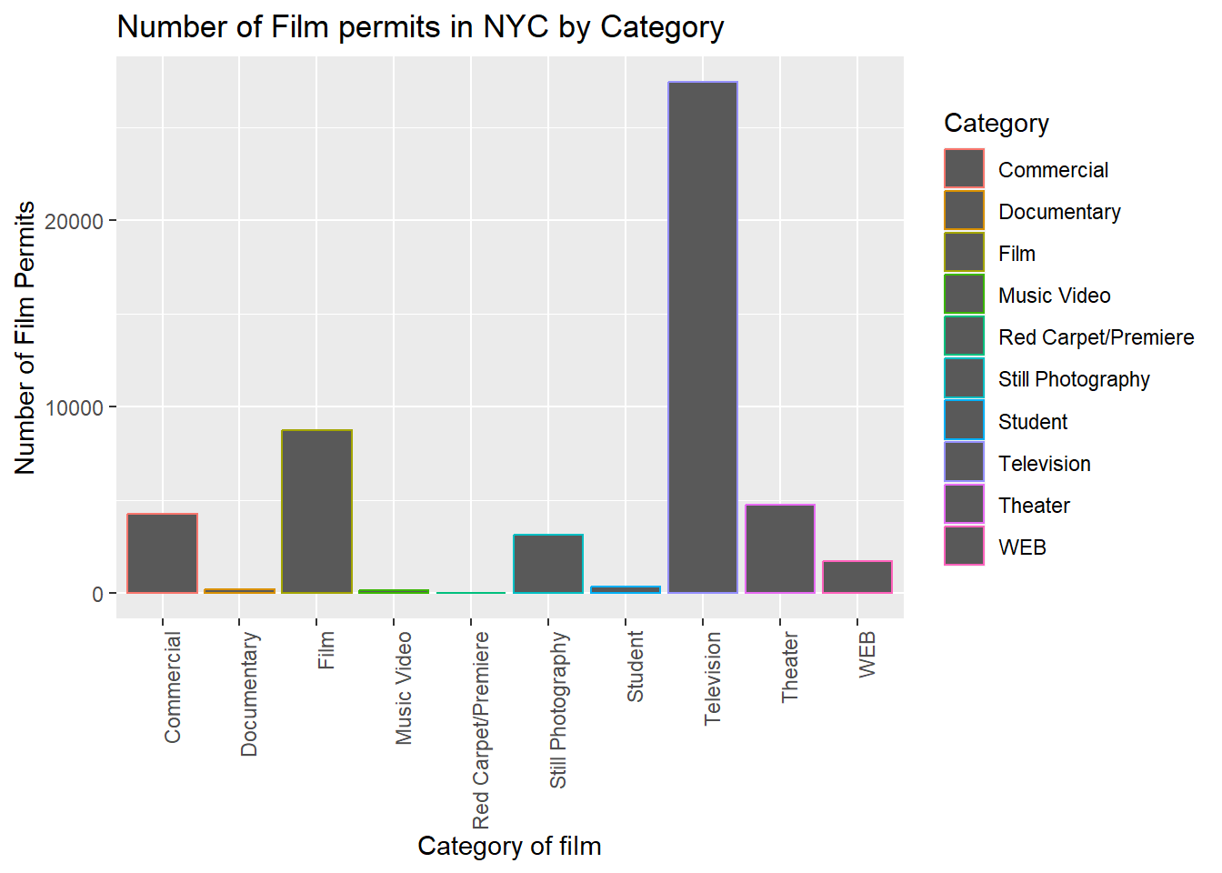
6.5 Fill fills in color
Let’s make the bars different colors. To do this, we add new code to
the inside of the aes() part…Notice we’ve started using new
lines to make the code more readable.
CC13
ggplot(counts2, aes(x = Category, y = count_of_permits,
                   color=Category,
                   fill= Category )) +
  geom_bar(stat="identity") +
  theme(axis.text.x = element_text(angle = 90, hjust = 1)) +
  ylab("Number of Film Permits") +
  xlab("Category of film") +
  ggtitle("Number of Film permits in NYC by Category")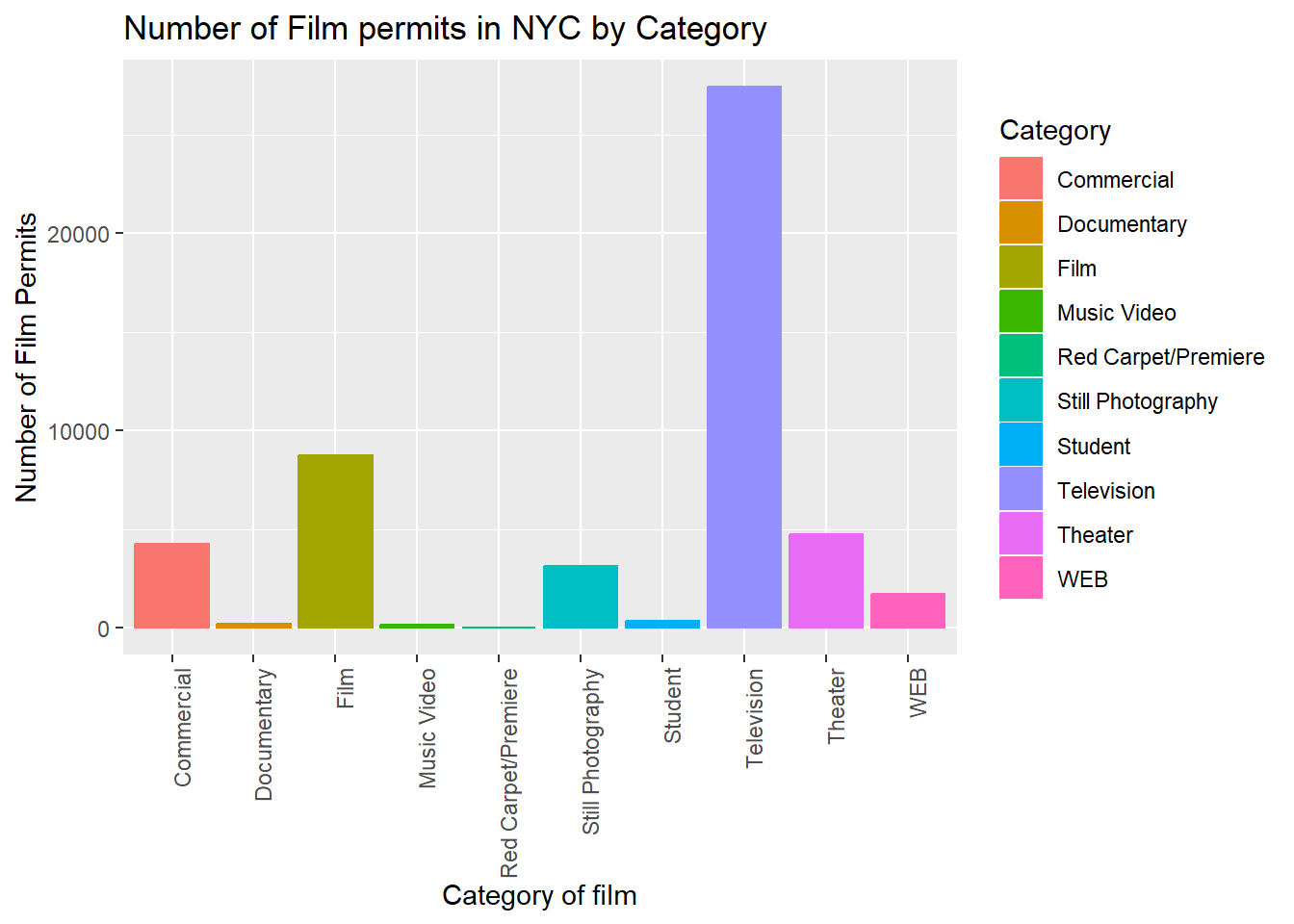
6.6 Get rid of the legend
Sometimes you just don’t want the legend on the side, to remove it add
theme(legend.position="none")
CC14
ggplot(counts2, aes(x = Category, y = count_of_permits,
                   color=Category,
                   fill= Category )) +
  geom_bar(stat="identity") +
  theme(axis.text.x = element_text(angle = 90, hjust = 1)) +
  ylab("Number of Film Permits") +
  xlab("Category of film") +
  ggtitle("Number of Film permits in NYC by Category") +
  theme(legend.position="none")
6.7 Change Theme
The theme_classic() makes white background.
The rest is often just visual preference. For example, the graph
above has this grey grid behind the bars. For a clean classic no
nonsense look, use theme_classic() to take away the
grid.
CC15
ggplot(counts2, aes(x = Category, y = count_of_permits,
                   color=Category,
                   fill= Category )) +
  geom_bar(stat="identity") +
  theme(axis.text.x = element_text(angle = 90, hjust = 1)) +
  ylab("Number of Film Permits") +
  xlab("Category of film") +
  ggtitle("Number of Film permits in NYC by Category") +
  theme(legend.position="none") +
  theme_classic()
6.8 Sometimes layer order matters
Interesting, theme_classic() is misbehaving a little
bit. It looks like we have some of our layers out of order, let’s
re-order. I just moved theme_classic() to just underneath
the geom_bar() line. Now everything gets drawn
properly.
CC16
ggplot(counts2, aes(x = Category, y = count_of_permits,
                   color=Category,
                   fill= Category )) +
  geom_bar(stat="identity") +
  theme_classic() +
  theme(axis.text.x = element_text(angle = 90, hjust = 1)) +
  ylab("Number of Film Permits") +
  xlab("Category of film") +
  ggtitle("Number of Film permits in NYC by Category") +
theme(legend.position="none") 
6.9 Font Size
Changing font-size is often something you want to do. ggplot2 can do
this in different ways. I suggest using the base_size
option inside theme_classic(). You set one number for the
largest font size in the graph, and everything else gets scaled to fit
with that first number. It’s really convenient.
6.9.1 Large
Look for the inside of theme_classic()to find “base_size
= 15”
CC17
ggplot(counts2, aes(x = Category, y = count_of_permits,
                   color=Category,
                   fill= Category )) +
  geom_bar(stat="identity") +
  theme_classic(base_size = 15) +
  theme(axis.text.x = element_text(angle = 90, hjust = 1)) +
  ylab("Number of Film Permits") +
  xlab("Category of film") +
  ggtitle("Number of Film permits in NYC by Category") +
theme(legend.position="none") 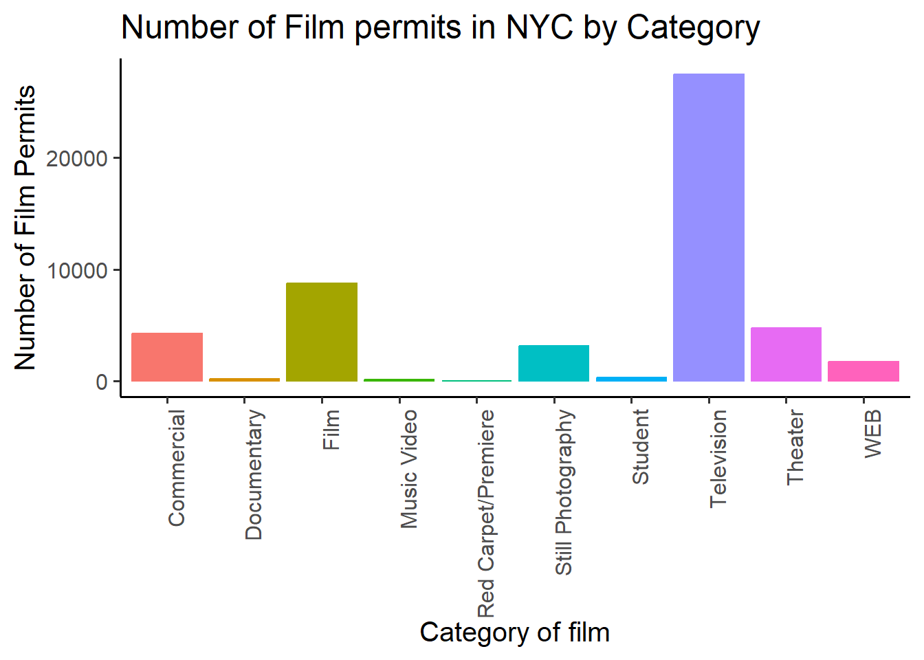
6.9.2 Small
Or make things smaller… just to see what happens by changing the base size.
CC18
ggplot(counts2, aes(x = Category, y = count_of_permits,
                   color=Category,
                   fill= Category )) +
  geom_bar(stat="identity") +
  theme_classic(base_size = 10) +
  theme(axis.text.x = element_text(angle = 90, hjust = 1)) +
  ylab("Number of Film Permits") +
  xlab("Category of film") +
  ggtitle("Number of Film permits in NYC by Category") +
theme(legend.position="none") 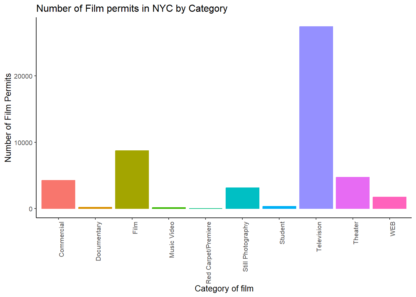
6.10 ggplot2 summary
That’s enough of the ggplot2 basics for now. You will discover that many things are possible with ggplot2. It is amazing. We are going to get back to answering some questions about the data with graphs. But, now that we have built the code to make the graphs, all we need to do is copy-paste, and make a few small changes, and boom, we have our graph.
7 More questions about NYC films
7.1 What are the sub-categories of films?
Notice the nyc_films data frame also has a column for
SubCategoryName. Let’s see what’s going on there with a
quick plot.
CC19
# get the counts (this is a comment it's just here for you to read)

counts3 <- nyc_films %>%
          group_by(SubCategoryName) %>%
          summarize(count_of_permits = length(SubCategoryName))

# make the plot

ggplot(counts3, aes(x = SubCategoryName, y = count_of_permits,
                   color=SubCategoryName,
                   fill= SubCategoryName )) +
  geom_bar(stat="identity") +
  theme_classic(base_size = 10) +
  theme(axis.text.x = element_text(angle = 45, hjust = 1)) +
  ylab("Number of Film Permits") +
  xlab("Sub-category of film") +
  ggtitle("Number of Film permits in NYC by Sub-category") +
theme(legend.position="none") 
I guess “episodic series” are the most common. Using a graph like this gave us our answer super fast.
7.2 Categories by different Boroughs
Let’s see one more really useful thing about ggplot2. It’s called
facet_wrap(). It’s an ugly word, but you will see that it
is very cool, and you can do next-level-super-hero graph styles with
facet_wrap that other people can’t do very easily.
Here’s our question. We know that some films are made in different Boroughs, and that same films are made in different categories, but do different Boroughs have different patterns for the kinds of categories of films they request permits for? Are there more TV shows in Brooklyn? How do we find out? Watch, just like this:
CC20
# get the counts (this is a comment it's just here for you to read)

counts4 <- nyc_films %>%
          group_by(Borough,Category) %>%
          summarize(count_of_permits = length(Category))

# make the plot

ggplot(counts4, aes(x = Category, y = count_of_permits,
                   color=Category,
                   fill= Category )) +
  geom_bar(stat="identity") +
  theme_classic(base_size = 10) +
  theme(axis.text.x = element_text(angle = 60, hjust = 1)) +
  ylab("Number of Film Permits") +
  xlab("Category of film") +
  ggtitle("Number of Film permits in NYC by Category and Borough") +
  theme(legend.position="none") +
  facet_wrap(~Borough, ncol=3)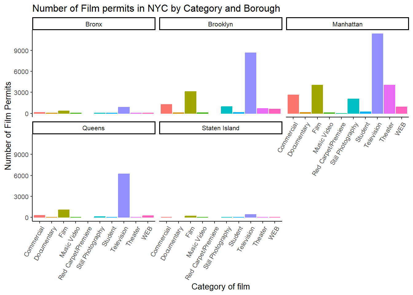
We did two important things. First we added Borough and
Category into the group_by() function. This
automatically gives separate counts for each category of film, for each
Borough. Note you may get a message about this grouping in
summarize.
In the make the plot chunk, we added
facet_wrap(~Borough, ncol=3) to the end of the plot, and it
automatically drew us 5 different bar graphs, one for each Borough! That
was fast. Imagine doing that by hand.
7.3 Switch Category and Borough
The nice thing about this is we can switch things around if we want.
For example, we could do it this way by switching the
Category with Borough, and facet-wrapping by
Category instead of Borough like we did above. Do what works for
you.
CC21
ggplot(counts4, aes(x = Borough, y = count_of_permits,
                   color=Borough,
                   fill= Borough )) +
  geom_bar(stat="identity") +
  theme_classic(base_size = 10) +
  theme(axis.text.x = element_text(angle = 60, hjust = 1)) +
  ylab("Number of Film Permits") +
  xlab("Borough") +
  ggtitle("Number of Film permits in NYC by Category and Borough") +
  theme(legend.position="none") +
  facet_wrap(~Category, ncol=5)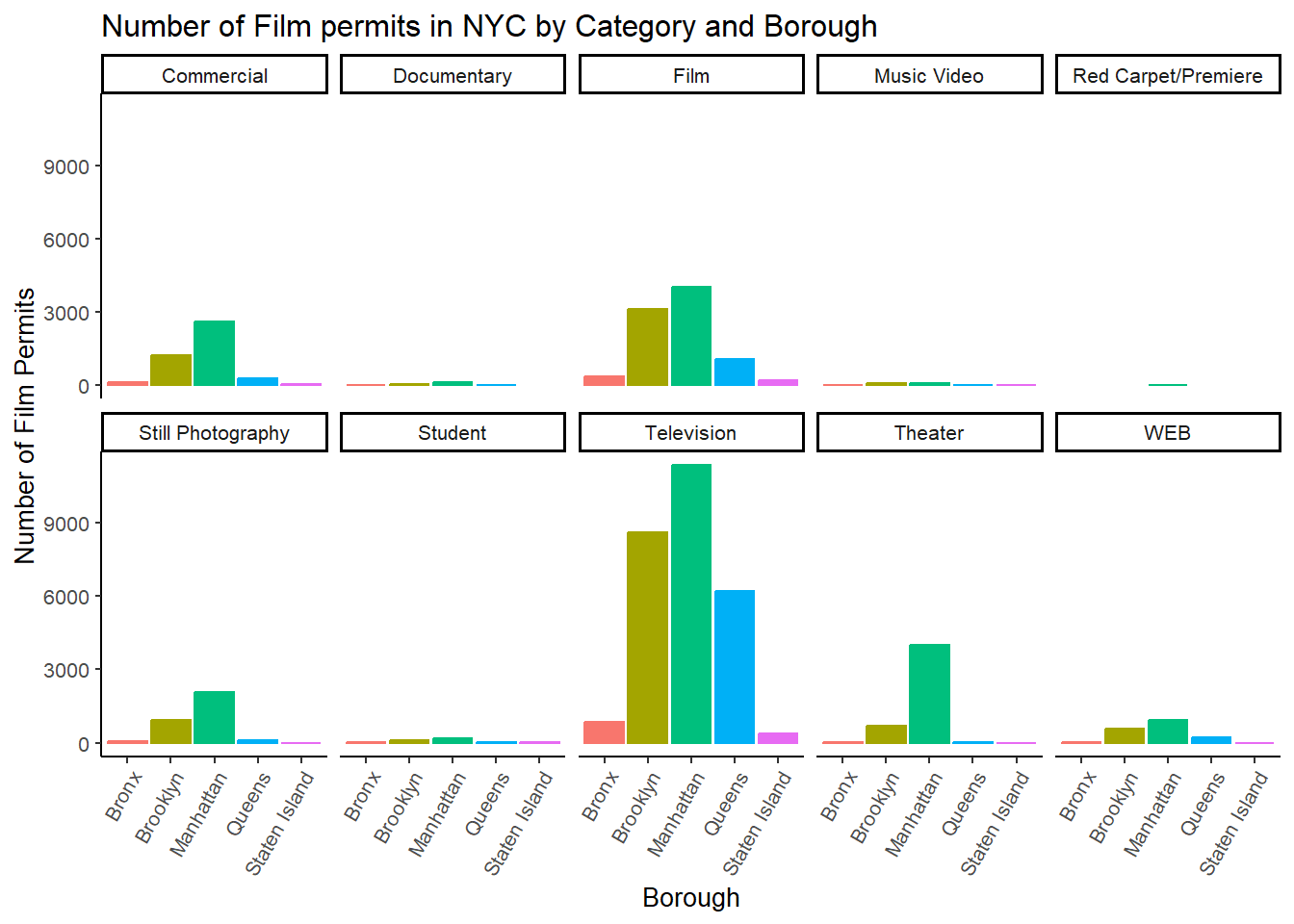
8 Gapminder Data
https://www.gapminder.org is an organization that collects some really interesting worldwide data. They also make cool visualization tools for looking at the data. There are many neat examples, and they have visualization tools built right into their website that you can play around with https://www.gapminder.org/tools/. That’s fun. Check it out.
There is also an R package called gapminder. When you
install this package, it loads in some of the data from gapminder, so we
can play with it in R.
If you don’t have the gapminder package loaded into the current workspace library, you can load it by running this code:
CC22
library(gapminder)Once the package is loaded, you can put the gapminder
data into a new data object, gapminder_df.
CC23
gapminder_df<-gapminderYou should see the gapminder_df data object in the Environment window.
8.1 Look at the data frame
You can look at the data frame to see what is in it, and you can use
summarytools again to view a summary of the data. But
recall the issue of the size of the table causing knitting problems. So
here we are just using the basic head and summary`
functions to “see” the data table.
CC24
#Overview of gapminder
gapminder

#The first six rows of gapminder
head(gapminder_df)

#A summary of key statistics for gapminder
summary <- summary(gapminder_df)
summary
Note: the code chunk CC24 above is not evaluated on this webpage. but you should see three outputs when you actually run it in your rehearse worksheet.
There are 1704 rows of data, and we see some columns for country, continent, year, life expectancy, population, and GDP per capita.
8.2 Asking Questions with the gap minder data
We will show you how to graph some data to answer a few different kinds of questions. Then you will form your own questions, and see if you can answer them with ggplot2 yourself. All you will need to do is copy and paste the following examples, and change them up a little bit
8.2.1 Life Expectancy histogram
How long are people living all around the world according to this
data set? There are many ways we could plot the data to find out. The
first way is a histogram. We have many numbers for life expectancy in
the column lifeExp. This is a big sample, full of numbers
for 142 countries across many years. It’s easy to make a histogram in
ggplot to view the distribution:
CC25
ggplot(gapminder_df, aes(x=lifeExp))+
  geom_histogram(color="white")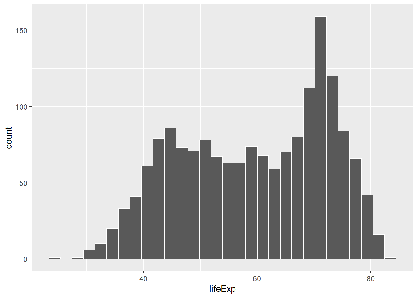
See, that was easy.
8.2.2 More Layers and Settings
Next, is a code block that adds more layers and settings if you wanted to modify parts of the graph:
CC26
ggplot(gapminder_df, aes(x = lifeExp)) +
  geom_histogram(color="white")+
  theme_classic(base_size = 15) +
  ylab("Frequency count") +
  xlab("Life Expectancy") +
  ggtitle("Histogram of Life Expectancy from Gapminder")
`stat_bin()` using `bins = 30`. Pick better value with `binwidth`.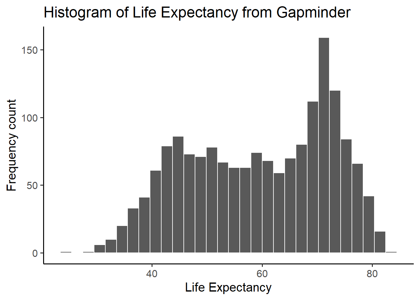
The histogram shows a wide range of life expectancies, from below 40 to just over 80. Histograms are useful, they can show you what kinds of values happen more often than others.
8.2.3 Change Bin Size
One final thing about histograms in ggplot. You may want to change
the bin size. That controls how wide or narrow, or the number of bars
(how they split across the range), in the histogram. You need to set the
bins= option in geom_histogram().
CC27
ggplot(gapminder_df, aes(x = lifeExp)) +
  geom_histogram(color="white", bins=50)+
  theme_classic(base_size = 15) +
  ylab("Frequency count") +
  xlab("Life Expectancy") +
  ggtitle("Histogram of Life Expectancy from Gapminder")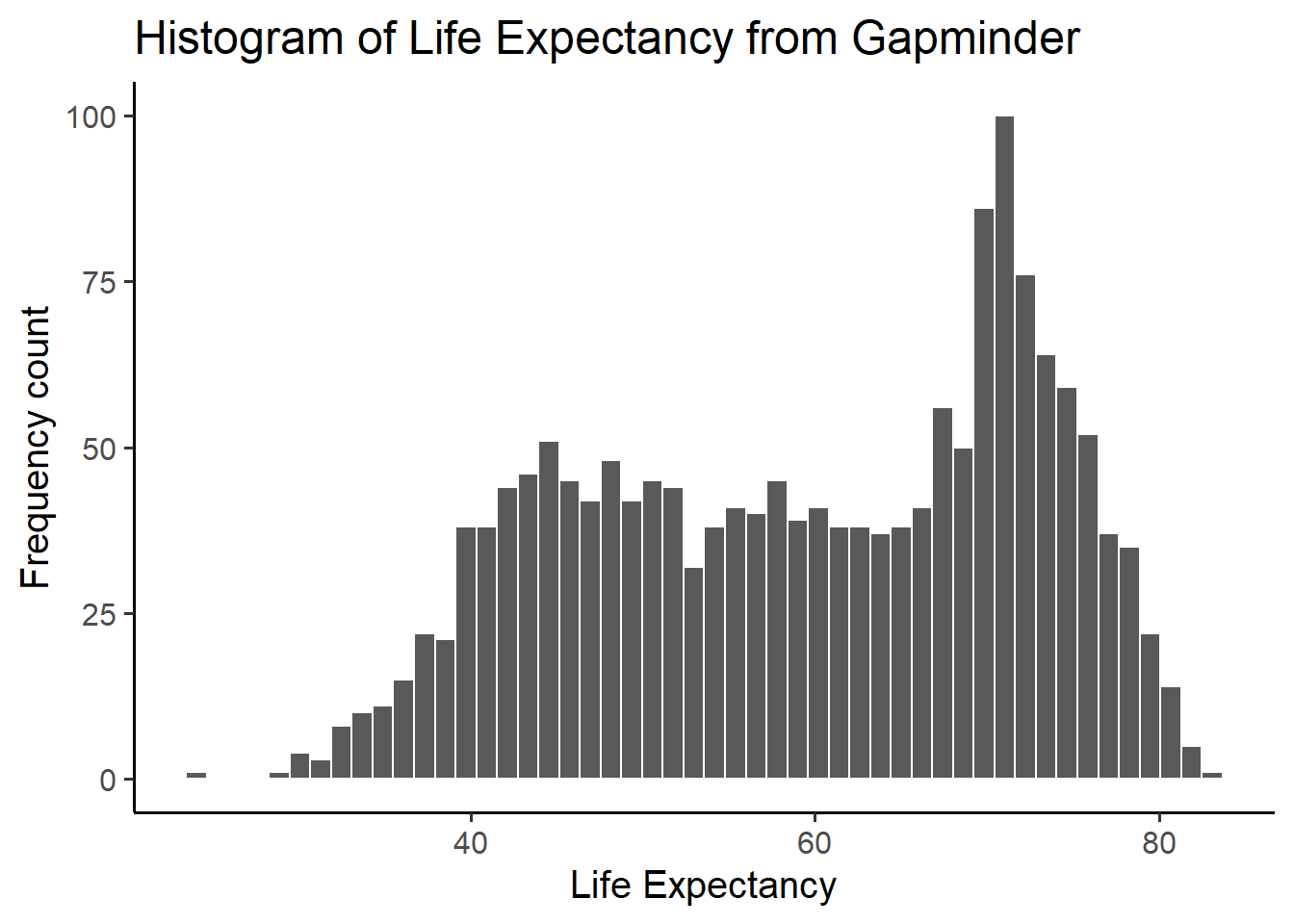
See, same basic pattern, but now breaking up the range into 50 little equal sized bins, rather than 30, which is the default. You get to choose what you want to do.
8.2.4 Life Expectancy by year Scatterplot
We can see we have data for life expectancy and different years. So, does worldwide life expectancy change across the years in the data set? As we go into the future, are people living longer?
Let’s look at this using a scatter plot. We can set the x-axis to be
year, and the y-axis to be life expectancy. Then we can use
geom_point() to display a whole bunch of dots, and then
look at them. Here’s the simple code:
CC28
ggplot(gapminder_df, aes(y= lifeExp, x= year))+
  geom_point()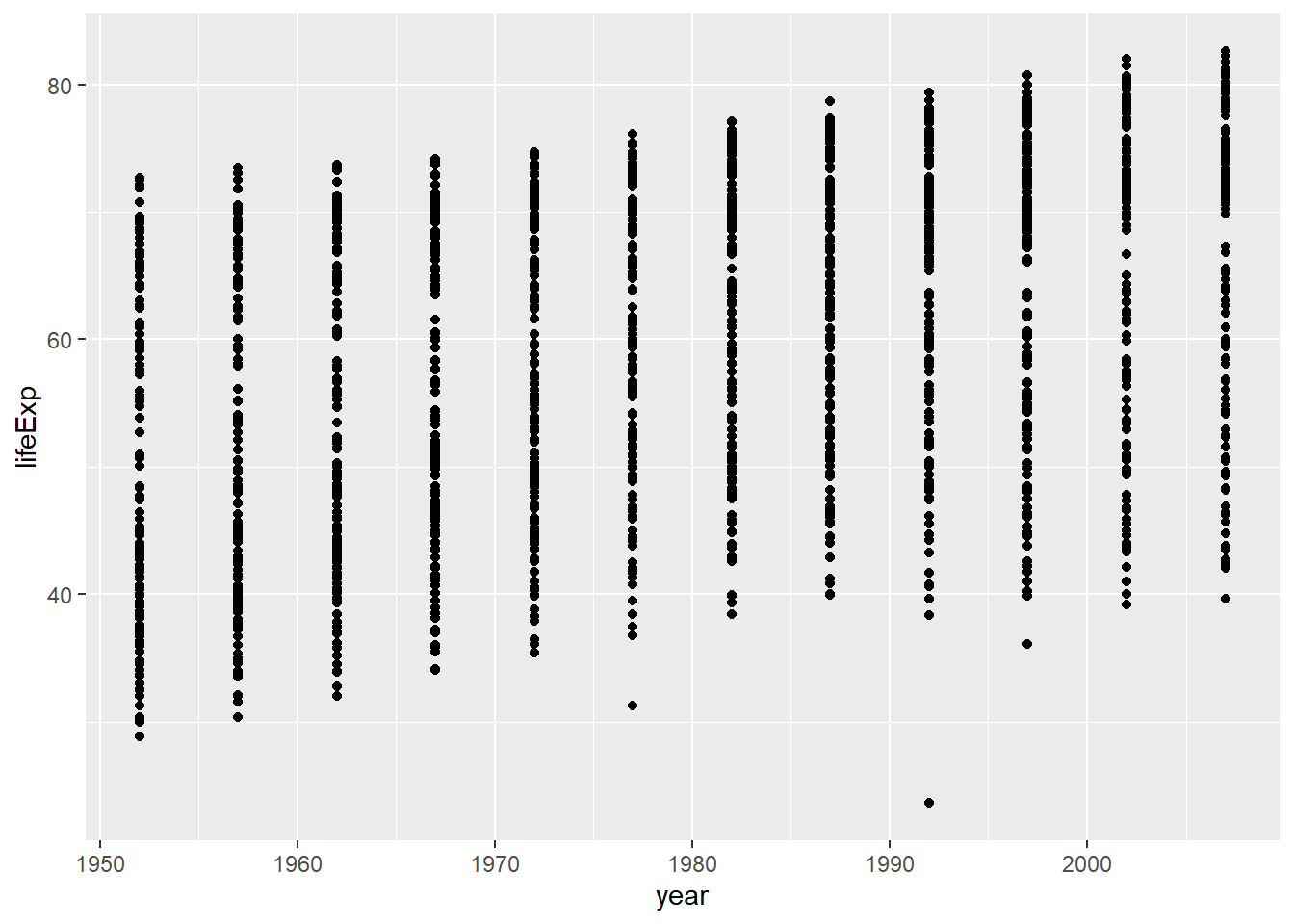
Whoa, that’s a lot of dots! Remember that each country is measured each year. So, the bands of dots you see show the life expectancies for the whole range of countries within each year of the database. There is a big spread inside each year. But, on the whole, it looks like groups of dots slowly go up over years.
8.2.5 One country, life expectancy by year
If you are from Canada, so maybe you want to know if life expectancy
for Canadians is going up over the years. To find out the answer for one
country, we first need to split the full data set, into another smaller
data set that only contains data for Canada. In other words, we want
only the rows where the word “Canada” is found in the
country column. We will use the filter
function from dplyr for this.
For more info on uses of the
filter function, see Filtering
Data with dplyr
CC29
# Filter portion: filter rows to contain Canada

smaller_df <- gapminder_df %>%
                 filter(country == "Canada")

# Plot Portion: plot the new data contained in smaller_df

ggplot(smaller_df, aes(y= lifeExp, x= year))+
  geom_point()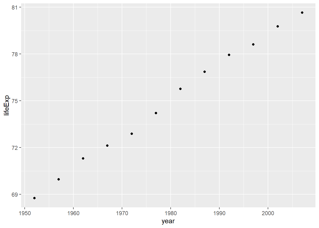
We would say things are looking good for Canadians, their life expectancy is going up over the years!
8.2.6 Multiple countries scatterplot
What if we want to look at a few countries altogether. We can do this too. We just change how we filter the data so more than one country is allowed, then we plot the data. We will also add some nicer color options and make the plot look pretty. First, the simple code:
Step 1 is to create a new data object smaller_df2 which
contains the filtered data from the gapminder_df data
frame. We edit the filter function in used in CC29 to now include three
countries: Canada, France, and Brazil. We use the %in%
operator to include the multiple country names in the filter function.
Although it does not have a formal name, I call %in% the
include operator.
Saying this in words: Using the gapminder_df data frame
“and then” filter the country variable to include only the
countries Canada, France, and Brazil. We then assign the filtered data
to a new data frame smaller_df2.
Step 2 is where we plot the new data in smaller_df2. We
use the aes function to put the lifeExp
variable on the y-axis; year on the x-axis; and group the
data by country. We use the geom_point() function to plot
individual dots.
CC30
# Step 1
smaller_df2 <- gapminder_df %>%
                 filter(country %in% c("Canada","France","Brazil") == TRUE)

# Step 2
ggplot(smaller_df2, aes(y= lifeExp, x= year, group= country))+
  geom_point()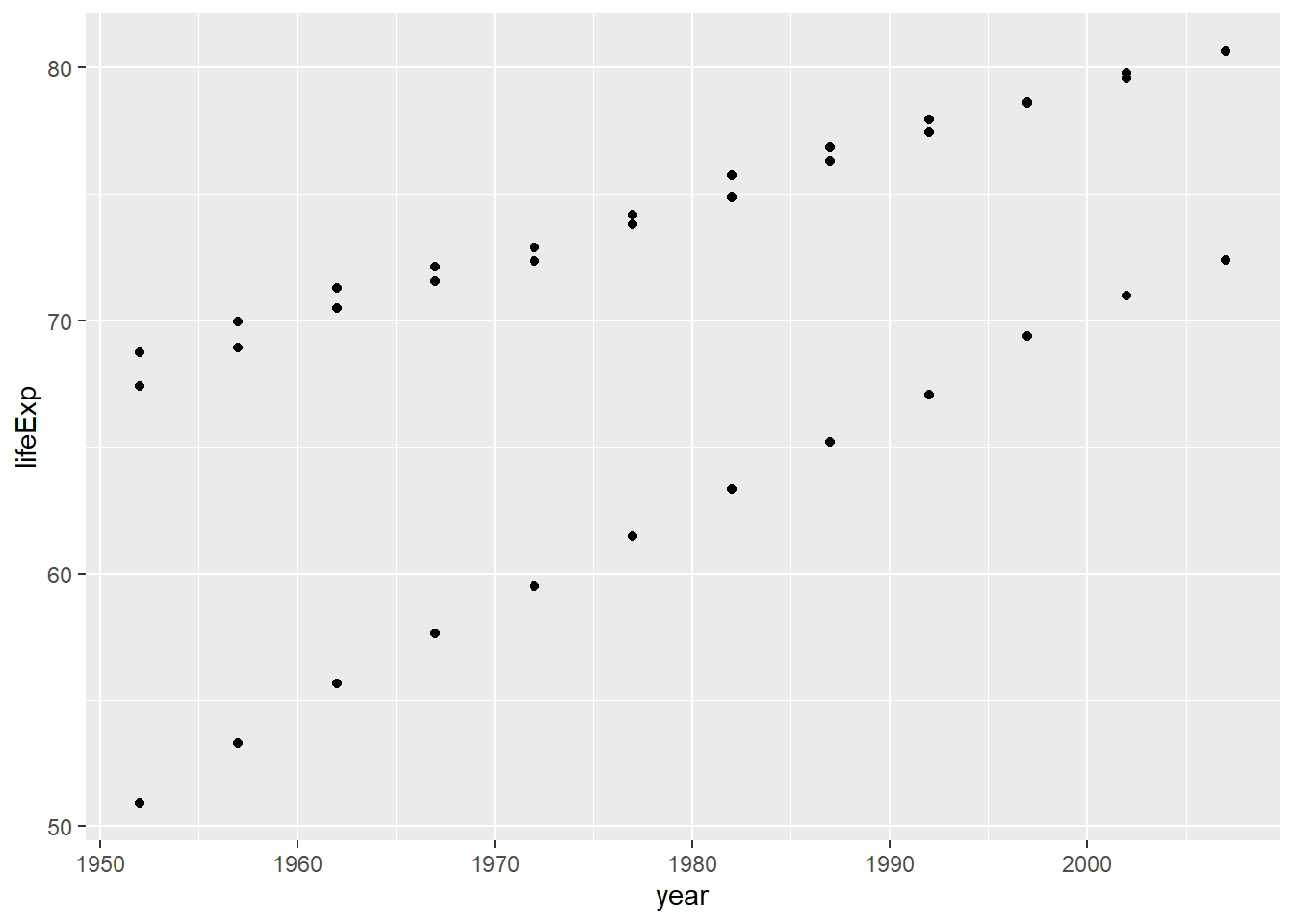
Nice, we can now see three sets of dots, but which are countries do they represent?
8.2.7 Add a Legend
Let’s add a legend, and make the graph better looking.
We also add the color = country to the aes function to
help us tell which dots belong to which country. Note this adds the
legend to the plot as well.
CC31
ggplot(smaller_df2,aes(y= lifeExp, x= year,
                      group= country, color = country)) +
  geom_point()+
  theme_classic(base_size = 15) +
  ylab("Life Expectancy") +
  xlab("Year") +
  ggtitle("Life expectancy by year for three countries")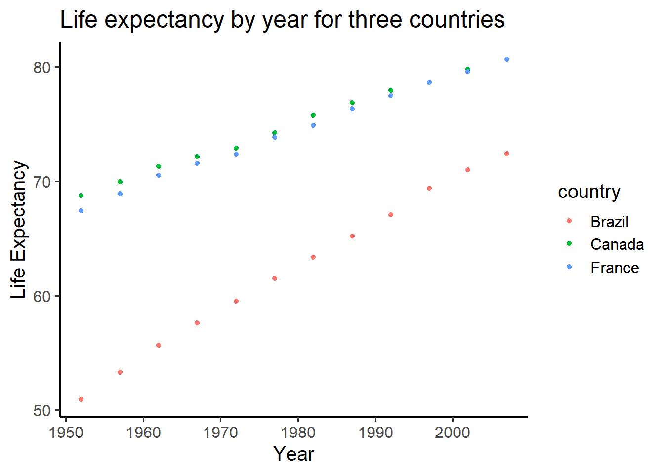
8.2.8 Add a line
We might also want to connect the dots with a line, to make it easier
to see the connection! Remember, ggplot2 draws layers on top of layers.
So, we add in a new geom_line() layer.
CC32
ggplot(smaller_df2,aes(y= lifeExp, x= year,
                      group= country, color = country)) +
  geom_point()+
  geom_line()+
  theme_classic(base_size = 15) +
  ylab("Life Expectancy") +
  xlab("Year") +
  ggtitle("Life expectancy by year for three countries")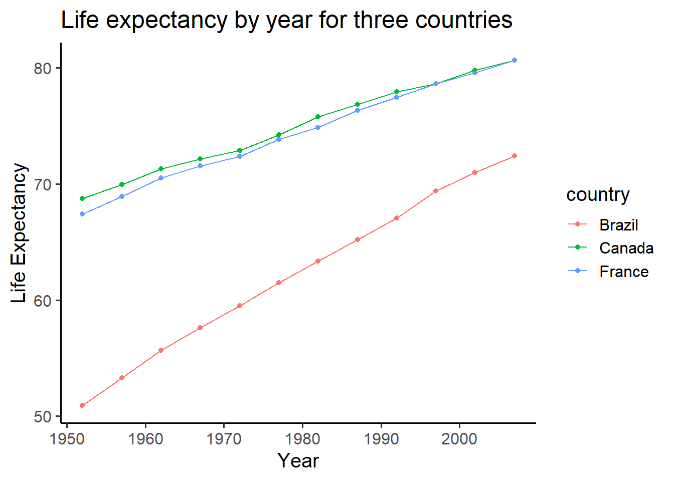
9 Lab Assignment Submission
Important
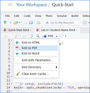
When you are ready to create your final lab report, save the Lab-02-Rehearse1-Worksheet.Rmd file and then Knit it to a Word or PDF file to make a reproducible file. This image below shows you how to select the knit document file type.

Note: knitting to a Word file is often easier (fewer snags/error messages) than knitting to a PDF file.
Note: If you encounter difficulty getting your worksheet to Knit, reach out to your instructor via course email as soon as you can. If you are against the submission deadline, you may submit your.Lab2-Rehearse1-Graphing-Data-Worksheet.Rmd file but will likely get a large deduction in points.
Submit your file in the Canvas M2.4 Lab 2 Rehearse(s): Exploring Data Canvas assignment area.
The Lab 2 Exploring Data Grading Rubric will be used.
 Congrats!
You have completed Lab 2 Rehearse 1 Graphing Data!
Now go to your next rehearsal!
 Previous: Lab 2 Overview
Next: Lab 2 Rehearse 2
Describing Data
Important info
Data for NYC film permits was obtained from the NYC open data website. The .csv file can be found here: Film_Permits.csv
Gapminder data from the gapminder project (copied from the R gapminder library) can be downloaded in .csv format here: gapminder.csv

This
work was created by Dawn Wright and is licensed under a
Creative
Commons Attribution-ShareAlike 4.0 International License.
V2.0.1, Date 11/5/25
Last Compiled 2025-11-05