Lab 5 Rehearse 1
Bootstrapping and Confidence Intervals
Lab 5 Rehearse 1: Bootstrapping and Confidence Intervals
Attribution: This lab is an adaptation of Chapter 8 in Modern Dive by Chester Ismay and Albert Y. Kim;.
1 Lab 5 Set Up
1.1 RStudio/Posit Cloud Set Up
Just as in previous labs, you will need to follow this link to
set up Lab 5 in your Posit Cloud work space:
Link to Set up Lab
5 Inference: Estimation and Confidence Intervals
 Important
After you have set up Lab 5 using the link above, do not use that link again as it may reset your work. The set up link loads fresh copies of the required files and they could replace the files you have worked on.
Instead use this link to go to Posit Cloud to continue to work on lab 5: https://posit.cloud/
1.2 RStudio Desktop Setup
Link to download the Lab 05 materials to RStudio Desktop https://github.com/DrDawn/BUS231_Project_Files/raw/main/Lab5.zip
Note that you will do all your work for this Rehearse in the Lab-05-Rehearse 1 worksheet, so click on that to open it in the Editor window in your RStudio/Posit Cloud Lab 05 workspace.
2 Load Libraries
Needed packages
Let’s load all the packages needed for this chapter (this assumes
you’ve already installed them). Recall from our discussion in the
previous module that loading the tidyverse package by
running library(tidyverse) loads the following commonly
used data science packages all at once:
ggplot2for data visualizationdplyrfor data wranglingtidyrfor converting data to tidy formatreadrfor importing spreadsheet data into R- As well as the more advanced
purrr,tibble,stringr, andforcatspackages.
In addition to ‘tidyverse’, we have two more packages with needed information and capabilities.

library(tidyverse)
library(moderndive)
library(infer)
Note it could take RStudio a minute or so to get the library loading done if it gives you a message that packages need to installed or updated. Be patient and wait for the > prompt to show up in the Console.
3 Introduction to Bootstrapping
In Module 3 Rehearse 2, we studied sampling. We started with a “tactile” exercise where we wanted to know the proportion of balls in the sampling bowl that are red. While we could have performed an exhaustive count, this would have been a tedious process.
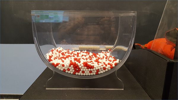
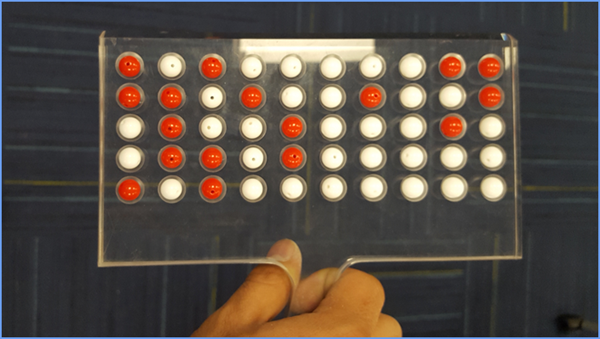
So instead, we used a shovel to extract a sample of 50 balls and used the resulting proportion that were red as an estimate. Furthermore, we made sure to mix the bowl’s contents before every use of the shovel. Because of the randomness created by the mixing, different uses of the shovel yielded different proportions of red and hence different estimates of the proportion of the bowl’s balls that are red.
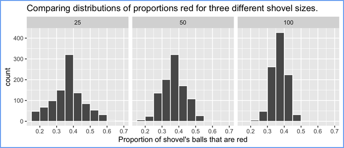
We then mimicked this “tactile” sampling exercise with an equivalent “virtual” sampling exercise performed on the computer. Using our computer’s random number generator, we quickly mimicked the above sampling procedure a large number of times. We quickly repeated this sampling procedure 1000 times, using three different “virtual” shovels with 25, 50, and 100 slots. We visualized these three sets of 1000 estimates in Figure 3.8 and saw that as the sample size increased, the variation in the estimates decreased.

In doing so, what we did was construct sampling distributions. The motivation for taking 1000 repeated samples and visualizing the resulting estimates was to study how these estimates varied from one sample to another; in other words, we wanted to study the effect of sampling variation.
We quantified the variation of these estimates using their standard deviation, which has a special name: the standard error. In particular, we saw that as the sample size increased from 25 to 50 to 100, the standard error decreased and thus the sampling distributions narrowed. Larger sample sizes led to more precise estimates that varied less around the center.
We then tied these sampling exercises to terminology and mathematical notation related to sampling in Module 3. Our study population was the large bowl with \(N\) = 2400 balls, while the population parameter, the unknown quantity of interest, was the population proportion \(p\) of the bowl’s balls that were red. Since performing a census would be expensive in terms of time and energy, we instead extracted a sample of size \(n\) = 50.
The point estimate, also known as a sample statistic, used to estimate \(p\) was the sample proportion \(\widehat{p}\) of these 50 sampled balls that were red.
Furthermore, since the sample was obtained at random, it can be considered as unbiased and representative of the population. Thus any results based on the sample could be generalized to the population. Therefore, the proportion of the shovel’s balls that were red was a “good guess” of the proportion of the bowl’s balls that are red. In other words, we used the sample to infer about the population.
However, both the tactile and virtual sampling exercises are not what one would do in real life; this was merely an activity used to study the effects of sampling variation. In a real-life situation, we would not take 1000 samples of size \(n\), but rather take a single representative sample that’s as large as possible.
Additionally, we knew that the true proportion of the bowl’s balls that were red was 37.5 %. In a real-life situation, we will not know what this value is. Because if we did, then why would we take a sample to estimate it?
An example of a realistic sampling situation would be a poll, like the Obama poll you saw earlier. Pollsters did not know the true proportion of all young Americans who supported President Obama in 2013, and thus they took a single sample of size \(n\) = 2089 young Americans to estimate this value.
After voting for him in large numbers in 2008 and 2012, young Americans are souring on President Obama. According to a new Harvard University Institute of Politics poll, just 41 percent of millennials — adults ages 18-29 — approve of Obama’s job performance, his lowest-ever standing among the group and an 11-point drop from April.
So how does one quantify the effects of sampling variation when you only have a single sample to work with? You cannot directly study the effects of sampling variation when you only have one sample. One common method to study this is bootstrapping resampling, which will be the focus of the earlier sections of this rehearse.
Furthermore, what if we would like not only a single estimate of the unknown population parameter, but also a range of highly plausible values?
Going back to the Obama poll article, it stated that the pollsters’ estimate of the proportion of all young Americans who supported President Obama was 41%. But in addition it stated that the poll’s “margin of error was plus or minus 2.1 percentage points.”
This “plausible range” was [41% - 2.1% to 41% + 2.1%] = [38.9%, to 43.1%].
This range of plausible values is what’s known as a confidence interval, which will be the focus of the later sections of this chapter.

Reflection Question
Why do we use bootstrapping resampling?
Your Answer here:

You may notice the code chunk numbers seen out of sequence. This lab has a lot of hidden code chunks which are needed for the appearance of the lab manual but which are not needed in your worksheet. RStudio numbers all chunks in sequence in the Editor package listing should you choose to use it.
3.1 Pennies activity
As we did in Module 3 Rehearse 2, we’ll begin with a hands-on tactile activity. Granted, “tactile” means touch and you cannot actually touch the balls and pennies used in this online activity. But hopefully, your imagination will help a bit.
3.1.1 What is the average year on US pennies in last year?
Try to imagine all the pennies being used in the United States last year. That’s a lot of pennies! Now say we’re interested in the average year of minting of all these pennies. One way to compute this value would be to gather up all pennies being used in the US, record the year, and compute the average. However, this would be near impossible!
So instead, let’s collect a sample of 50 pennies from a local bank as seen in Figure 5.1

Fig 5.1 Pennies from the bank
An image of these 50 pennies can be seen in Figure 5.2 . For each of the 50 pennies starting in the top left, progressing row-by-row, and ending in the bottom right, we assigned an “ID” identification variable and marked the year of minting.
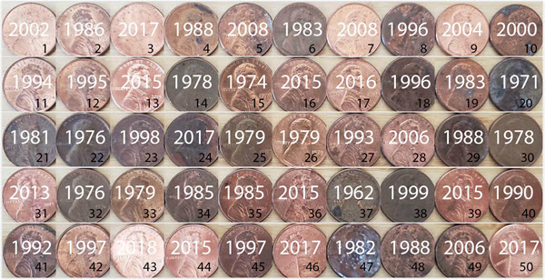
Fig 5.2 50 US pennies labelled.
The moderndive package contains this data on our 50
sampled pennies in the pennies_sample data frame:
CC10
pennies_sample## # A tibble: 50 × 2
## ID year
## <int> <dbl>
## 1 1 2002
## 2 2 1986
## 3 3 2017
## 4 4 1988
## 5 5 2008
## 6 6 1983
## 7 7 2008
## 8 8 1996
## 9 9 2004
## 10 10 2000
## # ℹ 40 more rowsTable 5.1 Sample of pennies
The pennies_sample data frame has 50 rows corresponding
to each penny with two columns. Recall we name the columns in a tidy
dataframe “variables.” The first variable ID corresponds to
the ID labels and is an integer. Whereas the second variable
year corresponds to the year of minting saved as a numeric
variable, also known as a double (dbl). This means it is
not an integer, but rather a continuous variable which can have many
decimal places.
Based on these 50 sampled pennies, what can we say about all US pennies in 2019?
Let’s study some properties of our sample by performing an
exploratory data analysis. Let’s first visualize the distribution of the
year of these 50 pennies using our data visualization tools from Module
2. Since year is a numerical variable, we use a histogram
to visualize its distribution.
CC11
ggplot(pennies_sample, aes(x = year)) +
  geom_histogram(binwidth = 10, fill = "#328da8", color = "white")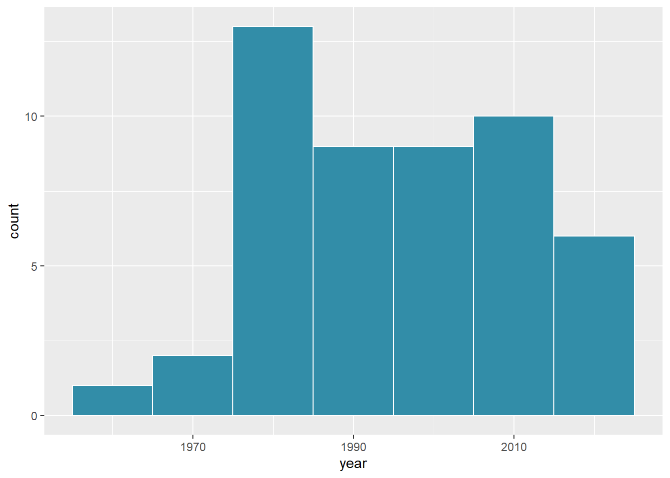
Fig 5.3 Distribution of year on 50 US pennies
Observe a slightly left-skewed distribution, since most pennies fall between 1980 and 2010 with only a few pennies older than 1970. What is the average year for the 50 sampled pennies? Eyeballing the histogram, it appears to be around 1990.
Let’s now compute this value exactly using some data wrangling.
CC12
x_bar <- pennies_sample %>%
  summarize(mean_year = mean(year))
x_bar
## # A tibble: 1 × 1
## mean_year
## <dbl>
## 1 1995.44Thus, if we’re willing to assume that pennies_sample is
a representative sample from all US pennies, a “good guess” of
the average year of minting of all US pennies would be 1995.44.
In other words, around 1995. This should all start sounding similar to what we did previously in Module 3 sampling!
In module 3, our study population was the bowl of \(N\) = 2400 balls.
Our population parameter was the population proportion of these balls that were red, denoted by \(p\). In order to estimate \(p\), we extracted a sample of 50 balls using the shovel. We then computed the relevant point estimate: the sample proportion of these 50 balls that were red, denoted mathematically by \(\widehat{p}\), which we say as “p-hat”.
Here our population is \(N\) = whatever the number of pennies are being used in the US, a value which we don’t know and probably never will. The population parameter of interest is now the population mean year of all these pennies, a value denoted mathematically by the Greek letter \(\mu\) (pronounced “mu”).
In order to estimate \(\mu\), we went to the bank and obtained a sample of 50 pennies and computed the relevant point estimate: the sample mean year of these 50 pennies, denoted mathematically by \(\overline{x}\) (pronounced “x-bar”).
An alternative and more intuitive notation for the sample mean is \(\widehat{\mu}\). However, this is unfortunately not as commonly used, so in this book we’ll stick with convention and always denote the sample mean as \(\overline{x}\).
We summarize the correspondence between the sampling bowl exercise in Module 3 Sampling and our pennies exercise in Table 5.2, which are the first two rows of the previously seen Table 5.1 .
Table 5.1
Going back to our 50 sampled pennies, the point estimate of interest is the sample mean \(\overline{x}\) of 1995.44. This quantity is an estimate of the population mean year of all US pennies \(\mu\).
Recall that we also saw in Module 3 Sampling that such estimates are prone to sampling variation.
For example, in this particular sample, we observed three pennies with the year 1999. If we sampled another 50 pennies, would we observe exactly three pennies with the year 1999 again? More than likely not. We might observe none, one, two, or maybe even all 50! The same can be said for the other 26 unique years that are represented in our sample of 50 pennies.
To study the effects of sampling variation in Module 3 Sampling, we took many samples, something we could easily do with our shovel. In our case with pennies, however, how would we obtain another sample? By going to the bank and getting another roll of 50 pennies.
Say we’re feeling lazy, however, and don’t want to go back to the bank. How can we study the effects of sampling variation using our single sample? We will do so using a technique known as bootstrap resampling with replacement, which we now illustrate.
3.1.2 Resampling once
Step 1: Let’s print out identically sized slips of paper representing our 50 pennies as seen in Figure 5.4.

Fig 5.4: Step 1: 50 slips of paper representing 50 US pennies.
Step 2: Put the 50 slips of paper into a hat or tuque as seen in Figure 5.5.
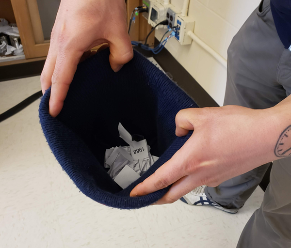
Fig 5.5: Step 2: Putting 50 slips of paper in a hat.
Step 3: Mix the hat’s contents and draw one slip of paper at random as seen in Figure 5.6. Record the year.
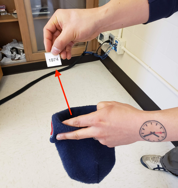
Fig 5.6: Step 3: Drawing one slip of paper at random.
Step 4: Put the slip of paper back in the hat! In other words, replace it as seen in Figure 5.7.
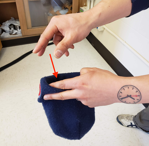
Fig 5.7: Step 4: Replacing slip of paper.
Step 5: Repeat Steps 3 and 4 a total of 49 more times, resulting in 50 recorded years.
What we just performed was a resampling of the original sample of 50 pennies.
We are not sampling 50 pennies from the population of all US pennies as we did in our trip to the bank. Instead, we are mimicking this act by resampling 50 pennies from our original sample of 50 pennies.
Now ask yourselves, why did we replace our resampled slip of paper back into the hat in Step 4? Because if we left the slip of paper out of the hat each time we performed Step 4, we would end up with the same 50 original pennies! In other words, replacing the slips of paper induces sampling variation.
Being more precise with our terminology, we just performed a resampling with replacement from the original sample of 50 pennies.
Had we left the slip of paper out of the hat each time we performed Step 4, this would be resampling without replacement.
Let’s study our 50 resampled pennies via an exploratory data analysis
First, let’s load the data into R by manually creating a data frame
pennies_resample of our 50 resampled values. We’ll do this
using the tibble() command from the dplyr
package. Note that the 50 values you resample will almost certainly not
be the same as ours given the inherent randomness.
CC13
pennies_resample <- tibble(
  year = c(1976, 1962, 1976, 1983, 2017, 2015, 2015, 1962, 2016, 1976,
           2006, 1997, 1988, 2015, 2015, 1988, 2016, 1978, 1979, 1997,
           1974, 2013, 1978, 2015, 2008, 1982, 1986, 1979, 1981, 2004,
           2000, 1995, 1999, 2006, 1979, 2015, 1979, 1998, 1981, 2015,
           2000, 1999, 1988, 2017, 1992, 1997, 1990, 1988, 2006, 2000)
)
The 50 values of year in pennies_resample
represent a resample of size 50 from the original sample of 50 pennies.
We display the 50 resampled pennies in Figure 5.8.
Fig 5.8: 50 resampled US pennies labelled.
Let’s compare the distribution of the numerical variable
year of our 50 resampled pennies with the distribution of
the numerical variable year of our original sample of 50
pennies in Figure 5.9.
CC14
ggplot(pennies_resample, aes(x = year)) +
  geom_histogram(binwidth = 10, fill = "#328da8", color = "white") +
  labs(title = "Resample of 50 pennies")
CC15
ggplot(pennies_sample, aes(x = year)) +
  geom_histogram(binwidth = 10, fill = "#FFA500", color = "white") +
  labs(title = "Original sample of 50 pennies")
This next code chunk is just taking the two images and placing them side by side. You do not need to run it. cc16
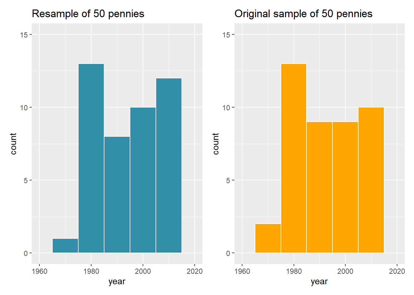
Fig 5.9: Comparing year in the resampled pennies_resample with the original sample pennies_sample.
Observe in Figure 5.9 that while the general shapes of both
distributions of year are roughly similar, they are not
identical.
Recall from the previous section that the sample mean of the original sample of 50 pennies from the bank was 1995.44.
What about for our resample? Any guesses? Let’s have
dplyr help us out as before:
CC17
resample_mean <- pennies_resample %>%
  summarize(mean_year = mean(year))
resample_mean
## # A tibble: 1 × 1
## mean_year
## <dbl>
## 1 1994.82We obtained a different mean year of 1994.82. This variation is induced by the resampling with replacement we performed earlier.
What if we repeated this resampling exercise many times? Would we
obtain the same mean year each time?
In other words, would our guess at the mean year of all pennies in the US in 2019 be exactly 1994.82 every time? Just as we did in module 3, let’s perform this resampling activity with the help of some of our friends: 35 friends in total.
3.1.3 Resampling 35 times
Each of our 35 friends will repeat the same five steps:
- Start with 50 identically sized slips of paper representing the 50 pennies.
- Put the 50 small pieces of paper into a hat or beanie cap.
- Mix the hat’s contents and draw one slip of paper at random. Record the year in a spreadsheet.
- Replace the slip of paper back in the hat!
- Repeat Steps 3 and 4 a total of 49 more times, resulting in 50 recorded years.
Since we had 35 of our friends perform this task, we ended up with \(35 \cdot 50 = 1750\) values. We recorded these values in a shared spreadsheet with 50 rows and 35 columns. We display a snapshot of the first 10 rows and five columns of this shared spreadsheet in Figure 5.10.
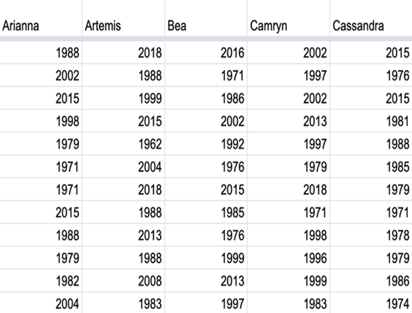
FIGURE 5.10: Snapshot of shared spreadsheet of resampled pennies.
For your convenience, we’ve taken these 35 \(\cdot\) 50 = 1750 values and saved them in
pennies_resamples, a “tidy” data frame included in the
moderndive package i.e., observations in rows and variables
in columns.
CC20
pennies_resamples## # A tibble: 1,750 × 3
## # Groups: name [35]
## replicate name year
## <int> <chr> <dbl>
## 1 1 Arianna 1988
## 2 1 Arianna 2002
## 3 1 Arianna 2015
## 4 1 Arianna 1998
## 5 1 Arianna 1979
## 6 1 Arianna 1971
## 7 1 Arianna 1971
## 8 1 Arianna 2015
## 9 1 Arianna 1988
## 10 1 Arianna 1979
## # ℹ 1,740 more rowsWhat did each of our 35 friends obtain as the mean year? Once again,
the dplyr package comes to the rescue!
After grouping the rows by name, we summarize each group
of 50 rows by their mean year:
CC21
resampled_means <- pennies_resamples %>%
  group_by(name) %>%
  summarize(mean_year = mean(year))
resampled_means
## # A tibble: 35 × 2
## name mean_year
## <chr> <dbl>
## 1 Arianna 1992.5
## 2 Artemis 1996.42
## 3 Bea 1996.32
## 4 Camryn 1996.9
## 5 Cassandra 1991.22
## 6 Cindy 1995.48
## 7 Claire 1995.52
## 8 Dahlia 1998.48
## 9 Dan 1993.86
## 10 Eindra 1993.56
## # ℹ 25 more rowsObserve that resampled_means has 35 rows corresponding
to the 35 means based on the 35 resamples. Furthermore, observe the
variation in the 35 values in the variable mean_year.
Let’s visualize this variation using a histogram in Figure 5.11.
Recall that adding the argument boundary = 1990 to the
geom_histogram() sets the binning structure so that one of
the bin boundaries is at 1990 exactly.
CC22
ggplot(resampled_means, aes(x = mean_year)) +
  geom_histogram(binwidth = 1, fill = "#328da8", color = "white", boundary = 1990) +
  labs(x = "Sampled mean year")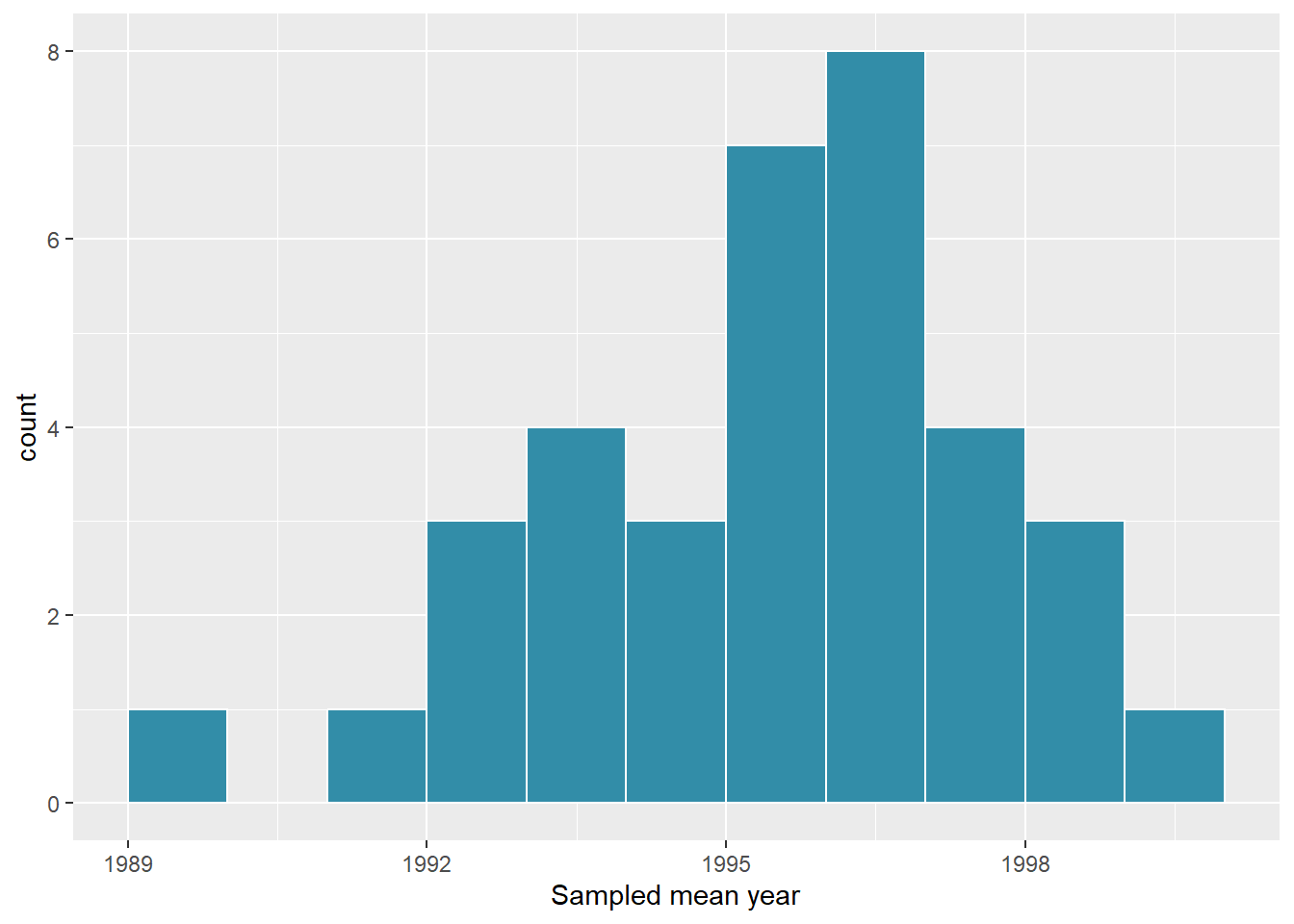
Fig 5.11: Distribution of 35 sample means from 35 resamples.
Observe in Figure 5.11 that the distribution looks roughly normal and that we rarely observe sample mean years less than 1992 or greater than 2000. Also observe how the distribution is roughly centered at 1995, which is close to the sample mean of 1995.44 of the original sample of 50 pennies from the bank.
3.1.4 What did we just do? Bootstrapping!
What we just demonstrated in this activity is the statistical procedure known as bootstrap resampling with replacement. We used resampling to mimic the sampling variation we studied in Module 3 on sampling. However, in this case, we did so using only a single sample from the population.
In fact, the histogram of sample means from 35 resamples in Figure 5.11 is called the bootstrap distribution.
It is an approximation to the sampling distribution of the sample mean, in the sense that both distributions will have a similar shape and similar spread. In fact in the upcoming Section 5, we’ll show you that this is the case. Using this bootstrap distribution, we can study the effect of sampling variation on our estimates. In particular, we’ll study the typical “error” of our estimates, known as the standard error.
In Section 3 we’ll mimic our tactile resampling activity virtually on the computer, allowing us to quickly perform the resampling many more than 35 times. In Section 4 we’ll define the statistical concept of a confidence interval, which builds off the concept of bootstrap distributions.
In sections 4 and 5, we’ll construct confidence intervals using the
dplyr package, as well as a new package: the
infer package for “tidy” and transparent statistical
inference. We’ll introduce the “tidy” statistical inference framework
that was part of the motivation for the infer package
pipeline. Professor Allen Downey’s five steps for inference also
inspired the folks who created the infer package.
The infer package will be the driving package throughout
the rest of this course.
As we did in Module 3, we’ll tie all these ideas together with a real-life case study in Section 8. This time we’ll look at data from an experiment about yawning from the US television show Mythbusters.
3.2 Computer simulation of resampling
Let’s now mimic our tactile resampling activity virtually with a computer.
3.2.1 Virtually resampling once
First, let’s perform the virtual analog of resampling once. Recall
that the pennies_sample data frame included in the
moderndive package contains the years of our original
sample of 50 pennies from the bank. Furthermore, recall in Module 3 on
sampling that we used the rep_sample_n() function as a
virtual shovel to sample balls from our virtual bowl of 2400 balls as
follows:
CC23
virtual_shovel <- bowl %>%
  rep_sample_n(size = 50)
Let’s modify this code to perform the resampling with replacement of the 50 slips of paper representing our original sample 50 pennies:
CC24
virtual_resample <- pennies_sample %>%
  rep_sample_n(size = 50, replace = TRUE)
Observe how we explicitly set the replace argument to
TRUE in order to tell rep_sample_n() that we
would like to sample pennies with replacement. Had we not set
replace = TRUE, the function would’ve assumed the default
value of FALSE and hence done resampling without
replacement.
Additionally, since we didn’t specify the number of replicates via
the reps argument, the function assumes the default of one
replicate reps = 1. Lastly, observe also that the
size argument is set to match the original sample size of
50 pennies.
Let’s look at only the first 10 out of 50 rows of
virtual_resample:
CC25
virtual_resample## # A tibble: 50 × 3
## # Groups: replicate [1]
## replicate ID year
## <int> <int> <dbl>
## 1 1 23 1998
## 2 1 24 2017
## 3 1 47 1982
## 4 1 14 1978
## 5 1 33 1979
## 6 1 2 1986
## 7 1 39 2015
## 8 1 23 1998
## 9 1 32 1976
## 10 1 30 1978
## # ℹ 40 more rowsThe replicate variable only takes on the value of 1
corresponding to us only having reps = 1, the
ID variable indicates which of the 50 pennies from
pennies_sample was resampled, and year denotes
the year of minting.
Let’s now compute the mean year in our virtual resample
of size 50 using data wrangling functions included in the
dplyr package:
CC26
virtual_resample %>%
  summarize(resample_mean = mean(year))
## # A tibble: 1 × 2
## replicate resample_mean
## <int> <dbl>
## 1 1 1992.86As we saw when we did our tactile resampling exercise, the resulting mean year is different than the mean year of our 50 originally sampled pennies of 1995.44.
3.2.2 Virtually resampling 35 times
Let’s now perform the virtual analog of our 35 friends’ resampling. Using these results, we’ll be able to study the variability in the sample means from 35 resamples of size 50.
Let’s first add a reps = 35 argument to
rep_sample_n() to indicate we would like 35 replicates.
Thus, we want to repeat the resampling with the replacement of 50
pennies 35 times.
CC27
virtual_resamples <- pennies_sample %>%
  rep_sample_n(size = 50, replace = TRUE, reps = 35)
virtual_resamples
## # A tibble: 1,750 × 3
## # Groups: replicate [35]
## replicate ID year
## <int> <int> <dbl>
## 1 1 41 1992
## 2 1 9 2004
## 3 1 44 2015
## 4 1 41 1992
## 5 1 4 1988
## 6 1 30 1978
## 7 1 19 1983
## 8 1 19 1983
## 9 1 47 1982
## 10 1 7 2008
## # ℹ 1,740 more rowsThe resulting virtual resamples data frame has 35 \(\cdot\) 50 = 1750 rows corresponding to 35
resamples of 50 pennies.
Let’s now compute the resulting 35 sample means using the same
dplyr code as we did in the previous section, but this time
adding a group_by(replicate):
CC28
virtual_resampled_means <- virtual_resamples %>%
  group_by(replicate) %>%
  summarize(mean_year = mean(year))
virtual_resampled_means
## # A tibble: 35 × 2
## replicate mean_year
## <int> <dbl>
## 1 1 1994.92
## 2 2 1995.3
## 3 3 1997.06
## 4 4 1998.38
## 5 5 1995.9
## 6 6 1990.54
## 7 7 1995.98
## 8 8 1994.96
## 9 9 1996.26
## 10 10 1997.9
## # ℹ 25 more rowsObserve that virtual_resampled_means has 35 rows,
corresponding to the 35 resampled means. Furthermore, observe that the
values of mean_year vary. Let’s visualize this variation
using a histogram in Figure 5.12.
CC29
ggplot(virtual_resampled_means, aes(x = mean_year)) +
  geom_histogram(binwidth = 1, fill = "#328da8", color = "white", boundary = 1990) +
  labs(x = "Resample mean year")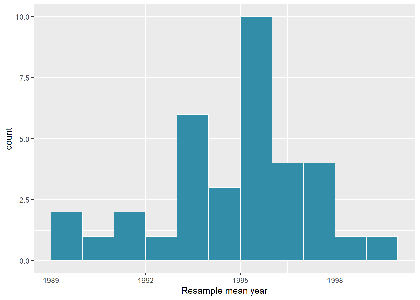
Fig 5.12: Distribution of 35 sample means from 35 resamples.
Let’s compare our virtually constructed bootstrap distribution with the one our 35 friends constructed via our tactile resampling exercise in Figure 5.13. Observe how they are somewhat similar, but not identical.
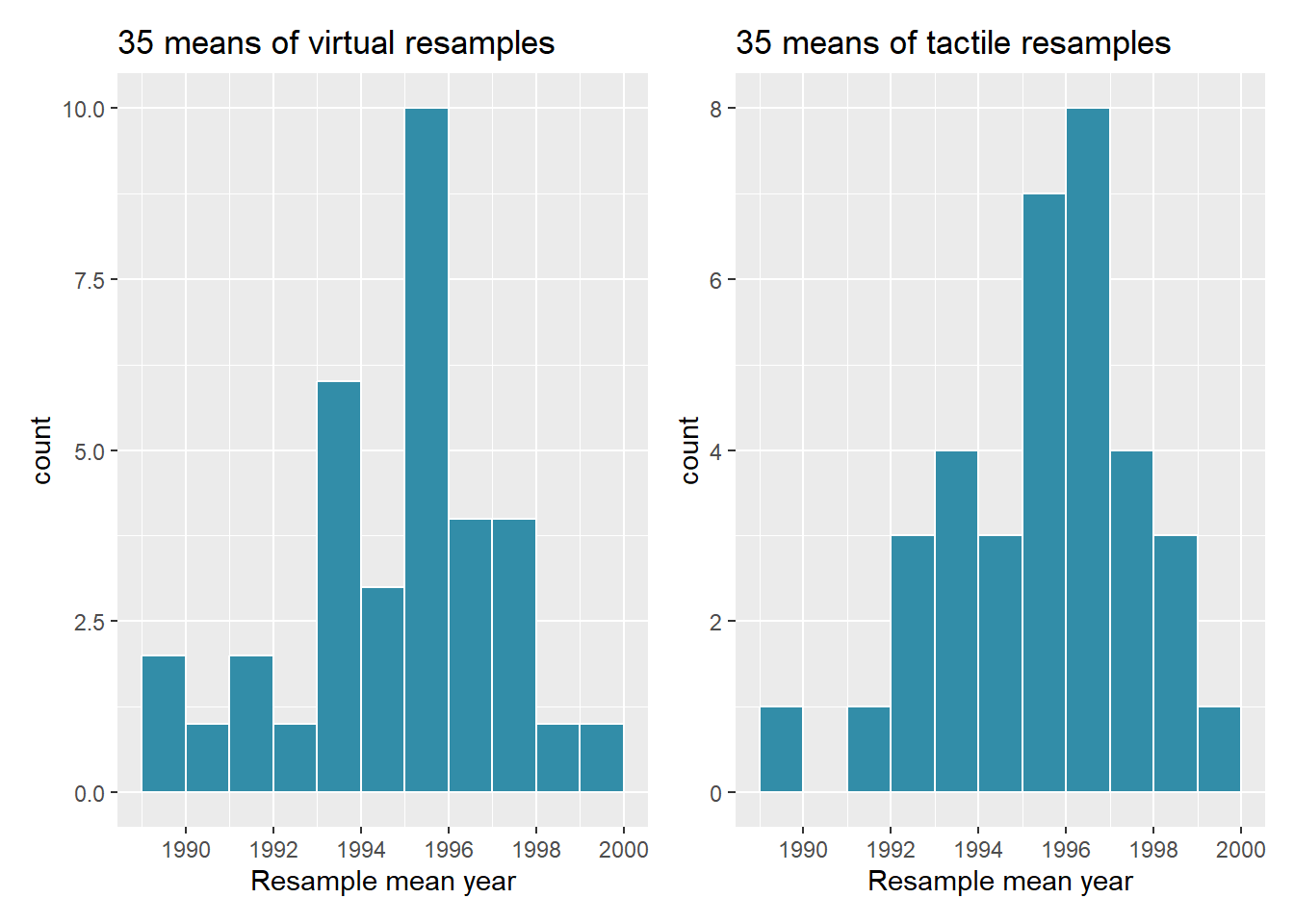
Comparing distributions of means from resamples.
Fig 5.13: Comparing distributions of means from resamples.
Recall that in the “resampling with replacement” scenario we are illustrating here, both of these histograms have a special name: the bootstrap distribution of the sample mean. Furthermore, recall they are an approximation to the sampling distribution of the sample mean, a concept you saw in Module 3 on sampling.
These distributions allow us to study the effect of sampling variation on our estimates of the true population mean, in this case the true mean year for all US pennies. However, unlike in Module 3 where we took multiple samples (something one would never do in practice), bootstrap distributions are constructed by taking multiple resamples from a single sample: in this case, the 50 original pennies from the bank.
3.2.3 Virtually resampling 1000 times
Remember that one of the goals of resampling with replacement is to construct the bootstrap distribution, which is an approximation of the sampling distribution. However, the bootstrap distribution in Figure 5.13 is based only on 35 resamples and hence looks a little coarse. Let’s increase the number of resamples to 1000 so that we can hopefully better see the shape and the variability between different resamples.
CC31
# Repeat resampling 1000 times
virtual_resamples <- pennies_sample %>%
  rep_sample_n(size = 50, replace = TRUE, reps = 1000)

# Compute 1000 sample means
virtual_resampled_means <- virtual_resamples %>%
  group_by(replicate) %>%
  summarize(mean_year = mean(year))
However, in the interest of brevity, going forward let’s combine
these two operations into a single chain of pipe (%>%)
operators:
CC32
virtual_resampled_means <- pennies_sample %>%
  rep_sample_n(size = 50, replace = TRUE, reps = 1000) %>%
  group_by(replicate) %>%
  summarize(mean_year = mean(year))
virtual_resampled_means
## # A tibble: 1,000 × 2
## replicate mean_year
## <int> <dbl>
## 1 1 1995.68
## 2 2 1996.34
## 3 3 1996.5
## 4 4 1992.42
## 5 5 1997.12
## 6 6 1995.68
## 7 7 1994.74
## 8 8 1995.62
## 9 9 1995.96
## 10 10 1995.96
## # ℹ 990 more rowsIn Figure 5.14 let’s visualize the bootstrap distribution of these 1000 means based on 1000 virtual resamples:
CC33
ggplot(virtual_resampled_means, aes(x = mean_year)) +
  geom_histogram(binwidth = 1, fill = "#328da8", color = "white", boundary = 1990) +
  labs(x = "sample mean")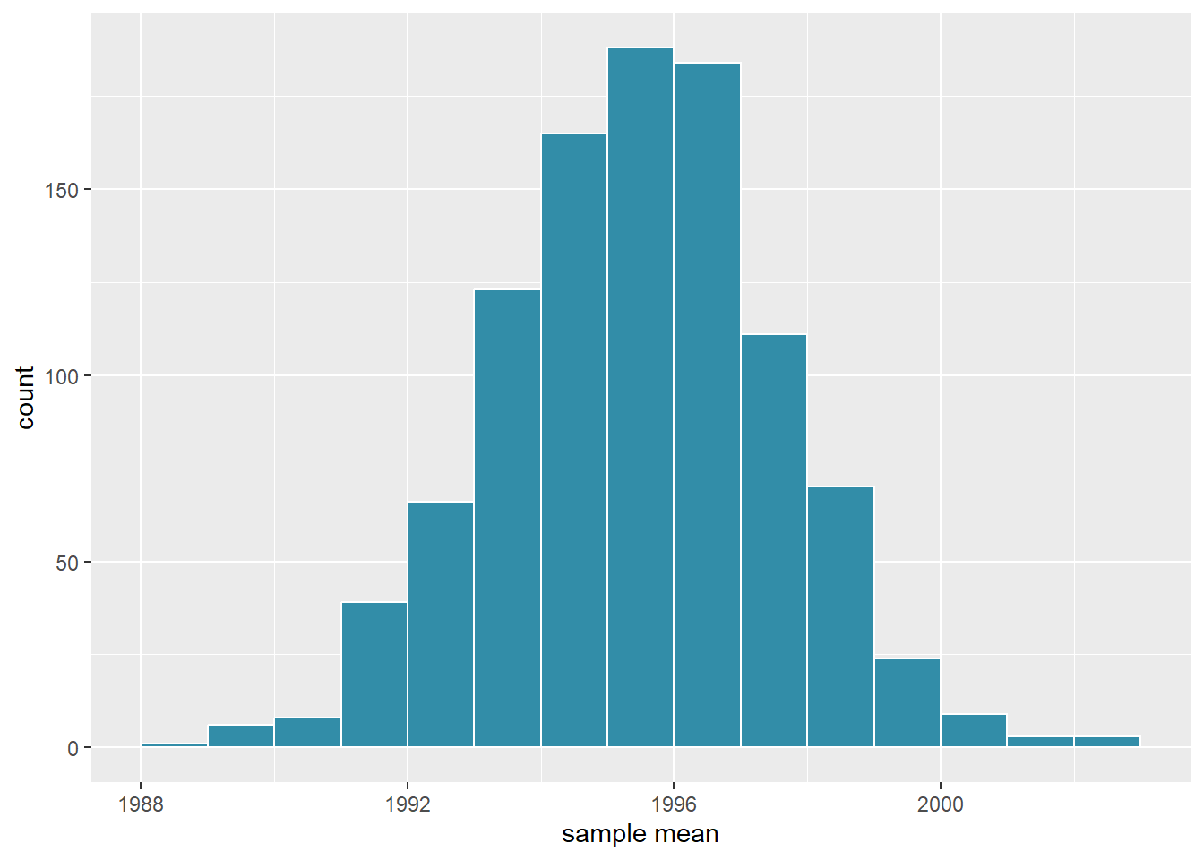
Bootstrap resampling distribution based on 1000 resamples.
Fig 5.14: Bootstrap resampling distribution based on 1000 resamples
Note here that the bell shape is starting to become much more apparent. We now have a general sense for the range of values that the sample mean may take on. But where is this histogram centered? Let’s compute the mean of the 1000 resample means:
CC34
virtual_resampled_means %>%
  summarize(mean_of_means = mean(mean_year))
## # A tibble: 1 × 1
## mean_of_means
## <dbl>
## 1 1995.46The mean of these 1000 means we just calculated is close to, but likely not exactly equal to the mean of our original sample of 50 pennies of 1995.44.
This is the case since each of the 1000 resamples is based on the original sample of 50 pennies. But we are using a random process each time which produces variation in the samples.
Congratulations! You’ve just constructed your first bootstrap distribution! In the next section, you’ll see how to use this bootstrap distribution to construct confidence intervals.
3.2.4 Learning check 1 & 2

LC 1 What is the chief difference between a bootstrap distribution and a sampling distribution?
Your answer here:
LC 2 Looking at the bootstrap distribution for the sample mean in Figure 5.14, between what two values would you say most values lie?
Your answer here:
3.3 Understanding confidence intervals
Let’s start this section with an analogy involving fishing. Say you are trying to catch a fish. On the one hand, you could use a spear, while on the other you could use a net. Using the net will probably allow you to catch more fish!
Now think back to our pennies exercise where you are trying to estimate the true population mean year \(\mu\) of all US pennies. Think of the value of \(\mu\) as a fish.
On the one hand, we could use the appropriate point estimate/sample statistic to estimate \(\mu\), which we saw in Table 5.1 is the sample mean \(\overline{x}\).
Based on our sample of 50 pennies from the bank, the sample mean was 1995.44. Think of using this value as “fishing with a spear.”
What would “fishing with a net” correspond to? Look at the bootstrap distribution in Figure 5.14 once more. Between which two years would you say that “most” sample means lie? While this question is somewhat subjective, saying that most sample means lie between 1992 and 2000 would not be unreasonable. Think of this interval as the “net.”
What we’ve just illustrated is the concept of a confidence interval, which we’ll abbreviate with “CI” throughout this course. As opposed to a point estimate/sample statistic that estimates the value of an unknown population parameter with a single value, a confidence interval gives what can be interpreted as a range of plausible values. Going back to our analogy, point estimates/sample statistics can be thought of as spears, whereas confidence intervals can be thought of as nets.
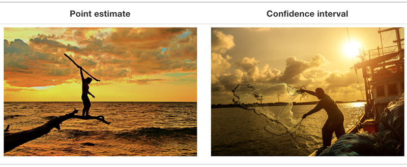 Figure 5.15:
Analogy of difference between point estimates and confidence
intervals.
Figure 5.15:
Analogy of difference between point estimates and confidence
intervals.
Our proposed interval of 1992 to 2000 was constructed by eye and was thus somewhat subjective. We now introduce two methods for constructing such intervals in a more exact fashion: the percentile method and the standard error method.
Both methods for confidence interval construction share some commonalities. First, they are both constructed from a bootstrap distribution, as you constructed in Subsection 5.2.3 and visualized in Figure 5.14.
Second, they both require you to specify the confidence level. Commonly used confidence levels include 90%, 95%, and 99%. All other things being equal, higher confidence levels correspond to wider confidence intervals, and lower confidence levels correspond to narrower confidence intervals. In this book, we’ll be mostly using 95% and hence constructing “95% confidence intervals for \(\mu\)” for our pennies activity.
3.3.1 Percentile method
One method to construct a confidence interval is to use the middle 95% of values of the bootstrap distribution. We can do this by computing the 2.5th and 97.5th percentiles, which are 1991.0585 and 1999.283, respectively. This is known as the percentile method for constructing confidence intervals.
For now, let’s focus only on the concepts behind a percentile method constructed confidence interval; we’ll show you the code that computes these values in the next section.
Let’s mark these percentiles on the bootstrap distribution with
vertical lines in Figure 5.16. About 95% of the mean_year
variable values in ’virtual_resampled_means` fall between 1991.0585 and
1999.283, with 2.5% to the left of the leftmost line and 2.5% to the
right of the rightmost line.
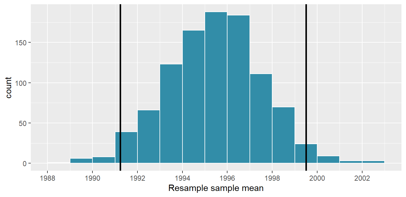
(ref:perc-method)
Figure 5.16 Percentile method 95% confidence interval. Interval endpoints marked by vertical lines.
3.3.2 Standard error method
Recall when we discussed the normal curve, we saw that if a numerical variable follows a normal distribution, or, in other words, the histogram of this variable is bell-shaped, then roughly 95% of values fall between \(\pm\) 1.96 standard deviations of the mean. Given that our bootstrap distribution based on 1000 resamples with replacement in Figure 5.16 is normally shaped, let’s use this fact about normal distributions to construct a confidence interval in a different way.
First, recall the bootstrap distribution has a mean equal to 1995.36. This value almost coincides exactly with the value of the sample mean \(\overline{x}\) of our original 50 pennies of 1995.44.
Second, let’s compute the standard deviation of the bootstrap
distribution using the values of mean_year in the
virtual_resampled_means data frame:
CC39
virtual_resampled_means %>%
  summarize(SE = sd(mean_year))
## # A tibble: 1 × 1
## SE
## <dbl>
## 1 2.14347What is this value? Recall that the bootstrap distribution is an approximation to the sampling distribution. Recall also that the standard deviation of a sampling distribution has a special name: the standard error. Putting these two facts together, we can say that 2.15466 is an approximation of the standard error of \(\overline{x}\).
Thus, using our 95% rule of thumb about normal distributions, we can use the following formula to determine the lower and upper endpoints of a 95% confidence interval for \(\mu\):
\[ \begin{aligned} \overline{x} \pm 1.96 \cdot SE &= (\overline{x} - 1.96 \cdot SE, \overline{x} + 1.96 \cdot SE)\\ &= (1995.44 - 1.96 \cdot 2.14, 1995.44 + 1.96 \cdot 2.14)\\ &= (1991.15, 1999.73) \end{aligned} \]
Let’s now add the SE method confidence interval with dashed lines in Figure 5.17, comparing both methods of finding the 95% confidence interval.
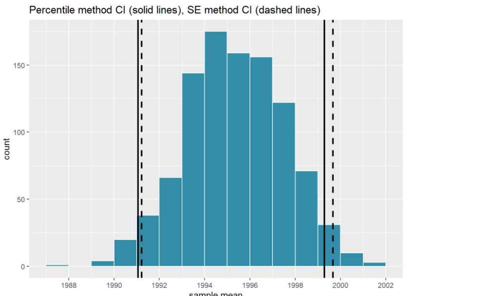
Figure 5.17: Comparing two 95% confidence interval methods.
We see that both methods produce nearly identical 95% confidence intervals for \(\mu\) with the percentile method yielding (1991.06, 1999.28) while the standard error method produces (1991.22, 1999.66).
However, recall that we can only use the standard error rule when the bootstrap distribution is roughly normally shaped.
Now that we’ve introduced the concept of confidence intervals and laid out the intuition behind two methods for constructing them, let’s explore the code that allows us to construct them.
3.3.3 Learning Check 3 & 4
LC 3 What condition about the bootstrap distribution must be met for us to be able to construct confidence intervals using the standard error method?
Your answer here:
LC 4 Say we wanted to construct a 68% confidence interval instead of a 95% confidence interval for \(\mu\). Describe what changes are needed to make this happen.
Hint: we suggest you look at this reference on the normal distribution: https://moderndive.com/A-appendixA.html#appendix-normal-curve
Your answer here:
3.4 Constructing Confidence Intervals using Infer
Recall that the process of resampling with replacement we performed by hand in Section 2 and virtually in Section 3 is known as bootstrapping. The term bootstrapping originates in the expression of “pulling oneself up by their bootstraps,” meaning to “succeed only by one’s own efforts or abilities.”
From a statistical perspective, bootstrapping alludes to succeeding in being able to study the effects of sampling variation on estimates from the “effort” of a single sample. Or more precisely, it refers to constructing an approximation to the sampling distribution using only one sample.
To perform this resampling with replacement virtually in Section 2,
we used the rep_sample_n() function, making sure that the
size of the resamples matched the original sample size of 50. In this
section, we’ll build off these ideas to construct confidence intervals
using a new package: the infer package for “tidy” and
transparent statistical inference.
3.4.1 Original workflow
Recall that in Section 3, we virtually performed bootstrap resampling
with replacement to construct bootstrap distributions. Such
distributions are approximations to the sampling distributions we saw in
Module 3, but are constructed using only a single sample. Let’s revisit
the original workflow using the %>% pipe operator.
First, we used the rep_sample_n() function to resample
size = 50 pennies with replacement from the original sample
of 50 pennies in pennies_sample by setting
replace = TRUE. Furthermore, we repeated this resampling
1000 times by setting reps = 1000:
CC41
pennies_sample %>%
  rep_sample_n(size = 50, replace = TRUE, reps = 1000)
Second, since for each of our 1000 resamples of size 50, we wanted to
compute a separate sample mean, we used the dplyr verb
group_by() to group observations/rows together by the
replicate variable…
CC42
pennies_sample %>%
  rep_sample_n(size = 50, replace = TRUE, reps = 1000) %>%
  group_by(replicate)
… followed by using summarize() to compute the sample
mean() year for each replicate group:
CC43
pennies_sample %>%
  rep_sample_n(size = 50, replace = TRUE, reps = 1000) %>%
  group_by(replicate) %>%
  summarize(mean_year = mean(year))
For this simple case, we can get by with using the
rep_sample_n() function and a couple of dplyr
verbs to construct the bootstrap distribution. However, using only
dplyr verbs only provides us with a limited set of tools.
For more complicated situations, we’ll need a little more firepower.
Let’s repeat this using the infer package.
3.4.2 infer package workflow
The infer package is an R package for statistical
inference. It makes efficient use of the %>% pipe
operator we introduced in our discussion of dyplr to spell out the
sequence of steps necessary to perform statistical inference in a “tidy”
and transparent fashion.Furthermore, just as the dplyr
package provides functions with verb-like names to perform data
wrangling, the infer package provides functions with
intuitive verb-like names to perform statistical inference.
Let’s go back to our pennies. Previously, we computed the value of
the sample mean \(\overline{x}\)
[x-bar] using the dplyr function
summarize():
CC44
pennies_sample %>%
  summarize(stat = mean(year))
We’ll see that we can also do this using infer functions
specify() and calculate():
CC45
pennies_sample %>%
  specify(response = year) %>%
  calculate(stat = "mean")
You might be asking yourself: “Isn’t the infer code
longer? Why would I use that code?”. While not immediately apparent,
you’ll see that there are three chief benefits to the infer
workflow as opposed to the dplyr workflow.
First, the infer verb names better align with the
overall resampling framework you need to understand to construct
confidence intervals and to conduct hypothesis tests we will discuss
next. We’ll see flowchart diagrams of this framework in the upcoming
figures.
Second, you can jump back and forth seamlessly between confidence
intervals and hypothesis testing with minimal changes to your code. This
will become apparent in the next section when we’ll compare the
infer code for both of these inferential methods.
Third, the infer workflow is much simpler for conducting
inference when you have more than one variable.
We’ll see two such situations. We’ll first see situations of two-sample inference where the sample data is collected from two groups, such as in section 8 where we study the contagiousness of yawning and in module 6 where we compare promotion rates of two groups at banks in the 1970s.
3.4.3 Sequence of Verbs
Let’s now illustrate the sequence of verbs necessary to construct a confidence interval for \(\mu\), the population mean year of minting of all US pennies in 2019.
3.4.3.1 Specify variables
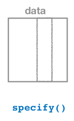 FIGURE 5.18: Diagram of the
specify() verb.
FIGURE 5.18: Diagram of the
specify() verb.
As shown in Figure 5.18, the specify() function is used
to choose which variables in a data frame will be the focus of our
statistical inference. We do this by specifying the
response argument. For example, in our
pennies_sample data frame of the 50 pennies sampled from
the bank, the variable of interest is year:
CC46
pennies_sample %>%
  specify(response = year)
## Response: year (numeric)
## # A tibble: 50 × 1
## year
## <dbl>
## 1 2002
## 2 1986
## 3 2017
## 4 1988
## 5 2008
## 6 1983
## 7 2008
## 8 1996
## 9 2004
## 10 2000
## # ℹ 40 more rowsNotice how the data itself doesn’t change, but the
Response: year (numeric) meta-data does. This is
similar to how the group_by() verb from dplyr
doesn’t change the data, but only adds “grouping” meta-data.
We can also specify which variables will be the focus of our
statistical inference using a formula = y ~ x.
This is the same formula notation we discussed earlier: the response
variable y is separated from the explanatory variable
x by a ~ (“tilde”). The following use of
specify() with the formula argument yields the
same result seen previously:
CC47
pennies_sample %>%
  specify(formula = year ~ NULL)
Since in the case of pennies we only have a response variable and no
explanatory variable of interest, we set the x on the
right-hand side of the ~ to be NULL.
While in the case of the pennies either specification works just
fine, we’ll see examples later on where the formula
specification is simpler. In particular, this comes up in the upcoming
Module 6 Rehearse 1 on comparing two proportions.
3.4.3.2 Generate replicates
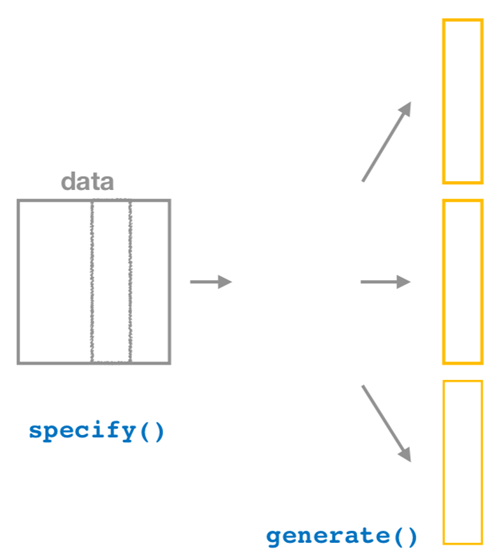
Figure 5.19: Diagram of generate() replicates.
After we specify() the variables of interest, we pipe
the results into the generate() function to generate
replicates. Figure 5.19 shows how this is combined with
specify() to start the pipeline.
In other words, repeat the resampling process a large number of times. Recall in section 3, we did this 35 and 1000 times.
The generate() function’s first argument is
reps, which sets the number of replicates we would like to
generate. Since we want to resample the 50 pennies in
pennies_sample with replacement 1000 times, we set
reps = 1000.
The second argument type determines the type of computer
simulation we’d like to perform. We set this to
type = "bootstrap" indicating that we want to perform
bootstrap resampling. You’ll see different options for type
in Module 6.
CC48
#set seed for reproducibilty
set.seed(123)

pennies_sample %>%
  specify(response = year) %>%
  generate(reps = 1000, type = "bootstrap")
## Response: year (numeric)
## # A tibble: 50,000 × 2
## # Groups: replicate [1,000]
## replicate year
## <int> <dbl>
## 1 1 1981
## 2 1 1988
## 3 1 2006
## 4 1 2016
## 5 1 2002
## 6 1 1985
## 7 1 1979
## 8 1 2000
## 9 1 2006
## 10 1 2016
## # ℹ 49,990 more rowsObserve that the resulting data frame has 50,000 rows. This is because we performed resampling of 50 pennies with replacement 1000 times and 50,000 = 50 \(\cdot\) 1000.
The variable replicate indicates which resample each row
belongs to. So it has the value 1 50 times, the value
2 50 times, all the way through to the value
1000 50 times. The default value of the type
argument is "bootstrap" in this scenario, so if the last
line was written as generate(reps = 1000), we’d obtain the
same results.
Comparing with original workflow
Note that the steps of the infer workflow so far produce
the same results as the original workflow using the
rep_sample_n() function we saw earlier. In other words, the
following two code chunks produce similar results:
# infer workflow:                   # Original workflow:
pennies_sample %>%                  pennies_sample %>%
  specify(response = year) %>%        rep_sample_n(size = 50, replace = TRUE,
  generate(reps = 1000)                            reps = 1000)
3.4.3.3 Calculate Summary Statistics
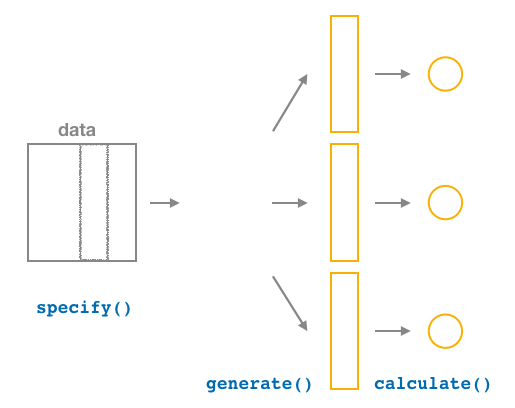
FIGURE 5.20: Diagram of calculate() summary statistics.
After we generate() many replicates of bootstrap
resampling with replacement, we next want to summarize each of the 1000
resamples of size
50 to a single sample statistic value. As seen in the diagram, thecalculate()`
function does this.
In our case, we want to calculate the mean year for each
bootstrap resample of size 50. To do so, we set the stat
argument to "mean".
You can also set the stat argument to a variety of other
common summary statistics, like "median",
"sum", "sd" (standard deviation), and
"prop" (proportion). To see a list of all possible summary
statistics you can use, type ?calculate and read the help
file.
Let’s save the result in a data frame called
bootstrap_distribution and explore its contents:
CC50
#set seed for reproducibilty
set.seed(123)

bootstrap_distribution <- pennies_sample %>%
  specify(response = year) %>%
  generate(reps = 1000) %>%
  calculate(stat = "mean")
bootstrap_distribution
## # A tibble: 1,000 × 2
## replicate stat
## <int> <dbl>
## 1 1 1995.7
## 2 2 1994.04
## 3 3 1993.62
## 4 4 1994.5
## 5 5 1994.08
## 6 6 1993.6
## 7 7 1995.26
## 8 8 1996.64
## 9 9 1994.3
## 10 10 1995.94
## # ℹ 990 more rowsObserve that the resulting data frame has 1000 rows and 2 columns
corresponding to the 1000 replicate values. It also has the
mean year for each bootstrap resample saved in the variable
stat.
Comparing with original workflow: You may have
recognized at this point that the calculate() step in the
infer workflow produces the same output as the
group_by() %>% summarize() steps in the original
workflow.
# infer workflow:                   # Original workflow:
pennies_sample %>%                  pennies_sample %>%
  specify(response = year) %>%        rep_sample_n(size = 50, replace = TRUE,
  generate(reps = 1000) %>%                        reps = 1000) %>%
  calculate(stat = "mean")            group_by(replicate) %>%
                                      summarize(stat = mean(year))
3.4.3.4 Visualize the results
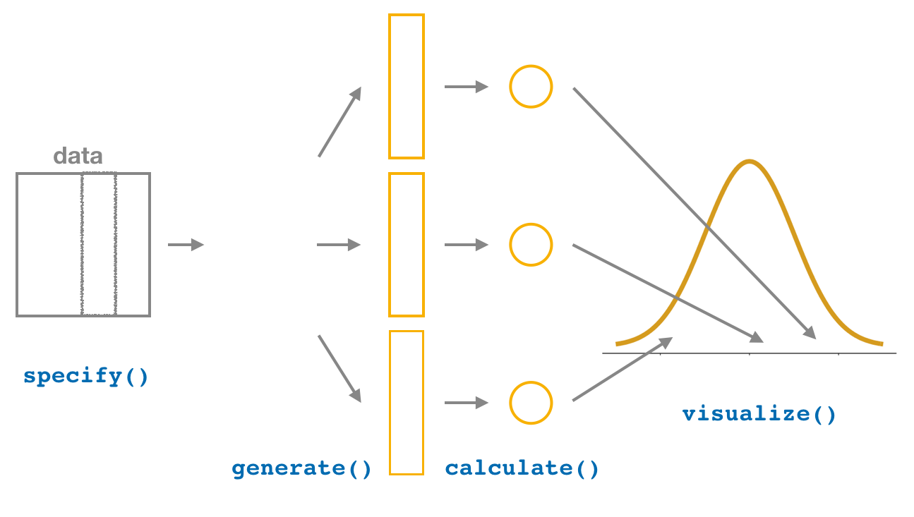
FIGURE 5.21: Diagram of visualize() results.
The visualize() verb provides a quick way to visualize
the bootstrap distribution as a histogram of the numerical
stat variable’s values. The pipeline of the main
infer verbs used for exploring bootstrap distribution
results is shown in Figure 5.21.
CC52
visualize(bootstrap_distribution)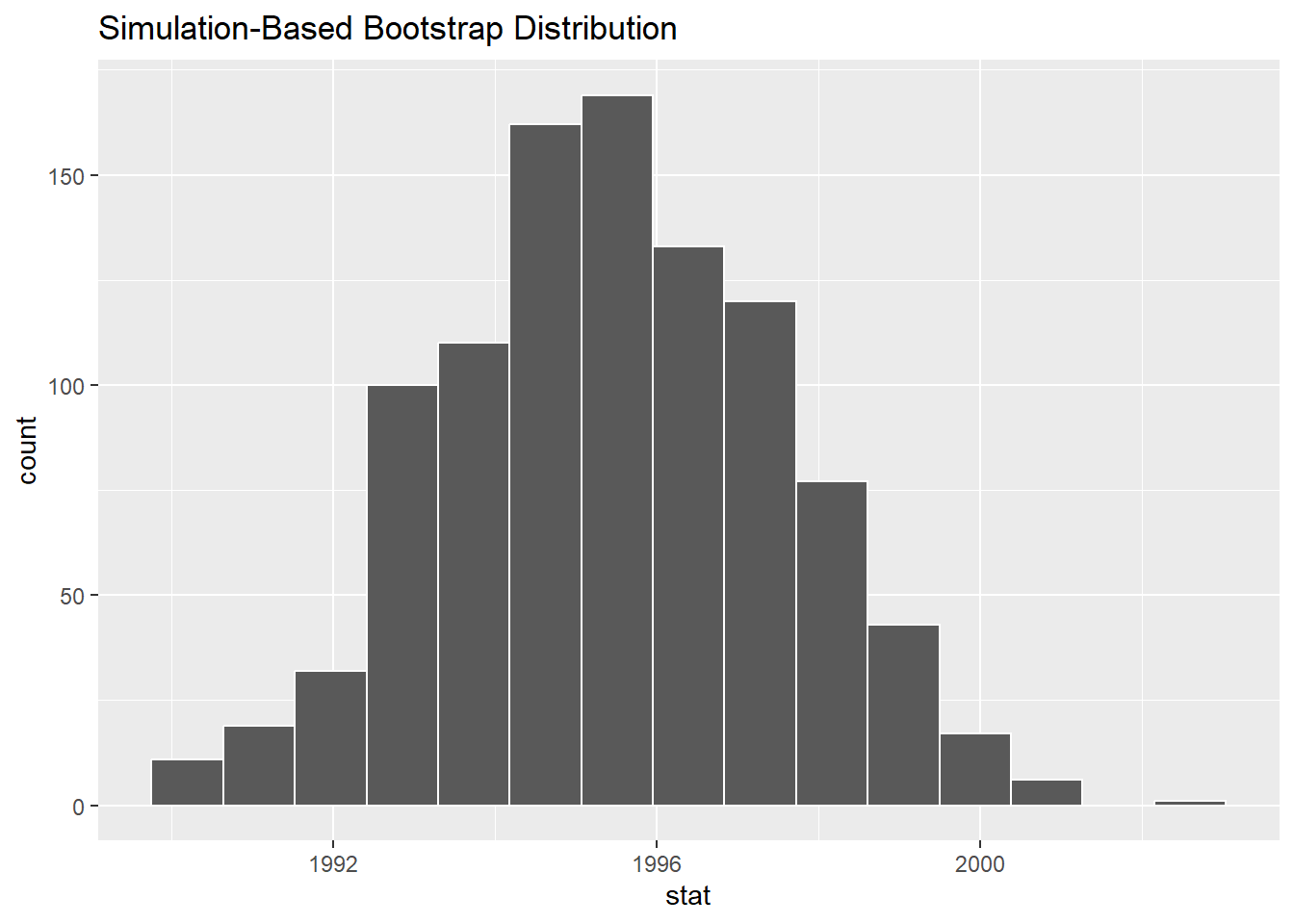
Bootstrap distribution.
FIGURE 5.22: Bootstrap distribution.
Comparing with original workflow: In fact,
visualize() is a wrapper function for the
ggplot() function that uses a geom_histogram()
layer.
# infer workflow:                    # Original workflow:
visualize(bootstrap_distribution)    ggplot(bootstrap_distribution,
                                            aes(x = stat)) +
                                       geom_histogram()
The visualize() function can take many other arguments
which we’ll see momentarily to customize the plot further. It also works
with helper functions to do the shading of the histogram values
corresponding to the confidence interval values.
Let’s recap the steps of the infer workflow for
constructing a bootstrap distribution and then visualizing it in Figure
5.23.
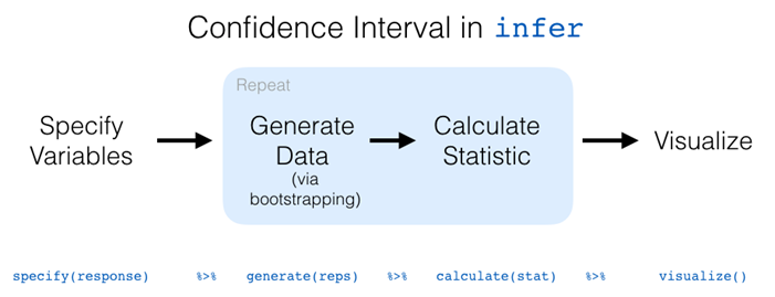
FIGURE 5.23: infer package workflow for confidence intervals.
Recall how we introduced two different methods for constructing 95% confidence intervals for an unknown population parameter using both the percentile method and the standard error method.
Let’s now check out the infer package code that
explicitly constructs these. There are also some additional neat
functions to visualize the resulting confidence intervals built-in to
the infer package!
3.4.4 Percentile method with infer
Recall the percentile method for constructing 95% confidence intervals we introduced in Section 4. This method sets the lower endpoint of the confidence interval at the 2.5th percentile of the bootstrap distribution and similarly sets the upper endpoint at the 97.5th percentile. The resulting interval captures the middle 95% of the values of the sample mean in the bootstrap distribution.
We can compute the 95% confidence interval by piping
bootstrap_distribution into the
get_confidence_interval() function from the
infer package, with the confidence level set
to 0.95 and the confidence interval type to be
"percentile". Let’s save the results in
percentile_ci.
CC54
percentile_ci <- bootstrap_distribution %>%
  get_confidence_interval(level = 0.95, type = "percentile")
percentile_ci
## # A tibble: 1 × 2
## lower_ci upper_ci
## <dbl> <dbl>
## 1 1991.24 1999.42Alternatively, we can visualize the interval (1991.24, 1999.42) by
piping the bootstrap_distribution data frame into the
visualize() function and adding a
shade_confidence_interval() layer.
We set the endpoints argument to be
percentile_ci.
CC55
visualize(bootstrap_distribution) +
  shade_confidence_interval(endpoints = percentile_ci)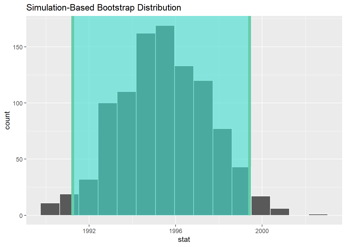
FIGURE 5.24: Percentile method 95% confidence interval shaded corresponding to potential values.
Observe in Figure 5.24 that 95% of the sample means stored in the
stat variable in bootstrap_distribution fall
between the two endpoints marked with the darker lines, with 2.5% of the
sample means to the left of the shaded area and 2.5% of the sample means
to the right. You also have the option to change the colors of the
shading using the color and fill
arguments.
You can also use the shorter named function shade_ci()
and the results will be the same. This is for folks who don’t want to
type out all of confidence_interval and prefer to type out
ci instead.
Try out the following code!
CC57
visualize(bootstrap_distribution) +
  shade_ci(endpoints = percentile_ci, color = "hotpink", fill = "khaki")
3.4.5 Standard error method with infer
Recall the standard error method for constructing 95% confidence intervals we introduced earlier. For any distribution that is normally shaped, roughly 95% of the values lie within two standard deviations of the mean. In the case of the bootstrap distribution, the standard deviation has a special name: the standard error.
So in our case, 95% of values of the bootstrap distribution will lie within \(\pm 1.96\) standard errors of \(\overline{x}\).
Thus, a 95% confidence interval is
\[\overline{x} \pm 1.96 \cdot SE = (\overline{x} - 1.96 \cdot SE, \, \overline{x} + 1.96 \cdot SE).\]
Computation of the 95% confidence interval can once again be done by
piping the bootstrap_distribution data frame we created
into the get_confidence_interval() function. However, this
time we set the first type argument to be
"se". Second, we must specify the
point_estimate argument in order to set the center of the
confidence interval.
We set this to be the sample mean of the original sample of 50
pennies of 1995.44 we saved in x_bar earlier.
CC58
standard_error_ci <- bootstrap_distribution %>%
  get_confidence_interval(type = "se", point_estimate = x_bar)
standard_error_ci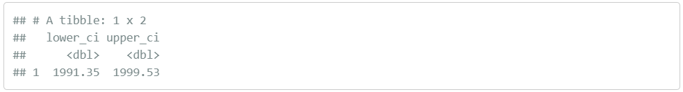
If we would like to visualize the interval (1991.22, 1999.66), we can
once again pipe the bootstrap_distribution data frame into
the visualize() function and add a
shade_confidence_interval() layer to our plot. We set the
endpoints argument to be standard_error_ci.
The resulting standard-error method based on a 95% confidence interval
for \(\mu\) can be seen in Figure
5.25.
CC59
visualize(bootstrap_distribution) +
  shade_confidence_interval(endpoints = standard_error_ci)
FIGURE 5.25: Standard-error-method 95% confidence interval.
As noted in Section 4, both methods produce similar confidence intervals:
- Percentile method: (1991.24, 1999.42)
- Standard error method: (1991.22, 1999.66)
3.5 Learning Check 5
LC 5 To find the median year of minting of all US pennies, we just need to edit some of the code. Below are CC32 and CC34. Edit the two chunks to find the median:
Hint: replace every instance of “mean” with “median”. Change the name of the new data frame “virtual_resampled_means” to be “virtual_resampled_median”. Change “mean_year” to “median_year”. Change “mean of means” to “median of medians”
CC32
virtual_resampled_means <- pennies_sample %>%
  rep_sample_n(size = 50, replace = TRUE, reps = 1000) %>%
  group_by(replicate) %>%
  summarize(mean_year = mean(year))
virtual_resampled_means
CC34
virtual_resampled_means %>%
  summarize(mean_of_means = mean(mean_year))
Your answer here:
Pause

This is a good stopping point if you need a break.
Be sure to save your file. If you need to submit evidence of your progress on the labs, you can save a copy of your Lab 5 Confidence worksheet with “-pause” added to the end of the file name. That way you can begin again when you are ready with the original file and come back here - Pause is shown in the table of contents.
4 Interpreting confidence intervals
Now that we’ve shown you how to construct confidence intervals using a sample drawn from a population, let’s now focus on how to interpret their effectiveness. The effectiveness of a confidence interval is judged by whether or not it contains the true value of the population parameter. Going back to our fishing analogy in Section 4, this is like asking, “Did our net capture the fish?”.
So, for example, does our percentile-based confidence interval of (1991.24, 1999.42) “capture” the true mean year \(\mu\) of all US pennies?
Alas, we’ll never know, because we don’t know what the true value of \(\mu\) is. After all, we’re sampling to estimate it!
In order to interpret a confidence interval’s effectiveness, we need to know what the value of the population parameter is. That way we can say whether or not a confidence interval “captured” this value.
Let’s revisit our sampling bowl. What proportion of the bowl’s 2400 balls are red? Let’s compute this:
CC61
bowl %>%
  summarize(p_red = mean(color == "red"))
## # A tibble: 1 × 1
## p_red
## <dbl>
## 1 0.375In this case, we know what the value of the population parameter is: we know that the population proportion \(p\) is 0.375. In other words, we know that 37.5% of the bowl’s balls are red.
As we stated earlier, the sampling bowl exercise doesn’t really reflect how sampling is done in real life, but rather was an idealized activity. In real life, we won’t know what the true value of the population parameter is, hence the need for estimation.
Let’s now construct confidence intervals for \(p\) using our 33 groups of friends’ samples from the bowl in Module 3 Sampling. We’ll then see if the confidence intervals “captured” the true value of \(p\), which we know to be 37.5%. That is to say, “Did the net capture the fish?”.
4.1 Did the net capture the fish?
Recall that we had 33 groups of friends each take samples of size 50
from the bowl and then compute the sample proportion of red balls \(\widehat{p}\). This resulted in 33 such
estimates of \(p\). Let’s focus on
Ilyas and Yohan’s sample, which is saved in the
bowl_sample_1 data frame in the moderndive
package:
CC63
bowl_sample_1## # A tibble: 50 × 1
## color
## <chr>
## 1 white
## 2 white
## 3 red
## 4 red
## 5 white
## 6 white
## 7 red
## 8 white
## 9 white
## 10 white
## # ℹ 40 more rowsThey observed 21 red balls out of 50 and thus their sample proportion \(\widehat{p}\) was 21/50 = `0.42 = 42%. Think of this as the “spear” from our fishing analogy.
Let’s now follow the infer package workflow to create a
percentile-method-based 95% confidence interval for \(p\) using Ilyas and Yohan’s sample. Think
of this as the “net.”
1. specify variables
First, we specify() the response variable
of interest color. And we need to define which event is of
interest! red or white balls? Since we are
interested in the proportion red, let’s set success to be
"red":
CC65
bowl_sample_1 %>%
  specify(response = color, success = "red")
## Response: color (factor)
## # A tibble: 50 × 1
## color
## <fct>
## 1 white
## 2 white
## 3 red
## 4 red
## 5 white
## 6 white
## 7 red
## 8 white
## 9 white
## 10 white
## # ℹ 40 more rows2. generate replicates
Second, we generate() 1000 replicates of bootstrap
resampling with replacement from bowl_sample_1 by
setting reps = 1000 and
type = "bootstrap".
CC66
#set seed for reproducibilty
set.seed(123)

bowl_sample_1 %>%
  specify(response = color, success = "red") %>%
  generate(reps = 1000, type = "bootstrap")
## Response: color (factor)
## # A tibble: 50,000 × 2
## # Groups: replicate [1,000]
## replicate color
## <int> <fct>
## 1 1 white
## 2 1 white
## 3 1 white
## 4 1 white
## 5 1 red
## 6 1 white
## 7 1 white
## 8 1 white
## 9 1 white
## 10 1 red
## # ℹ 49,990 more rowsObserve that the resulting data frame has 50,000 rows. This is because we performed resampling of 50 balls with replacement 1000 times and thus 50,000 = 50 \(\cdot\) 1000.
The variable replicate indicates which resample each row
belongs to. So it has the value 1 50 times, the value
2 50 times, all the way through to the value
1000 50 times.
3. calculate summary statistics
Third, we summarize each of the 1000 resamples of size 50 with the
proportion of successes. In other words, the proportion of the
balls that are "red".
We can set the summary statistic to be calculated as the proportion
by setting the stat argument to be "prop".
Let’s save the result as sample_1_bootstrap:
CC68
#set seed for reproducibilty
set.seed(123)

sample_1_bootstrap <- bowl_sample_1 %>%
  specify(response = color, success = "red") %>%
  generate(reps = 1000, type = "bootstrap") %>%
  calculate(stat = "prop")
sample_1_bootstrap
## # A tibble: 1,000 × 2
## replicate stat
## <int> <dbl>
## 1 1 0.32
## 2 2 0.42
## 3 3 0.44
## 4 4 0.4
## 5 5 0.44
## 6 6 0.52
## 7 7 0.38
## 8 8 0.44
## 9 9 0.34
## 10 10 0.42
## # ℹ 990 more rowsObserve there are 1000 rows in this data frame and thus 1000 values
of the variable stat. These 1000 values of
stat represent our 1000 replicated values of the
proportion, each based on a different resample.
4. visualize the results
Fourth and lastly, let’s compute the resulting 95% confidence interval.
CC70
percentile_ci_1 <- sample_1_bootstrap %>%
  get_confidence_interval(level = 0.95, type = "percentile")
percentile_ci_1
## # A tibble: 1 × 2
## lower_ci upper_ci
## <dbl> <dbl>
## 1 0.3 0.56Let’s visualize the bootstrap distribution along with the
percentile_ci_1 percentile-based 95% confidence interval
for \(p\) in Figure 5.26. We’ll adjust
the number of bins to better see the resulting shape.
Furthermore, we’ll add a dashed vertical line at Ilyas and Yohan’s
observed \(\widehat{p}\) = 21/50 = 0.42
= 42% using geom_vline().
CC71
sample_1_bootstrap %>%
  visualize(bins = 15) +
  shade_confidence_interval(endpoints = percentile_ci_1) +
  geom_vline(xintercept = 0.42, linetype = "dashed")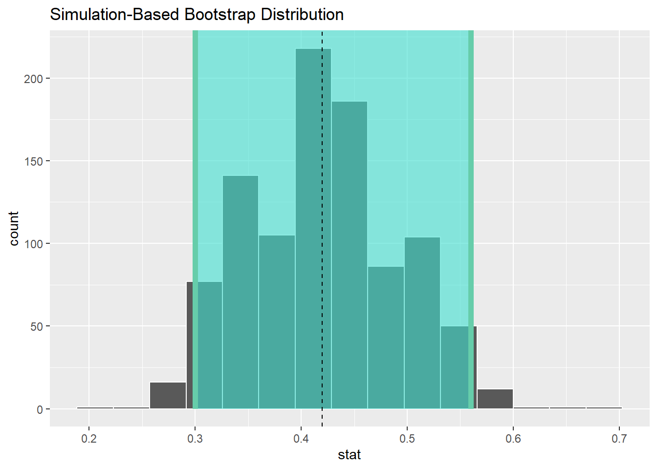
Figure 5.26
Did Ilyas and Yohan’s net capture the fish? Did their 95% confidence interval for \(p\) based on their sample contain the true value of \(p\) of 0.375? Yes! 0.375 is between the endpoints of their confidence interval (0.3, 0.56).
However, will every 95% confidence interval for \(p\) capture this value? In other words, if we had a different sample of 50 balls and constructed a different confidence interval, would it necessarily contain \(p\) = 0.375 as well? Let’s see!
Let’s first take a different sample from the bowl, this time using the computer as we did in Module 3 Sampling:
CC73
bowl_sample_2 <- bowl %>% rep_sample_n(size = 50)
bowl_sample_2
## # A tibble: 50 × 3
## # Groups: replicate [1]
## replicate ball_ID color
## <int> <int> <chr>
## 1 1 458 white
## 2 1 2210 white
## 3 1 1117 red
## 4 1 1565 white
## 5 1 888 white
## 6 1 1701 white
## 7 1 82 red
## 8 1 2019 red
## 9 1 1788 red
## 10 1 553 white
## # ℹ 40 more rowsLet’s reapply the same infer functions on
bowl_sample_2 to generate a different 95% confidence
interval for \(p\). First, we create
the new bootstrap distribution and save the results in
sample_2_bootstrap:
CC74
#set seed for reproducibilty
set.seed(123)

sample_2_bootstrap <- bowl_sample_2 %>%
  specify(response = color,
          success = "red") %>%
  generate(reps = 1000,
           type = "bootstrap") %>%
  calculate(stat = "prop")
sample_2_bootstrap
## # A tibble: 1,000 × 2
## replicate stat
## <int> <dbl>
## 1 1 0.48
## 2 2 0.38
## 3 3 0.32
## 4 4 0.32
## 5 5 0.34
## 6 6 0.26
## 7 7 0.3
## 8 8 0.36
## 9 9 0.44
## 10 10 0.36
## # ℹ 990 more rowsWe once again compute a percentile-based 95% confidence interval for \(p\):
CC76
percentile_ci_2 <- sample_2_bootstrap %>%
  get_confidence_interval(level = 0.95, type = "percentile")
percentile_ci_2
## # A tibble: 1 × 2
## lower_ci upper_ci
## <dbl> <dbl>
## 1 0.2 0.48Does this new net capture the fish? In other words, does the 95% confidence interval for p based on the new sample contain the true value of p of 0.375? Yes again! 0.375 is between the endpoints of our confidence interval (0.2, 0.48).
Let’s now repeat this process 100 more times: we take 100 virtual samples from the bowl and construct 100 95% confidence intervals. Let’s visualize the results in Figure 5.27 where:
- We mark the true value of p = 0.375 with a vertical line.
- We mark each of the 100 95% confidence intervals with horizontal lines. These are the “nets.”
- The horizontal line is colored grey if the confidence interval “captures” the true value of \(p\) marked with the vertical line. The horizontal line is colored black otherwise.
Note this image is a bit too complex for our course. Don’t worry about the code.
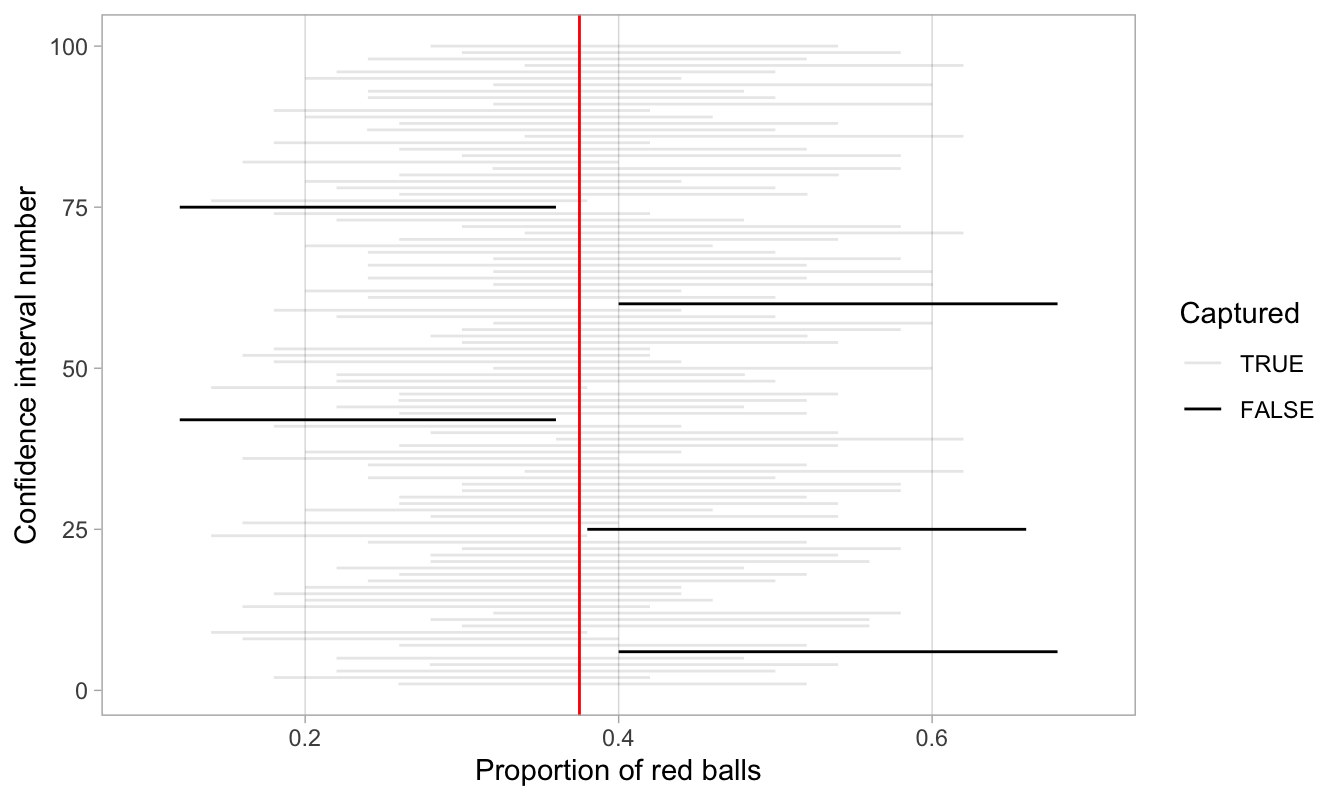
FIGURE 5.27: 100 percentile-based 95% confidence intervals for
p.
Of the 100 95% confidence intervals, 95 of them captured the true value \(p = 0.375\), whereas 5 of them didn’t. In other words, 95 of our nets caught the fish, whereas 5 of our nets didn’t.
This is where the “95% confidence level” we defined in Section 5.3 comes into play: for every 100 95% confidence intervals, we expect that 95 of them will capture \(p\) and that five of them won’t.
Note that “expect” is a probabilistic statement referring to a long-run average. In other words, for every 100 confidence intervals, we will observe about 95 confidence intervals that capture \(p\), but not necessarily exactly 95. In Figure 5.27 for example, 95 of the confidence intervals capture \(p\).
To further accentuate our point about confidence levels, let’s generate a figure similar to Figure 5.27, but this time constructing 80% standard-error method based confidence intervals instead. Let’s visualize the results in Figure 5.28 with the scale on the x-axis being the same as in Figure 5.27 to make comparison easy. Furthermore, since all standard-error method confidence intervals for \(p\) are centered at their respective point estimates \(\widehat{p}\), we mark this value on each line with dots.
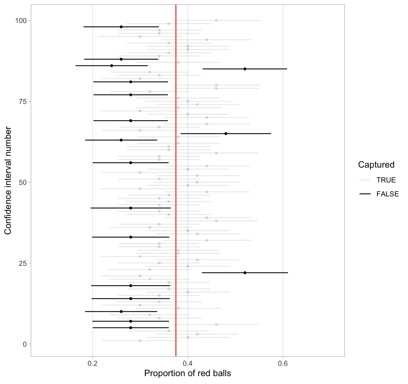
FIGURE 5.28: 100 SE-based 80% confidence intervals for p with point estimate center marked with dots.
Observe how the 80% confidence intervals are narrower than the 95% confidence intervals, reflecting our lower degree of confidence. Think of this as using a smaller “net.” We’ll explore other determinants of confidence interval width in the upcoming Subsection 5R1.6.
Furthermore, observe that of the 100 80% confidence intervals, 82 of them captured the population proportion \(p\) = 0.375, whereas 18 of them did not. Since we lowered the confidence level from 95% to 80%, we now have a much larger number of confidence intervals that failed to “catch the fish.”
4.2 Precise and shorthand interpretation
Let’s return our attention to 95% confidence intervals. The precise and mathematically correct interpretation of a 95% confidence interval is a little long-winded:
Precise interpretation: If we repeated our sampling procedure a large number of times, we expect about 95% of the resulting confidence intervals to capture the value of the population parameter.
This is what we observed in Figure 5.28. Our confidence interval construction procedure is 95% reliable. That is to say, we can expect our confidence intervals to include the true population parameter about 95% of the time.
A common but incorrect interpretation is: “There is a 95% probability that the confidence interval contains \(p\).” Looking at Figure 5.28, each of the confidence intervals either does or doesn’t contain \(p\). In other words, the probability is either a 1 or a 0.
So if the 95% confidence level only relates to the reliability of the confidence interval construction procedure and not to a given confidence interval itself, what insight can be derived from a given confidence interval?
For example, going back to the pennies example, we found that the percentile method 95% confidence interval for \(\mu\) was (1991.24, 1999.42), whereas the standard error method 95% confidence interval was (1991.22, 1999.66).
What can be said about these two intervals?
Loosely speaking, we can think of these intervals as our “best guess” of a plausible range of values for the mean year \(\mu\) of all US pennies.
For the rest of this course, we’ll use the following shorthand summary of the precise interpretation.
Short-hand interpretation: We are 95% “confident” that a 95% confidence interval captures the value of the population parameter.
We use quotation marks around “confident” to emphasize that while 95% relates to the reliability of our confidence interval construction procedure, ultimately a constructed confidence interval is our best guess of an interval that contains the population parameter. In other words, it’s our best net.
So returning to our pennies example and focusing on the percentile method, we are 95% “confident” that the true mean year of pennies in circulation in 2019 is somewhere between 1991.24 and 1999.42.
5 Width of confidence intervals
Now that we know how to interpret confidence intervals, let’s go over some factors that determine their width.
5.1 Impact of confidence level
One factor that determines confidence interval widths is the pre-specified confidence level. For example, in Figures 5.28 and 5.29, we compared the widths of 95% and 80% confidence intervals and observed that the 95% confidence intervals were wider. The quantification of the confidence level should match what many expect of the word “confident.” In order to be more confident in our best guess of a range of values, we need to widen the range of values.
To elaborate on this, imagine we want to guess the forecasted high temperature in Seoul, South Korea on August 15th. Given Seoul’s temperate climate with four distinct seasons, we could say somewhat confidently that the high temperature would be between 50°F - 95°F (10°C - 35°C). However, if we wanted a temperature range we were absolutely confident about, we would need to widen it.
We need this wider range to allow for the possibility of anomalous weather, like a freak cold spell or an extreme heat wave. So a range of temperatures we could be near certain about would be between 32°F - 110°F (0°C - 43°C). On the other hand, if we could tolerate being a little less confident, we could narrow this range to between 70°F - 85°F (21°C - 30°C).
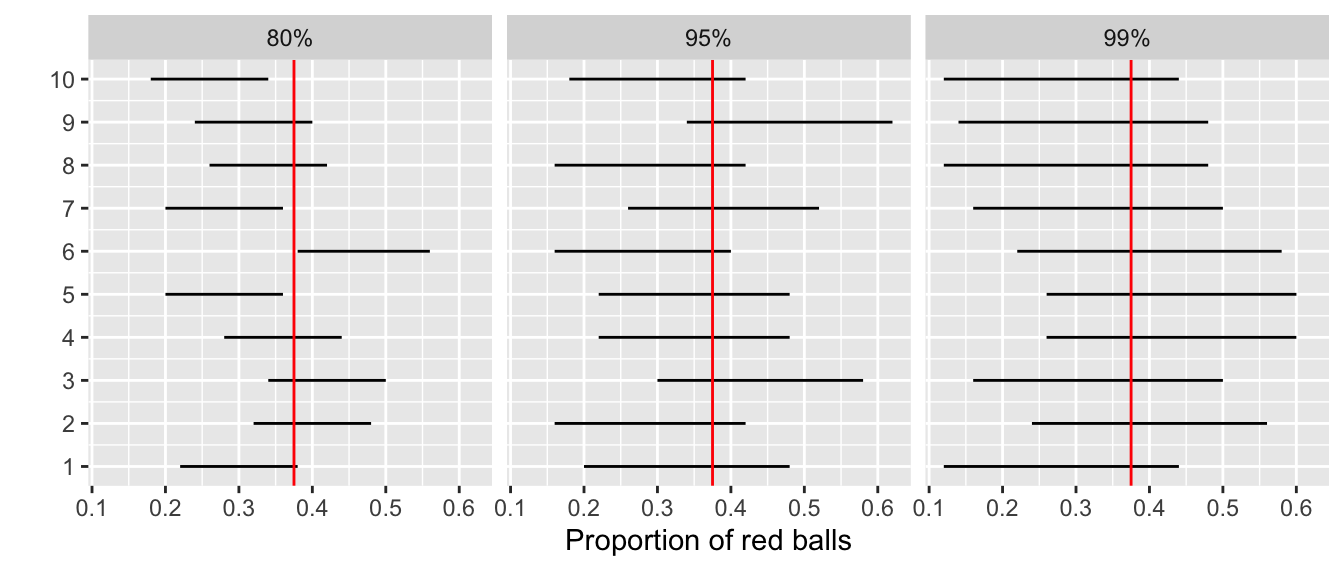
Let’s revisit our sampling bowl Module 3 Sampling. Let’s compare \(10 \cdot 3 = 30\) confidence intervals for \(p\) based on three different confidence levels: 80%, 95%, and 99%.
Specifically, we’ll first take 30 different random samples of size 50 balls from the bowl. Then we’ll construct 10 percentile-based confidence intervals using each of the three different confidence levels.
Finally, we’ll compare the widths of these intervals. We visualize the resulting confidence intervals in Figure 5.29 along with a vertical line marking the true value of \(p\) = 0.375.
 FIGURE
5.29: Ten 80, 95, and 99% confidence intervals for p based on
n = 50.
FIGURE
5.29: Ten 80, 95, and 99% confidence intervals for p based on
n = 50.
Observe that as the confidence level increases from 80% to 95% to 99%, the confidence intervals tend to get wider as seen in Table 5.2 where we compare their average widths.
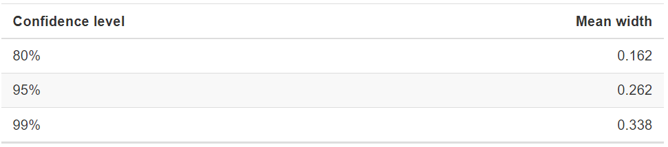
TABLE 5.2: Average width of 80, 95, and 99% confidence intervals
So in order to have a higher confidence level, our confidence intervals must be wider. Ideally, we would have both a high confidence level and narrow confidence intervals. However, we cannot have it both ways. If we want to be more confident, we need to allow for wider intervals. Conversely, if we would like a narrow interval, we must tolerate a lower confidence level.
The moral of the story is:
Higher confidence levels tend to produce wider confidence intervals.
When looking at Figure 5.29, it is important to keep in mind that we
kept the sample size fixed at \(n\) =
50. Thus, all \(10 \cdot 3 = 30\)
random samples from the bowl had the same sample size.
What happens if instead we took samples of different sizes? Recall that we did this in section 3 using virtual shovels with 25, 50, and 100 slots.
5.2 Impact of sample size
This time, let’s fix the confidence level at 95%, but consider three different sample sizes for \(n\): 25, 50, and 100. Specifically, we’ll first take 10 different random samples of size 25, 10 different random samples of size 50, and 10 different random samples of size 100. We’ll then construct 95% percentile-based confidence intervals for each sample. Finally, we’ll compare the widths of these intervals. We visualize the resulting 30 confidence intervals in Figure @ref(fig:reliable-percentile-n-25-50-100). Note also the vertical line marking the true value of \(p\) = 0.375.
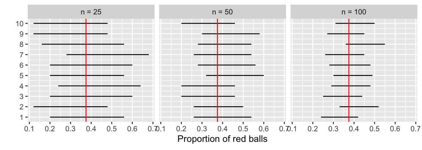 Figure 5.30 Ten 95% confidence intervals for \(p\) with \(n =
25, 50,\) and \(100\).
Figure 5.30 Ten 95% confidence intervals for \(p\) with \(n =
25, 50,\) and \(100\).
Observe that as the confidence intervals are constructed from larger and larger sample sizes, they tend to get narrower. Let’s compare the average widths in Table 5.3.
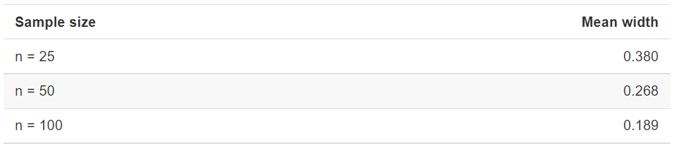 TABLE 5.3: Average width of
95% confidence intervals based on n= 25, 50, and 100
TABLE 5.3: Average width of
95% confidence intervals based on n= 25, 50, and 100
5.3 Moral of the Story
The moral of the story is: Larger sample sizes tend to produce narrower confidence intervals.
Recall that this was a key message in Subsection Module 3. As we used larger and larger shovels for our samples, the sample proportions red \(\widehat{p}\) tended to vary less.
In other words, our estimates got more and more precise.
Recall that we visualized these results in Figure 3.12, where we compared the sampling distributions for \(\widehat{p}\) based on samples of size \(n\) equal 25, 50, and 100. We also quantified the sampling variation of these sampling distributions using their standard deviation, which has that special name: the standard error.
So as the sample size increases, the standard error decreases.
In fact, the standard error is another related factor in determining confidence interval width. We’ll explore this fact when we discuss theory-based methods for constructing confidence intervals using mathematical formulas. Such methods are an alternative to the computer-based methods we’ve been using so far.
6 Case study: Is yawning contagious?
Let’s apply our knowledge of confidence intervals to answer the question: “Is yawning contagious?”. If you see someone else yawn, are you more likely to yawn? In an episode of the US show Mythbusters, the hosts conducted an experiment to answer this question. The episode is available to view on several streaming services.
6.1 Mythbusters study data
Fifty adult participants who thought they were being considered for
an appearance on the show were interviewed by a show recruiter. In the
interview, the recruiter either yawned or did not. Participants then sat
by themselves in a large van and were asked to wait. While in the van,
the Mythbusters team watched the participants using a hidden
camera to see if they yawned. The data frame containing the results of
their experiment is available in the mythbusters_yawn data
frame included in the moderndive package:
CC83
mythbusters_yawn## # A tibble: 50 × 3
## subj group yawn
## <int> <chr> <chr>
## 1 1 seed yes
## 2 2 control yes
## 3 3 seed no
## 4 4 seed yes
## 5 5 seed no
## 6 6 control no
## 7 7 seed yes
## 8 8 control no
## 9 9 control no
## 10 10 seed no
## # ℹ 40 more rowsThe variables are:
subj: The participant ID with values 1 through 50.group: A binary treatment variable indicating whether the participant was exposed to yawning."seed"indicates the participant was exposed to yawning while"control"indicates the participant was not.yawn: A binary response variable indicating whether the participant ultimately yawned.
Let’s use some data wrangling to obtain counts of the four possible outcomes:
CC85
mythbusters_yawn %>%
  group_by(group, yawn) %>%
  summarize(count = n())
## `summarise()` has regrouped the output.
## ℹ Summaries were computed grouped by group and yawn.
## ℹ Output is grouped by group.
## ℹ Use `summarise(.groups = "drop_last")` to silence this message.
## ℹ Use `summarise(.by = c(group, yawn))` for per-operation grouping
## (`?dplyr::dplyr_by`) instead.## # A tibble: 4 × 3
## # Groups: group [2]
## group yawn count
## <chr> <chr> <int>
## 1 control no 12
## 2 control yes 4
## 3 seed no 24
## 4 seed yes 10Let’s first focus on the "control" group participants
who were not exposed to yawning. 12 such participants did not yawn,
while 4 such participants did. So out of the 16 people who were not
exposed to yawning, 4/16 = 0.25 = 25% did yawn.
Let’s now focus on the "seed" group participants who
were exposed to yawning where 24 such participants did not yawn, while
10 such participants did yawn. So out of the 34 people who were exposed
to yawning, 10/34 = 0.294 = 29.4% did yawn. Comparing these two
percentages, the participants who were exposed to yawning yawned 29.4% -
25% = 4.4% more often than those who were not.
But this sample of just 50 people did not provide sufficient evidence to produce a statistically significant result. So the test was run again. Here is a link to a short video on the retest Is Yawning Contagious Second Test
6.2 Sampling scenario
Let’s review the terminology and notation related to sampling we studied in Subsection @ref(terminology-and-notation). In Module 3 our study population was the bowl of \(N\) = 2400 balls.
Our population parameter of interest was the population proportion of these balls that were red, denoted mathematically by \(p\). In order to estimate \(p\), we extracted a sample of 50 balls using the shovel and computed the relevant point estimate: the sample proportion that were red, denoted mathematically by \(\widehat{p}\).
Who is the study population here? All humans? All the people who watch the show Mythbusters? It’s hard to say! This question can only be answered if we know how the show’s hosts recruited participants! In other words, what was the sampling methodology used by the Mythbusters to recruit participants? We alas are not provided with this information. Only for the purposes of this case study, however, we’ll assume that the 50 participants are a representative sample of all Americans given the popularity of this show. Thus, we’ll be assuming that any results of this experiment will generalize to all \(N\) = 327 million Americans (2018 population).
Just like with our sampling bowl, the population parameter here will involve proportions. However, in this case it will be the difference in population proportions \(p_{seed} - p_{control}\), where \(p_{seed}\) is the proportion of all Americans who if exposed to yawning will yawn themselves, and \(p_{control}\) is the proportion of all Americans who if not exposed to yawning still yawn themselves. Correspondingly, the point estimate/sample statistic based the Mythbusters’ sample of participants will be the difference in sample proportions \(\widehat{p}_{seed} - \widehat{p}_{control}\). Let’s extend Table 5.3 of scenarios of sampling for inference to include our latest scenario.
 TABLE 5.4: Scenarios of
sampling for inference
TABLE 5.4: Scenarios of
sampling for inference
This is known as a two-sample inference situation since we have two separate samples. Based on their two-samples of size \(n_{seed}\) = 34 and \(n_{control}\) = 16, the point estimate is
\[ \widehat{p}_{seed} - \widehat{p}_{control} = \frac{24}{34} - \frac{12}{16} = 0.04411765 \approx 4.4\% \]
However, say the Mythbusters repeated this experiment. In other words, say they recruited 50 new participants and exposed 34 of them to yawning and 16 not. Would they obtain the exact same estimated difference of 4.4%? Probably not, again, because of sampling variation.
How does this sampling variation affect their estimate of 4.4%? In other words, what would be a plausible range of values for this difference that accounts for this sampling variation? We can answer this question with confidence intervals! Furthermore, since the Mythbusters only have a single two-sample of 50 participants, they would have to construct a 95% confidence interval for \(p_{seed} - p_{control}\) using bootstrap resampling with replacement.
We make a couple of important notes. First, for the comparison
between the "seed" and "control" groups to
make sense, however, both groups need to be independent from
each other. Otherwise, they could influence each other’s results. This
means that a participant being selected for the "seed" or
"control" group has no influence on another participant
being assigned to one of the two groups. As an example, if there were a
mother and her child as participants in the study, they wouldn’t
necessarily be in the same group. They would each be assigned randomly
to one of the two groups of the explanatory variable.
Second, the order of the subtraction in the difference doesn’t matter so long as you are consistent and tailor your interpretations accordingly. In other words, using a point estimate of \(\widehat{p}_{seed} - \widehat{p}_{control}\) or \(\widehat{p}_{control} - \widehat{p}_{seed}\) does not make a material difference, you just need to stay consistent and interpret your results accordingly.
6.3 Constructing the confidence interval
Let’s first construct the bootstrap distribution for \(\widehat{p}_{seed} -
\widehat{p}_{control}\) and then use this to construct 95%
confidence intervals for \(p_{seed} -
p_{control}\). We’ll do this using the infer
workflow again. However, since the difference in proportions is a new
scenario for inference, we’ll need to use some new arguments in the
infer functions along the way.
1. specify variables
Let’s take our mythbusters_yawn data frame and
specify() which variables are of interest using the
y ~ x formula interface where:
- Our response variable is
yawn: whether or not a participant yawned. It has levels"yes"and"no". - The explanatory variable is
group: whether or not a participant was exposed to yawning. It has levels"seed"(exposed to yawning) and"control"(not exposed to yawning). And we need to tell R we are interested in success being yes.
CC87
mythbusters_yawn %>%
  specify(formula = yawn ~ group, success = "yes")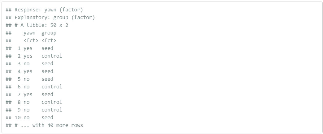
2. generate replicates
Our next step is to perform bootstrap resampling with replacement like we did with the slips of paper in our pennies activity. We saw how it works with both a single variable in computing bootstrap means and in computing bootstrap proportions, but we haven’t yet worked with bootstrapping involving multiple variables.
In the infer package, bootstrapping with multiple
variables means that each row is potentially resampled. Let’s
investigate this by focusing only on the first six rows of
mythbusters_yawn:
CC88
first_six_rows <- head(mythbusters_yawn)
first_six_rows
When we bootstrap this data, we are potentially pulling the subject’s
readings multiple times. Thus, we could see the entries of
"seed" for group and "no" for
yawn together in a new row in a bootstrap sample. This is
further seen by exploring the sample_n() function in
dplyr on this smaller 6-row data frame comprised of
head(mythbusters_yawn). The sample_n()
function can perform this bootstrapping procedure and is similar to the
rep_sample_n() function in infer, except that
it is not repeated, but rather only performs one sample with or without
replacement.
CC89
first_six_rows %>%
  sample_n(size = 6, replace = TRUE)
We can see that in this bootstrap sample generated from the first six
rows of mythbusters_yawn, we have some rows repeated. The
same is true when we perform the generate() step in
infer as done in what follows. Using this fact, we
generate 1000 replicates, or, in other words, we bootstrap
resample the 50 participants with replacement 1000 times.
CC90
mythbusters_yawn %>%
  specify(formula = yawn ~ group, success = "yes") %>%
  generate(reps = 1000, type = "bootstrap")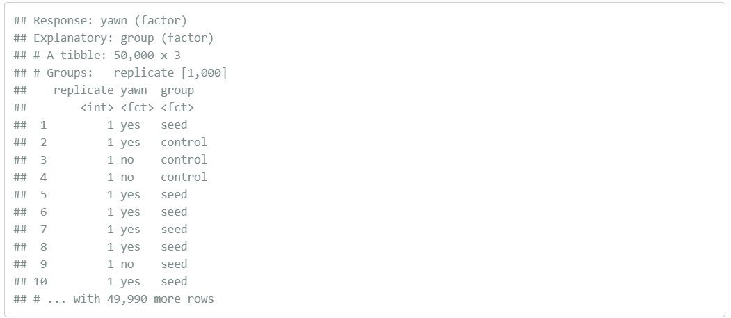
Observe that the resulting data frame has 50,000 rows. This is
because we performed resampling of 50 participants with replacement 1000
times and 50,000 = 1000 * 50. The variable replicate
indicates which resample each row belongs to. So it has the value
1 50 times, the value 2 50 times, all the way
through to the value 1000 50 times.
3. calculate summary statistics
After we generate() many replicates of bootstrap
resampling with replacement, we next want to summarize the bootstrap
resamples of size 50 with a single summary statistic, the difference in
proportions. We do this by setting the stat argument to
"diff in props":
We need to specify the order of the subtraction. Is it \(\widehat{p}_{seed} -
\widehat{p}_{control}\) or \(\widehat{p}_{control} -
\widehat{p}_{seed}\). We specify it to be \(\widehat{p}_{seed} -
\widehat{p}_{control}\) by setting
order = c("seed", "control"). Note that you could’ve also
set order = c("control", "seed"). As we stated earlier, the
order of the subtraction does not matter, so long as you stay consistent
throughout your analysis and tailor your interpretations
accordingly.
Let’s save the output in a data frame
bootstrap_distribution_yawning:
CC92
bootstrap_distribution_yawning <- mythbusters_yawn %>%
  specify(formula = yawn ~ group, success = "yes") %>%
  generate(reps = 1000, type = "bootstrap") %>%
  calculate(stat = "diff in props", order = c("seed", "control"))
bootstrap_distribution_yawning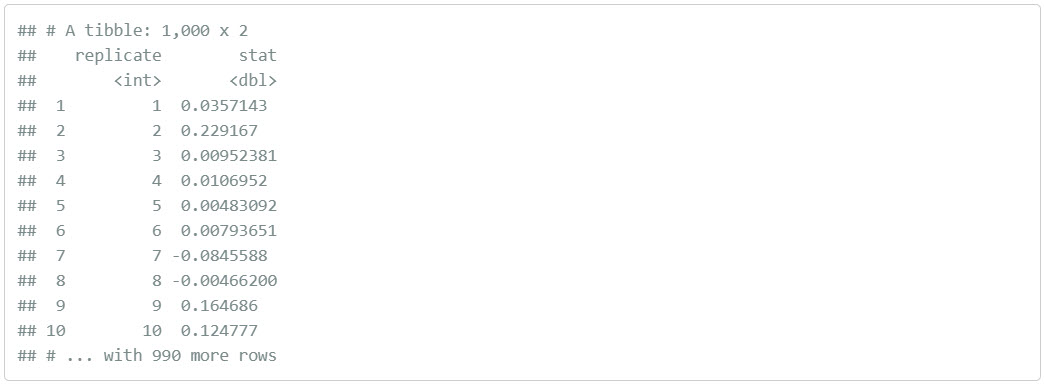
Observe that the resulting data frame has 1000 rows and 2 columns
corresponding to the 1000 replicate ID’s and the 1000
differences in proportions for each bootstrap resample in
stat.
4. visualize the results
Earlier we visualize() the resulting bootstrap
resampling distribution. Let’s also add a vertical line at 0 by adding a
geom_vline() layer.
CC94
visualize(bootstrap_distribution_yawning) +
  geom_vline(xintercept = 0)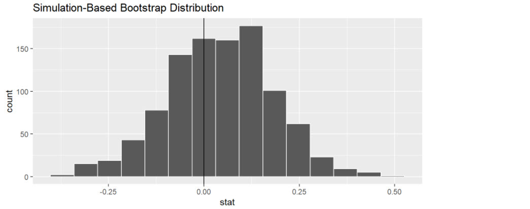
Fig 5.31 Bootstrap Distribution
First, let’s compute the 95% confidence interval for \(p_{seed} - p_{control}\) using the percentile method, in other words, by identifying the 2.5th and 97.5th percentiles which include the middle 95% of values. Recall that this method does not require the bootstrap distribution to be normally shaped.
CC96
bootstrap_distribution_yawning %>%
  get_confidence_interval(type = "percentile", level = 0.95)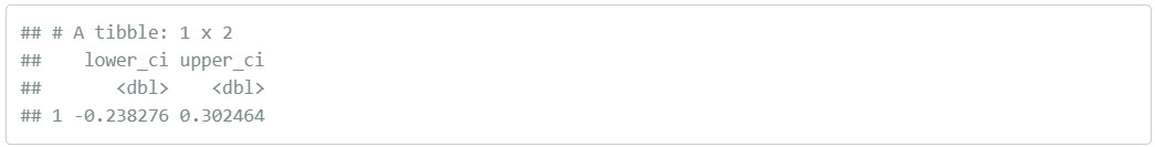
Second, since the bootstrap distribution is roughly bell-shaped, we
can construct a confidence interval using the standard error method as
well. Recall that to construct a confidence interval using the standard
error method, we need to specify the center of the interval using the
point_estimate argument. In our case, we need to set it to
be the difference in sample proportions of 4.4% that the
Mythbusters observed.
We can also use the infer workflow to compute this value
by excluding the generate() 1000 bootstrap replicates step.
In other words, do not generate replicates, but rather use only the
original sample data. We can achieve this by commenting out the
generate() line, telling R to ignore it:
CC98
obs_diff_in_props <- mythbusters_yawn %>%
  specify(formula = yawn ~ group, success = "yes") %>%
  # generate(reps = 1000, type = "bootstrap") %>%
  calculate(stat = "diff in props", order = c("seed", "control"))
obs_diff_in_props
We thus plug this value in as the point_estimate
argument.
CC99
myth_ci_se <- bootstrap_distribution_yawning %>%
  get_confidence_interval(type = "se", point_estimate = obs_diff_in_props)
myth_ci_se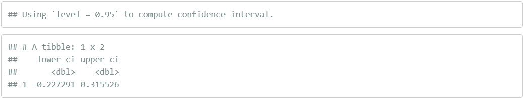
Let’s visualize both confidence intervals in Figure 5.32, with the percentile-method interval marked with black lines and the standard-error-method marked with grey lines. Observe that they are both similar to each other.
Note again this is a complicated graphic whose code you do not have to worry about.
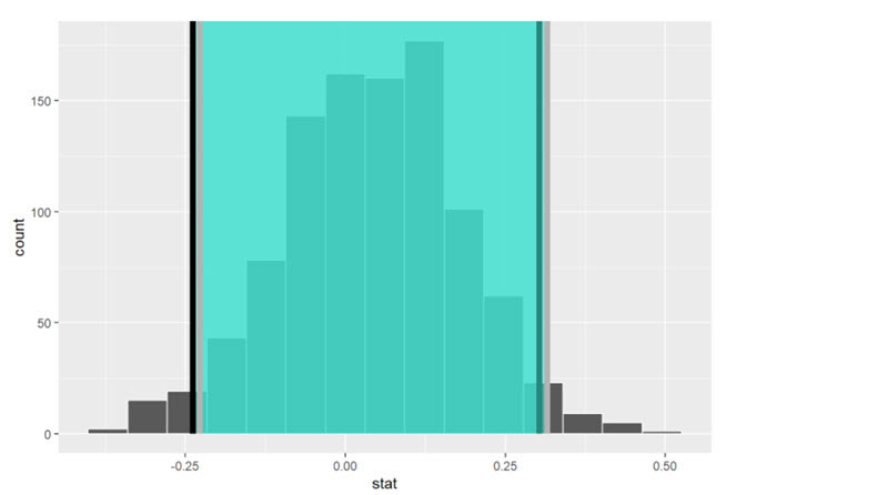
FIGURE 5.32: Two 95% confidence intervals: percentile method (black) and standard error method (grey).
6.4 Interpreting the confidence interval
Given that both confidence intervals are quite similar, let’s focus our interpretation to only the percentile-method confidence interval of (- 0.2383, 0.3025).
Recall that the precise statistical interpretation of a 95% confidence interval is: if this construction procedure is repeated 100 times, then we expect about 95 of the confidence intervals to capture the true value of \(p_{seed} - p_{control}\).
In other words, if we gathered 100 samples of \(n\) = 50 participants from a similar pool of people and constructed 100 confidence intervals each based on each of the 100 samples, about 95 of them will contain the true value of \(p_{seed} - p_{control}\) while about five won’t.
Given that this is a little long winded, we use the shorthand interpretation: we’re 95% “confident” that the true difference in proportions \(p_{seed} - p_{control}\) is between (- 0.2383, 0.3025).
There is one value of particular interest that this 95% confidence interval contains: zero.
If \(p_{seed} - p_{control}\) were equal to 0, then there would be no difference in proportion yawning between the two groups. This would suggest that there is no associated effect of being exposed to a yawning recruiter on whether you yawn yourself.
In our case, since the 95% confidence interval includes 0, we cannot conclusively say if either proportion is larger.
Of our 1000 bootstrap resamples with replacement, sometimes \(\widehat{p}_{seed}\) was higher and thus those exposed to yawning yawned themselves more often. At other times, the reverse happened.
Say, on the other hand, the 95% confidence interval was entirely above zero. This would suggest that \(p_{seed} - p_{control} > 0\).
Or, in other words, \(p_{seed} > p_{control}\), and thus we’d have evidence suggesting those exposed to yawning do yawn more often.
7 Conclusion
7.1 Comparing bootstrap and sampling distributions
Let’s talk more about the relationship between sampling distributions and bootstrap distributions.
Recall from our earlier discussion, we took 1000 virtual samples from
the bowl using a virtual shovel, computed 1000 values of
the sample proportion red \(\widehat{p}\), then visualized their
distribution in a histogram.
Recall that this distribution is called the sampling distribution of \(\widehat{p}\). Furthermore, the standard deviation of the sampling distribution has a special name: the standard error.
We also mentioned that this sampling activity does not reflect how
sampling is done in real life. Rather, it was an idealized
version of sampling so that we could study the effects of sampling
variation on estimates, like the proportion of the shovel’s balls that
are red.
In real life, however, one would take a single sample that’s as large as
possible, much like in the Obama poll we saw earlier. But how can we get
a sense of the effect of sampling variation on estimates if we only have
one sample and thus only one estimate? Don’t we need many samples and
hence many estimates?
The workaround to having a single sample was to perform bootstrap resampling with replacement from the single sample. We did this in the resampling activity where we focused on the mean year of minting of pennies. We used pieces of paper representing the original sample of 50 pennies from the bank and resampled them with replacement from a hat. We had 35 of our friends perform this activity and visualized the resulting 35 sample means \(\overline{x}\) in a histogram in Figure 5.32.
This distribution was called the bootstrap distribution of \(\overline{x}\). We stated at the time that the bootstrap distribution is an approximation to the sampling distribution of \(\overline{x}\) in the sense that both distributions will have a similar shape and similar spread. Thus the standard error of the bootstrap distribution can be used as an approximation to the standard error of the sampling distribution.
Let’s show you that this is the case by now comparing these two types of distributions. Specifically, we’ll compare
- the sampling distribution of \(\widehat{p}\) based on 1000 virtual samples
from the
bowlto - the bootstrap distribution of \(\widehat{p}\) based on 1000 virtual
resamples with replacement from Ilyas and Yohan’s single sample
bowl_sample_1.
7.2 Sampling distribution
Here is the code chunk used to construct the sampling distribution of \(\widehat{p}\) shown again in Figure 5.33, with some changes to incorporate the statistical terminology relating to sampling from Module 3. Note that it is really 3 chunks put together and is just what we did earlier in one chunk. Note we have put the comment symbol # in to break out the three pieces more clearly
CC102
# Take 1000 virtual samples of size 50 from the bowl:
virtual_samples <- bowl %>%
  rep_sample_n(size = 50, reps = 1000)
# Compute the sampling distribution of 1000 values of p-hat
sampling_distribution <- virtual_samples %>%
  group_by(replicate) %>%
  summarize(red = sum(color == "red")) %>%
  mutate(prop_red = red / 50)
# Visualize sampling distribution of p-hat
ggplot(sampling_distribution, aes(x = prop_red)) +
  geom_histogram(binwidth = 0.05, boundary = 0.4, color = "white") +
  labs(x = "Proportion of 50 balls that were red",
       title = "Sampling distribution")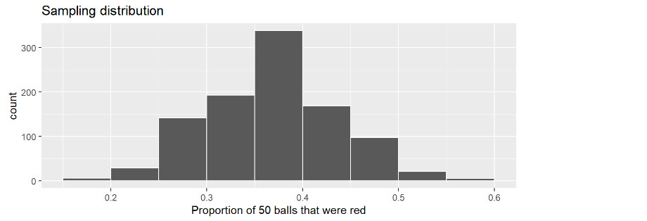
FIGURE 5.33: Previously seen sampling distribution of sample proportion red for n = 1000.
An important thing to keep in mind is the default value for
replace is FALSE when using
rep_sample_n(). This is because when sampling 50 balls with
a shovel, we are extracting `50 balls one-by-one without
replacing them. This is in contrast to bootstrap resampling
with replacement, where we resample a ball and put it back, and
repeat this process 50 times.
Let’s quantify the variability in this sampling distribution by
calculating the standard deviation of the prop_red variable
representing 1000 values of the sample proportion \(\widehat{p}\). Remember that the standard
deviation of the sampling distribution is the standard error,
frequently denoted as se.
CC103
sampling_distribution %>% summarize(se = sd(prop_red))7.3 Bootstrap distribution
Here is the code you previously saw earlier to construct the
bootstrap distribution of \(\widehat{p}\) based on Ilyas and Yohan’s
original sample of 50 balls saved in bowl_sample_1.
CC106
bootstrap_distribution <- bowl_sample_1 %>%
  specify(response = color, success = "red") %>%
  generate(reps = 1000, type = "bootstrap") %>%
  calculate(stat = "prop")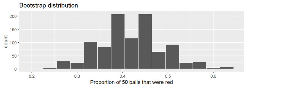
FIGURE 5.34: Bootstrap distribution of proportion red for n = 1000.
CC109
bootstrap_distribution %>% summarize(se = sd(stat))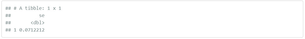
7.4 Comparison
Now that we have computed both the sampling distribution and the bootstrap distributions, let’s compare them side-by-side in Figure 5.35. We’ll make both histograms have matching scales on the x- and y-axes to make them more comparable. Furthermore, we’ll add:
- To the sampling distribution on the top: a solid line denoting the proportion of the bowl’s balls that are red \(p\) = 0.375.
- To the bootstrap distribution on the bottom: a dashed line at the sample proportion \(\widehat{p}\) = 21/50 = 0.42 = 42% that Ilyas and Yohan observed.
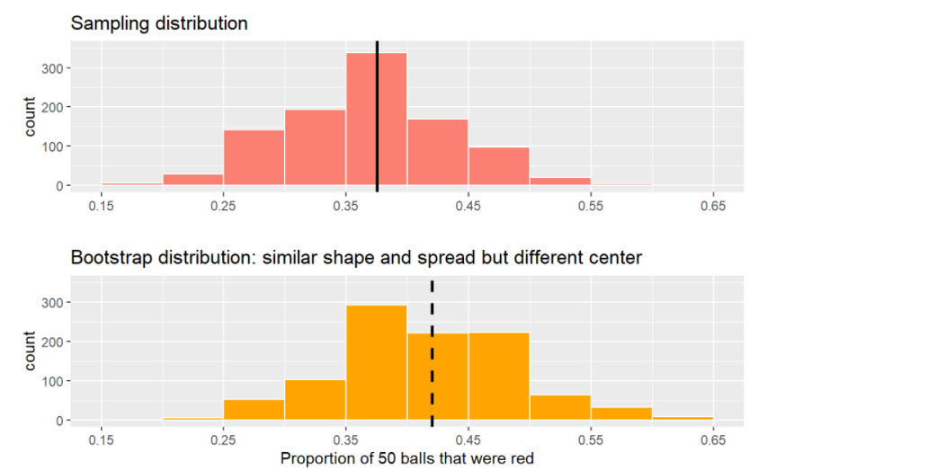
FIGURE 5.35: Comparing the sampling and bootstrap distributions of \(p-hat\)
There is a lot going on in Figure 5.35, so let’s break down all the comparisons slowly. First, observe how the sampling distribution on top is centered at \(p\) = 0.375. This is because the sampling is done at random and in an unbiased fashion. So the estimates \(\widehat{p}\) are centered at the true value of \(p\).
However, this is not the case with the following bootstrap distribution. The bootstrap distribution is centered at 0.42, which is the proportion red of Ilyas and Yohan’s 50 sampled balls. This is because we are resampling from the same sample over and over again. Since the bootstrap distribution is centered at the original sample’s proportion, it doesn’t necessarily provide a better estimate of \(p\) = 0.375. This leads us to our first lesson about bootstrapping:
The bootstrap distribution will likely not have the same center as the sampling distribution.
In other words, bootstrapping cannot improve the quality of an estimate.
Second, let’s now compare the spread of the two distributions: they are somewhat similar. In the previous code, we computed the standard deviations of both distributions as well. Recall that such standard deviations have a special name: standard errors. Let’s compare them in Table 5.5.
TABLE 5.5: Comparing standard errors
Notice that the bootstrap distribution’s standard error is a rather good approximation to the sampling distribution’s standard error. This leads us to our second lesson about bootstrapping:
Even if the bootstrap distribution might not have the same center as the sampling distribution, it will likely have very similar shape and spread. In other words, bootstrapping will give you a good estimate of the standard error.
Thus, using the fact that the bootstrap distribution and sampling distributions have similar spreads, we can build confidence intervals using bootstrapping as we’ve done all throughout this chapter!
Lab Assignment Submission
Important
When you are ready to create your final lab report, save the Lab-05-Rehearse1-Worksheet.Rmd lab file and then Knit it to PDF or Word to make a reproducible file. This image shows you how to select the knit document file type.
Note that if you have difficulty getting the documents to Knit to either Word or PDF, and you cannot fix it, just save the completed worksheet and submit your .Rmd file.
Ask your instructor to help you sort out the issues if you have time.
Submit your file in the Canvas M5.2 Lab 5 Rehearse(s): Estimation and Confidence Intervals assignment area.
The Lab 5 Inference: Estimation and Confidence Intervals Grading Rubric will be used.

Congrats! You have finished Rehearse 1 of Lab 5. Now go to Rehearse 2!
 Previous:Lab 5 Overview

This
work was created by Dawn Wright and is licensed under a
Creative
Commons Attribution-ShareAlike 4.0 International License.
Date 4/2/26
Last Compiled 2026-04-02