Lab 4 Rehearse 1: Correlation
Exploring Relationships with Data
Lab 4 Rehearse 1 Correlation
Attribution: This lab is an adaptation of Chapter 3 of Answering questions with data Lab Manual by Matt Crump and his team.
Lab 04 Set Up
Posit Cloud Set Up
Just as in Lab 1, 2 and 3, you will need to follow this link to set up Lab 4 in your Posit Cloud workspace: Link to Set up Lab 4 Relationships
 Important
Remember to save the “temp” workspace as “permanent.”
Important
Remember to save the “temp” workspace as “permanent.”
After you have set up Lab 4 using the link above, do not use that link again as it may reset your work. The set up link loads fresh copies of the required files and they could replace the files you have worked on.
Instead use this link to go to Posit Cloud: Link to Continue work on Lab 4
RStudio Desktop Setup
Link to download the Lab 4 materials to RStudio Desktop https://github.com/DrDawn/BUS231_Project_Files/raw/main/Lab4.zip
Note that you will do all your work for this Correlation Rehearse in the Lab-4-Rehearse 1 worksheet, so click on that to open it in the Editor window in your Posit Cloud Lab 04 Relationshipsspace.
Intro to Correlation
If … we choose a group of social phenomena with no antecedent knowledge of the causation or absence of causation among them, then the calculation of correlation coefficients, total or partial, will not advance us a step toward evaluating the importance of the causes at work.
—Sir Ronald Fisher
In the textbook, we have been discussing the idea of correlation. This is the idea that two things that we measure can be somehow related to one another. For example, your personal happiness, which we could try to measure say with a questionnaire, might be related to other things in your life that we could also measure, such as number of close friends, yearly salary, how much chocolate you have in your bedroom, or how many times you have said the word Nintendo in your life. Some of the relationships that we can measure are meaningful, and might reflect a causal relationship where one thing causes a change in another thing. Some of the relationships are spurious, and do not reflect a causal relationship.
In this lab, you will learn how to compute correlations between two variables in R code, and then ask some questions about the correlations that you observe.
General Goals
- Compute Pearson’s correlation coefficient r between two variables using R code.
- Discuss the possible meaning of correlations that you observe.
Data Source
We use data from the World Happiness Report. The data file WHR2018v2.csv is in the data folder in your work space for this lab.
Load Libraries
 CC1 = Code Chunk 1
The green run-button tells you to Copy/Paste/Run the code chunks in your lab worksheet!
library(tidyverse)
# includes packages ggplot2, dyplr and several others
In this lab, we will use R to explore correlations between two quantitative (numerical) variables. We will let R calculate the correlation coefficient r between the two variables. Then we will create a scatter chart displaying the data points, and plot a “best-fit” straight line through the data.
Important
Remember it is easy to find explanations/how-to’s for R functions. For example, to see how the data.frame function works just Google “how does the data.frame function work in R?” Here is the first link we found for data.frame [note - we are not endorsing this site, but it worked for us] : https://www.tutorialspoint.com/r/r_data_frames.htm
The correlation function cor()
R has the cor function for computing Pearson’s
r between any two numerical variables. In
fact, this same function computes other versions of correlation, but
we’ll skip those here.
We begin by creating two numerical variables which we will name “x” and “y”. After you run the next code chunk CC2 you will see the x and y variables in your Environment.
CC2
# create the x and y variables using the assignment `<-` and combine `c()` functions
x  <- c(1,3,2,5,4,6,5,8,9)
y  <- c(6,5,8,7,9,7,8,10,13)

# calculate the correlation coefficient r using cor(x,y)
# and then using the `round`function to round the
# result to two digits.
# Then assign the results to a new data object `r`
r <- round(cor(x,y), digits=4)

# show the value of the new data object `r` which is the
# correlation coefficient of the two variables x and y
r
[1] 0.7654Well, that was easy. We got a correlation coefficient r of 0.77.
Reflection Question

What do you think the correlation coefficient of 0.77 tells us about the relationship between the two variables?
Your answer here:
Scatterplots
Let’s take our simple example, and plot the data in a scatter plot
using the package ggplot2 which is loaded as part of the
larger package tidyverse`. And let’s also return the
correlation r and print it on the scatter
plot.
 Remember
ggplot2 needs the data in a data.frame, so we first put
our x and y variables in a data frame. Remember a data frame is like an
Excel spreadsheet.
CC3
# create data frame for plotting
my_df <- data.frame(x,y)

# using the `my_df` data frame, plot the x  variable on the x axis; the y variable on the y axis.
ggplot(my_df, aes(x=x,y=y))+
  # plot the xy data pairs as points
  geom_point()+
  # add a "best fit" linear trend line to show the slope
  geom_smooth(method=lm, se=FALSE)+
  # add label containing r to specific x and y coordinates
  # on the graph.
  geom_text(aes(label="Correlation r = ", x = 1.7, y = 12.5))+
  # add a lable which shows the correlation coefficient r
  geom_text(aes(label = round(cor(x,y), digits=4), x=3.0, y=12.5 ))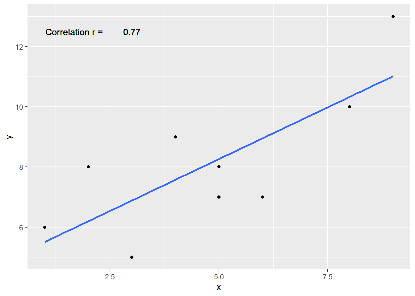
There is a bit of a pattern showing y increases when x increases. That’s known as a positive slope which is indicated by r having a value greater than 0. The correlation coefficient must fall in the limits of 0 to 1 for a positive slope and 0 to -1 for a negative slope.
Lots of scatterplots
Before we move on to real data, let’s look at some fake data first. Often we will have many measures of X and Y, split between a few different conditions. For example, A, B, C, and D. Let’s make some fake data for X and Y, for each condition A, B, C, and D, and then use facet_wrapping to look at four scatter plots all at once.
We will use the rnorm() function which is a random
number generator. That means ever time it is run, it will generate a
different set of values. We can control that by using a
set.seed() to provide a consistent starting value so that
we get the same output each time.
To use the set.seed function, just put a number inside the (),
e.g. set.seed(123).
CC4
 # Set the random number seed to a fixed value
set.seed(123)

 # Create two variables from normal distributions using the
 # `rnorm` function. the arguments in the () are the number
 # of values we want, 40; the mean of the distribution, 0;
 # and the standard deviation of the distribution, 1.
x<-rnorm(40,0,1)
y<-rnorm(40,0,1)

 # Create another variable `conditions` using using the
 # combine function which is repeated 10 times
 # with the rep function.
conditions<-rep(c("A","B","C","D"), each=10)

 # create new data frame named `all_data` using the three
 # variables
all_df <- data.frame(conditions, x, y)

 # Plot the `all_df` data frame using ggplot
 # use the `aes` function to set the x and y axis variables
ggplot(all_df, aes(x=x,y=y))+
  # make scatter plot aka "point" plot using `geom_point` function
  geom_point()+
   # Add a "best fit" line to show the slope using the
   # `geom_smooth` function
   # The `method` argument we want is a linear model `lm`
   # we do not need to see the confidence interval yet,
   # so we set `se=FALSE`
  geom_smooth(method=lm, se=FALSE)+
   # Using the `facet_wrap` function, make smaller plots,
   # one for each level of the `conditions` variable
  facet_wrap(~conditions)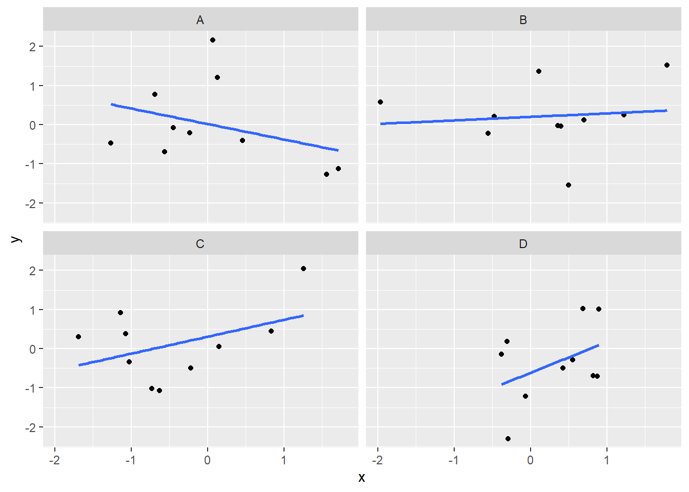
Computing the correlations all at once
We’ve seen how we can make four graphs at once. Facet_wrap will always try to make as many graphs as there are individual conditions in the column variable. In this case, there are four, so it makes four.
Notice, the scatter plots don’t show the correlation (r) values.
Getting these numbers on there is possible, but the plot would get busy.
Instead, what we will do is make a table of the correlations in addition
to the scatter plot. We again use the package
dplyr, which was installed as part of `tidyverse` to do
this:
CC5
library(dplyr)

all_df %>%
  group_by(conditions) %>%
  summarise("Correlation r" = round(cor(x,y), digits=4))
# A tibble: 4 × 2
conditions `Correlation r`
<chr> <dbl>
1 A -0.349
2 B 0.109
3 C 0.43
4 D 0.418OK, we are basically ready to turn to some real data and ask if there are correlations between interesting variables…You will find that there are some… But before we do that, we do one more thing. This will help you become a little bit more skeptical of these “correlations”.
Chance correlations
As you learned from the textbook. We can find correlations by chance alone, even when there is no true correlation between the variables. For example, if we sampled randomly into x, and then sampled some numbers randomly into y. We know they aren’t related, because we randomly sampled the numbers. However, doing this creates some correlations some of the time just by chance.
You can demonstrate this to yourself with the following code. It’s a repeat of what we already saw, just with a few more conditions added. Let’s look at 20 conditions, with random numbers for x and y in each. For each, sample size will be 10. We’ll make the fake (i.e. random) data, then make a big graph to look at all. And, even though we get to regression later in the lab, I’ll put the best fit line onto each scatter plot, so you can “see the correlations”.
CC6
# Use set.seed to give repeatable results for the random
# variables created using `rnorm()`
set.seed(123)

# Create three variables: x, y, and conditions
x<-rnorm(10*20,0,1) #creates 10 sets of 20 - just makes 200, random values of x
y<-rnorm(10*20,0,1)  #creates 10 sets of 20 - just makes 200, random values of y
conditions<-rep(1:20, each=10) #creates 10 sets of numbers of 10 copies of 1 thru 20

# You can see the three variables in the Values section in the Environment

all_df <- data.frame(conditions, x, y) #creates a df of the three variables of equal length. Inspect it by clicking on the name in the Environment

ggplot(all_df, aes(x=x,y=y))+
  geom_point()+
  geom_smooth(method=lm, se=FALSE)+
  facet_wrap(~conditions)+
  theme_classic()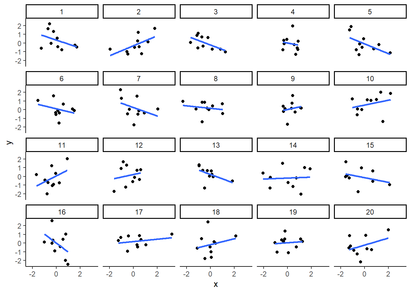
You can see that the slope of the blue line is not always flat. Sometimes it looks like there is a correlation, when we know there shouldn’t be. You can keep re-doing this graph, by re-knitting your R Markdown document, or by pressing the little green play button. This is basically you simulating the outcomes as many times as you press the button.
The point is, now you know you can find correlations by chance.
So, in the next section, you should always wonder if the correlations you find reflect meaningful association between the x and y variable, or could have just occurred by chance.
Reflection Question
Does a strong correlation coefficient tell us that one of the
variables is caused by the other variable?
Answer the question and explain your thinking.
Your answer here:
World Happiness Report (WHR)
Let’s take a look at some correlations in real data. We are going to look at responses to a questionnaire about happiness that was sent around the world, from the world happiness report
Load the data
Next, load the WHR data into the work session and save it in a data
frame we will call whr_data.
Reminder, the data file WHR2018v2.csv is in the data folder in your Posit Cloud workspace.
CC7
# this line of code reads the data file and stores a copy in a new
# data object `whr_data`

whr_data <- read_csv('./data/WHR2018v2.csv')
Look at the data.
You should see the data frame whr_data in your
Environment window. There should be a summary which indicates there are
14 variables with 1562 observations of them.
There are a number of ways to explore the data, including some which will calculate summary statistics and display small histograms of numeric data. (See optional CC8 below)
For our purposes the easiest is to just “click” on the name in the Environment which will open the data object in the Source window and display it as a “spreadsheet” like Excel.
You should be able to see that there is data for many different countries (164 of them), across a few different years (13). There are lots of different kinds of measures, and each is given a name.
The following optional code chunk 8 loads the
summarytools package and creates a “view” of the data that
contains a lot of information about the data set. Typically, this view
opens in the Viewer in the Files window. Or, it may open in your
browser. But it will not show up in your knitted document.
Note: we have commented out the code so it does not run by default. If you want to run it, just delete the hash marks #. But again, this is not required.
CC8
#library(summarytools)
#view(dfSummary(whr_data))
Next, let’s see some examples of asking questions about correlations with this data.
Correlation Example 1
For the year 2017 only, does a country’s measure for Freedom_to_make_life_choices correlate with that country’s measure for Confidence_in_national_government?
Let’s find out. We will begin by first calculating the correlation for all the data in the whr_data object, and then we will make the scatter plot. We will filter the data for just the year 2017 in a later chunk.
CC9
## CC9a
# this section of code finds the correlation coefficient r
# between our two numeric variables and
# assigns it to a new data object r

r <- cor(whr_data$Freedom_to_make_life_choices,
    whr_data$Confidence_in_national_government)

# this section of code plots the data and displays the value of r

ggplot(whr_data,
       aes(x=Freedom_to_make_life_choices,
                     y=Confidence_in_national_government))+
       geom_point()+
       theme_classic()
Warning: Removed 167 rows containing missing values or values outside the scale range
(`geom_point()`).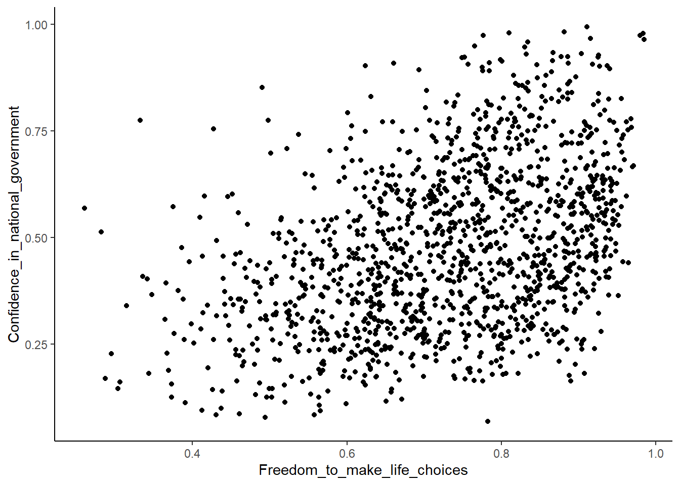
#CC9b
r
[1] NAInteresting, what happened here? We can see some dots, but the correlation r shows a value of NA (meaning undefined). And there is a warning that a lot of rows/observations were removed.
This occurred because there are some missing data points in the data.
We can use the function filter to remove all the rows with
NAs in our two chosen variables.
 This blog has good examples of how to
use the filter function to get what you want: Filtering Data with dplyr
This blog has good examples of how to
use the filter function to get what you want: Filtering Data with dplyr
CC10
library(dplyr)

# this sections filters the `whr_data` dataset and assigns the result to
# a new data object `smaller_df`
smaller_df <- whr_data %>%
              filter(!is.na(Freedom_to_make_life_choices),
                      !is.na(Confidence_in_national_government))

# this section of code finds the value of the correlation coefficient
# and assigns it to the data object r

r <- cor(smaller_df$Freedom_to_make_life_choices,
    smaller_df$Confidence_in_national_government)

# this plots the data in `smaller_df` and displays it and r in the graph

ggplot(smaller_df,
       aes(x=Freedom_to_make_life_choices,
           y=Confidence_in_national_government))+
  geom_point()+
  theme_classic()+
 # this section places the value of r on the graph in
  # the upper left corner
  annotate("text",
           x = min(smaller_df$Freedom_to_make_life_choices),
           y = max(smaller_df$Confidence_in_national_government),
           label = paste("Correlation r =", round(r, 3)),
           # you can use the hjust and vjust to fine tune the
              # positon of the text
           hjust = 0.0, vjust = 0.0)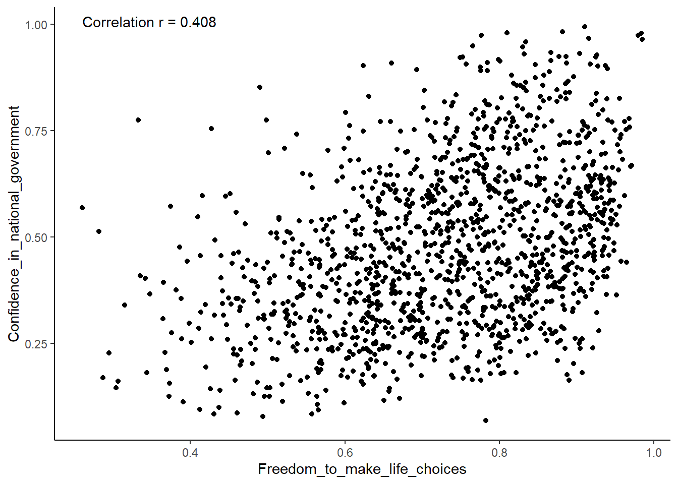
Although the scatter plot shows the dots are everywhere, it generally shows that as Freedom_to_make_life_choices increases in a country, that country’s Confidence_in_national_government also increases.
The correlation coefficient r is 0.408.
This is a positive correlation.
Let’s do this again and add the best fit line, so the trend is more
clear, we use geom_smooth(method=lm, se=FALSE).
And now let’s add a filter to just use the data for the year 2017.
Hint
What do the two parameters we give the function geom_smooth do?
“method=lm” gives us a straight line. “se=FALSE” tells ggplot to not show the confidence interval (standard error method) around to the line to reduce clutter.
We also change the alpha value of the dots so they blend
it bit, and you can see more of them.
CC11
# create a new data object `smaller_df` to contain the filtered WHR data
smaller_df <- whr_data %>%
  # filter for the year variable = 2017
               filter(year == 2017) %>%

  # filter out any values that are missing/NA
               filter(!is.na(Freedom_to_make_life_choices),
               !is.na(Confidence_in_national_government))

# calculate correlation coefficient r

r <- cor(smaller_df$Freedom_to_make_life_choices,
    smaller_df$Confidence_in_national_government)

# plot the new dataframe "smaller_df" with best fit line

ggplot(smaller_df, aes(x=Freedom_to_make_life_choices,
                     y=Confidence_in_national_government))+
  geom_point(alpha=.5)+
  geom_smooth(method=lm, se=FALSE)+
  theme_classic()+
  annotate("text",
           x = min(smaller_df$Freedom_to_make_life_choices),
           y = max(smaller_df$Confidence_in_national_government),
           label = paste("Correlation r =", round(r, 3)),
           hjust = 0, vjust = 0)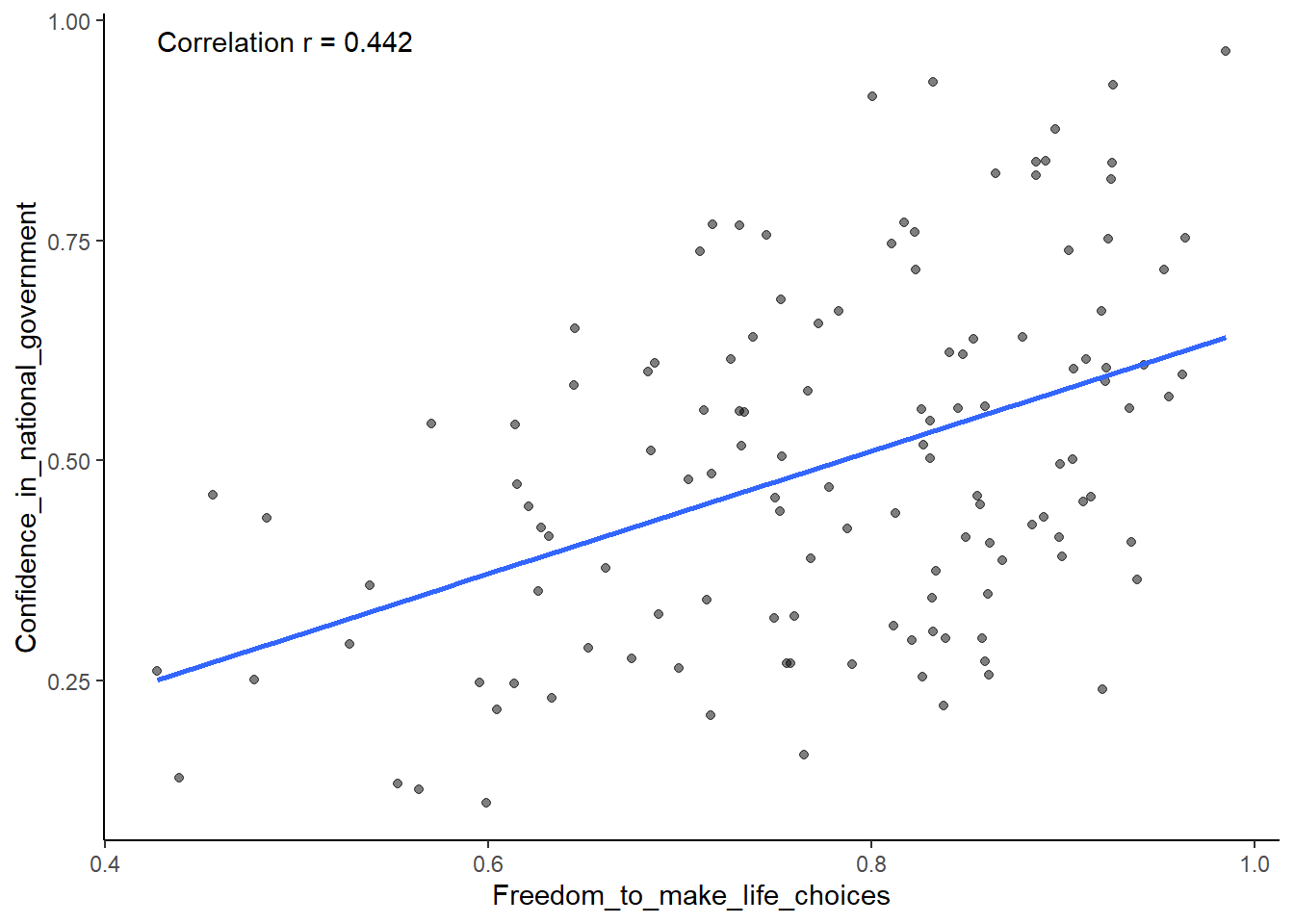
OK. That works. As we have in the past, we could add a title and nicer labels for the two axes but this is ok for now.
Reflection Question
Think back to high school geometry. Recall (hopefully) that the
equation of a straight line takes the form of y = mx + b where “m” is
the slope of the line and “b” is the point where the line crosses the
y-axis.
If you were given, or could calculate the values of m and b, could you
find the value of y for a given value of x? Why or why not?
Your answer here:
Correlation Example 2
After all that work, we can now speedily answer more questions.
For example, what is the relationship between Positive_affect in a country and Negative_affect in a country?
We wouldn’t be surprised if there was a negative correlation here: when positive feelings generally go up, shouldn’t negative feelings generally go down?
To answer this question, we just copy paste the last code block, and change the x and y variables to be Positive_affect and Negative_affect.
CC12
# select DVs and filter for NAs

smaller_df <- whr_data %>%
               filter(!is.na(Positive_affect),
                      !is.na(Negative_affect))

# calculate correlation coefficient r

r <- cor(smaller_df$Positive_affect,
    smaller_df$Negative_affect)

# plot the data frame smaller_df with best fit line

ggplot(smaller_df, aes(x=Positive_affect,
                     y=Negative_affect))+
    geom_point(alpha=.5)+
    geom_smooth(method=lm, se=FALSE)+
    theme_classic()+
    annotate("text",
           x = min(smaller_df$Positive_affect),
           y = max(smaller_df$Negative_affect),
           label = paste("Correlation r =", round(r, 3)),
           hjust = 0.0, vjust = 0.0) +

#add title and axes labels
    ylab("Negative Affect Score") +
    xlab("Positive Affect Score") +
    ggtitle("Relationship of a Country's Positive and Negative Affect Scores")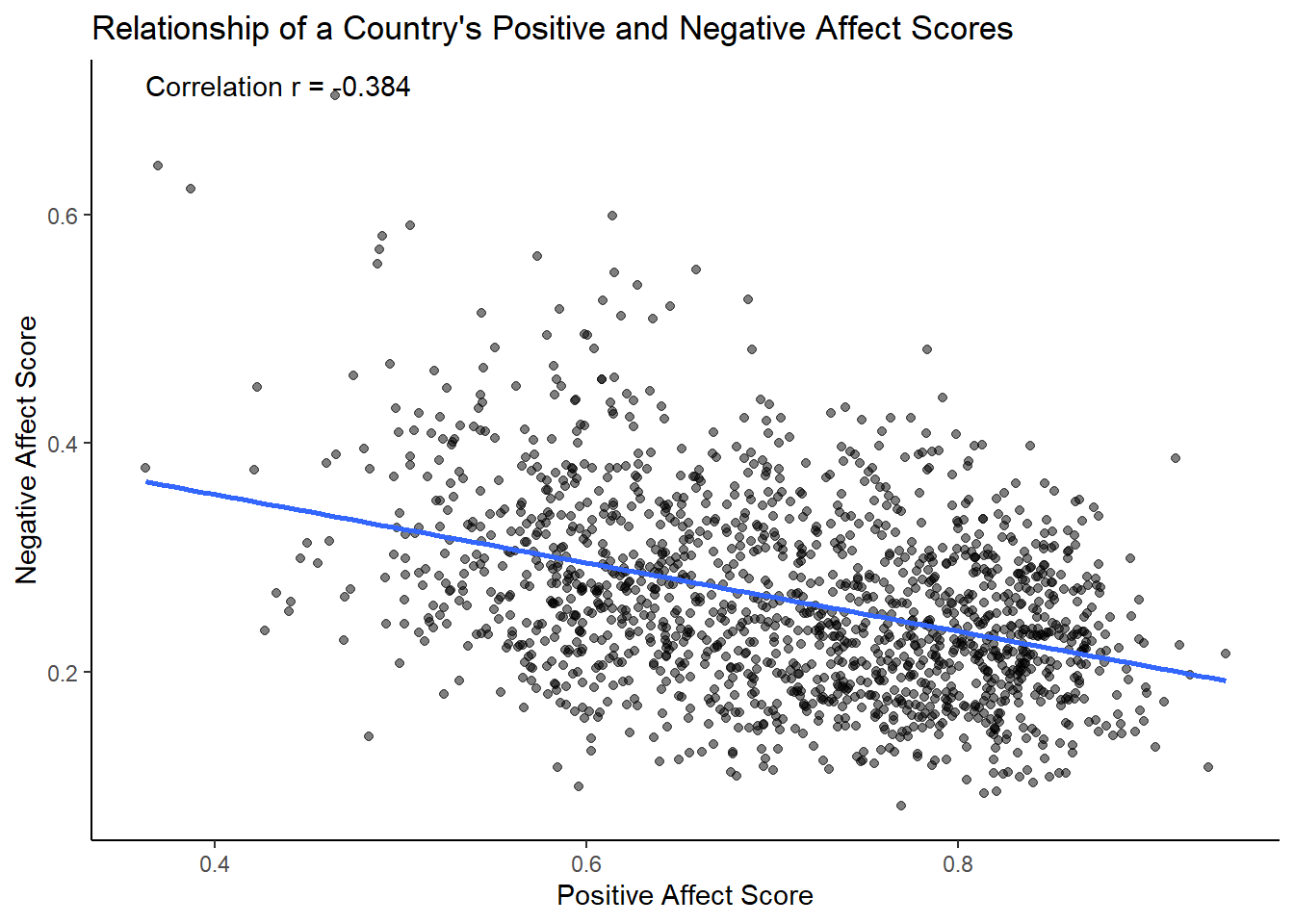
There we have it. As Positive Affect increases, Negative Affect decreases.
Reflection Question
How would you characterize the correlation coefficient in this second example? What does it tell us about the relationship between the two variables?
Your answer here:
Lab Assignment Submission
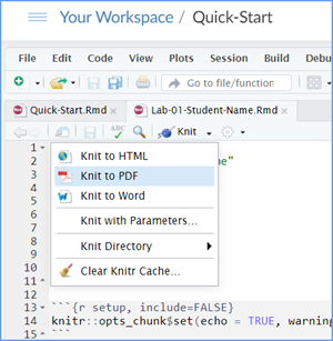
Important
When you are ready to create your final lab report, save the Lab-04-Rehearse-1-Worksheet.Rmd lab file and then Knit it to PDF or Word to make a reproducible file. This image shows you how to select the knit document file type.
Note that if you have difficulty getting the documents to Knit to either Word or PDF, and you cannot fix it, just save the completed worksheet and submit your .Rmd file.
Ask your instructor to help you sort out the issues if you have time.
Submit your file in the M4.3 Lab 4 Rehearse(s): Exploring Relationships assignment area.
The Lab 4 Exploring Relationships Grading Rubric will be used.

You have completed the first rehearsal in Lab 4.
Now on to Rehearse 2!
 Previous: Lab 4 Over view
Next: Lab 4 Rehearse 2
Regression Models

This
work was created by Dawn Wright and is licensed under a
Creative
Commons Attribution-ShareAlike 4.0 International License.
Date 3/29/26
Last Compiled 2026-03-29