Lab 2 Exploring Data Remix
Click this Link to return to your previously deployed Posit Cloud Lab 2 Workspace:
Link to Posit Cloud
Open the “Lab 2 Exploring Data” project.
Use of Generative AI Tools
![]()
Use of generative AI tools for this assignment is limited to your getting help debugging (fixing errors) or explaining code.
You may not use Gen AI to create entire code blocks/chunks.
You may not use Gen AI to generate conclusions based on analysis of a dataset.
You may not use Gen AI to write your answer to reflection questions which are usually indicated by this icon:
 .
.You must cite your use of Gen AI using this APA guidance: Citing generative AI in APA Style

Remember to check the Lab Manual Resources Page for additional “How to” videos on this assignment.
 IMPORTANT!
Open the Lab2-Remix-Student-Name.Rmd report template file in your RStudio Cloud Lab 2 Exploring Data workspace.
Remember to rename this file to include your name in place of Student-Name, e.g. “Lab2-Remix-Wright-Dawn.Rmd”
Other than entering your name to replace Student Name and changing
the date to the current date, do not change anything in the
yaml head space at the top of the worksheet.
Load the libraries!
Copy the code in the L2 Remix CC1 chunk below and paste it in the remix template in the appropriate empty code chunk.
Then run it.
 L2 Remix CC1
#L2 Remix CC1

library(tidyverse)
library(data.table)
library(summarytools)
library(gapminder)
When you knit a document, the objects in the Environment are ignored and only ones created by the code in your document will be found. So be sure to recreate any data frames or other objects needed for this document to knit properly.
Load the Data
Create the gapminder_df data object by copy/paste and
then running the L2 Remix CC2 code chunk in your remix template:
L2 Remix CC2
#L2 Remix CC2
gapminder_df<-gapminder
OK! Let’s do this! In this lab, we are going to combine the Remix and Report. This is similar to what happens in many research papers and reports to management.
Question 1:
Look at Income
In 8.2.3 in the Lab 2 Rehearse 1 Graphing, we made a histogram of the life expectancy of countries in the Gapminder data.
Copy that code chunk Lab 2 Rehearse 1 CC27, paste it in the report template in Remix CC3 and re-run that code here:
L2 Remix CC3
#L2 Remix CC3
#paste copy of Lab 2 Rehearse 1 CC27 code here:
Let’s look at income instead of life expectancy.
Inspect the gapminder_df and find the name of the
variable related to income.
Confirm that you should use the gdpPercap column
(variable) for the GDP per capita data by checking the
gapminder_df in the Environment.
In the r code chunk below is a copy of the above code.
We added a ggplot “layer” added to change the x-axis limits to let us focus on the range of values of GDP per capita. We did that by using the xlim function along with the combine function. This will make the minimum value 0 and the max 50,000.
Because there are outliers (extreme values) in the GDP data, not doing this would “squeeze” most of the data we are interested in into a small number of bins on the left end of the x-axis.
The data is in US dollars but doesn’t have a $, so add that to the x axis label.
Change the y-axis label to indicate these are number of countries we are talking about and not just abstract “things.”
So, in this code chunk Remix 4 below, you need to:
change the name of the x-variable in the aes function [“aes” stands for “aesthetic”]. This function will create the basic graph. Replace
lifeExpwith the new one we want from the gapminder data frame:gdpPercap.edit the x-axis label and the y-axis label to indicate GPD Per Capita and Count of Countries.
edit graph title appropriately.
Then run the code chunk.
Remix CC4
#Remix CC4

#You need to edit this chunk

ggplot(gapminder_df, aes(x = lifeExp)) +
  geom_histogram(color="white", bins=50)+
  xlim(c(0,50000)) +
  theme_classic(base_size = 15) +
  ylab("Frequency count") +
  xlab("Life Expectancy") +
  ggtitle("Histogram of Life Expectancy from Gapminder")
Hint!
If you forget to change the x variable in the aes(x = ) function to the GDP variable name, you will likely get a blank plot since the range of life expectancy (approximagely 0 years to 90 years) is so small compared to the way we have formatted the x-axis to be from 0 dollars to 50,000 dollars so we can accommodate the much larger range of GDP per capita!
Reflect
Q1a.
What are your thoughts about the income of people in our world?
Your answer here:
Q1b.
Is the distribution “bell shaped” or have a “skew” toward one end of the x-axis?
Hint
Examples of Skewness in Data Distribution plots
Your answer here:
Q1c.
How does the income histogram compare to the life expectancy histogram?
Your answer here:
Q1d.
Does this information lead you to believe that life expectancy is related to income? Why or why not?
Your answer here:
Question 2:
Let’s check to see if we can get more information about a possible relationship between life expectancy and income.
Make a graph plotting GDP per capita [using the
gdpPercap variable] and life expectancy [using the
lifeExp variable] for all the years for the United
States, Italy, and Germany [by filtering the
country variable]. Make gdpPercap the
x-variable and lifeExp the y-variable.
Remember you need to filter the data set to get just those three
countries and put them in a new data frame named
remix1.
For more info on uses of the `filter` function, see in the Lab Manual Resources How to Filter in R: A Detailed Introduction to the dplyr Filter Function
The code chunk, CC30, you need is in Section 8.2.6 of the Lab 2 Rehearse 1 Graphing Data. Copy CC30, paste it here in Remix CC5, and edit it before you run it. Link to Section 8.2.6 CC 30
Note: you need to delete the “plot portion” of the code in CC30 as that graph is not needed here.
You will need to edit the remaining portion of Rehearse 1 CC30 in the Remix CC5:
Remix CC5
#Rehearse 1 CC30 code here and edit itYou should see a new data object remix1 in your
Environment.
Next, we need to create a graph of remix1 using ggplot.
The base code chunk you need CC32 is in 8.2.8 of the Lab 2 Graphing
Data Rehearse 1.
Again, copy CC32 here and be sure to edit it
for the new data frame
remix1for the new variable
gdpPercapon the x-axis and leavelifeExpon the y-axis.and to make the axis labels and title more appropriate.
Remix CC6
#paste Rehearse 1 CC32 code here and edit it Reflect
Q2a.
After you run the edited code chunk, what do you see in the new graph of life expectancy “versus” GDP per capita for those three countries?
Your answer here:
Q2b.
Are the lines generally sloping up, down, or flat? Remember the data points are for each year from 1952 to 2007 in five-year increments. 1952 is the lowest data point on the left end and 2007 is the last data point on the right end.
Your answer here:
Q2c.
Which country has the highest GDP per capita in 1952? Which one in 2007?
Your answer here:
Q2d.
Which country had the longest life expectancy in 1952? Which one in 2007?
Your answer here:
Q2e.
What do you conclude about the US compared to Germany with respect to life expectancy and its relationship to income in the form of GDP per capita?
Your answer here:
Question 3:
In section 5.1 in the Lab 2 Rehearse 2 Describing Data, we found descriptive statistics for the Gapminder data for life expectancy for each continent.
We have copied Lab 2 Rehearse 2 CC25 as edited in the Rehearse to find the descriptive statistics for each continent into Remix CC7 below. Run the code to calculate and display the results.
Remix CC7
#CC25 after editing for the Lab 2 Rehearse 2 instructions
summary_df <- gapminder_df %>%
               group_by(continent) %>%
               summarise(means = mean(lifeExp),
                         sds = sd(lifeExp),
                         min = min(lifeExp),
                         max = max(lifeExp))
#Display the summary table by placing the data object name created #above for "summary_df in the next line.
summary_df
Copy the code chunk above in Remix CC7 and paste it in Remix CC8 below.
Edit the code to find the mean, standard deviation, minimum, and maximum life expectancy for all the gapminder data (across all the years and countries).
Hint!
Do not use the group_by function and be sure to
include code that will display your resulting data frame.
Remix CC8
# Remix CC8
# Paste a copy of Remix CC7 code here and edit it
Assign the results to a new data object remix2 so we do not overwrite the data in our other data objects.
Remember to print out/display the remix2 data table.
Reflect
Q3a.
Which continent’s statistics in Remix CC7 are most like the overall (all continents) statistics shown in Remix CC8?
Your answer here:
Q3b.
Why do you think that is true?
Your answer here:
Q3c.
Other than ‘year’, which of the six variables in the gapminder data frame may be most important in impacting the overall life expectancy statistics? Explain why you believe that.
Your answer here:
Question 4:
What is the mean, standard deviation, minimum and maximum
GDP per capita in each of the continents in
2007, the most recent year in the gapminder
dataset.
Copy code chunk in Remix CC7 above for question 3 into Remix CC9.
Edit it to answer Q4 and create a new data object
remix3.
Hint! Add another pipe using
filter(year==2007) %>%.
Remember to include code to display the calculated results in the new
remix3 data object.
Remix CC9
# Remix CC9
# Paste Remix CC7 code here and edit it
Reflect
Q4a.
Which continent has the highest (max) GDP per capita? What are the major countries in that continent?
Your answer here:
Q4b.
Which continent has the highest mean GDP per capita?
Your answer here:
Q4c.
Which continent has the largest standard deviation in GDP per capita?
Your answer here:
Q4d.
What do you find surprising about these descriptive statistics?
Your answer here:
Question 5:
Reflect
Q5a.
Of the two forms of exploring data - graphing and descriptive statistics - which do you find more helpful?
Your answer here:
Q5b.
Why?
Your answer here:
Almost done!
As you did in the Quick-Start, when you have edited the code chunks, you need to Knit it so see the updated graphs and tables in your final report.
When you Knit an Rmarkdown file, any code chunks in it are automatically run and remember that all data objects in the current Environment are ignored.
Lab Assignment Submission
Important
When you are ready to create your final lab report, save the
Lab2-Remix.Rmd file.
Remember to rename this file to include your name in
place of Student-Name,
e.g. “Lab2-Remix-Wright-Dawn.Rmd”.
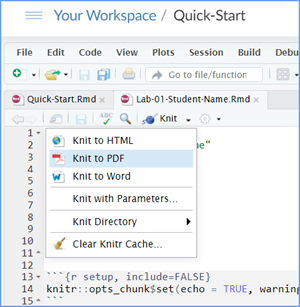
Then then Knit it to Word or PDF to make a reproducible
file. This image below shows you how to select the knit document file
type.

Note: knitting to a Word file is often easier (fewer snags/error messages) than knitting to a PDF file.
Note: If you encounter difficulty getting your worksheet to Knit, reach out to your instructor via course email as soon as you can. If you are against the submission deadline, you may submit your Lab2-Remix.Rmd file but will likely get a large deduction in points.
Submit your file in the M2.6 Lab 2 Remix and Report: Exploring Data assignment area.
The Lab 2 Exploring Data Grading Rubric will be used.

Congrats - you have completed Lab 2 Exploring Data!
V2.1, 1/9/26
Last Compiled 2026-01-20