Lab 3 Rehearse 1
Probability Distributions
By a small sample, we may judge of the whole piece.
—Miguel de Cervantes from Don Quixote
Attribution: This lab is an adaptation of Lab 04 in Answering questions with data Lab Manual by Matt Crump and his team.
1 Lab 3 Set Up
1.1 Posit Cloud Set up
Just as in Lab 1 and 2, you will need to follow this link to set up Lab 3 in your Posit Cloud workspace:
Link to Set up Lab 3 Probability Distributions

Important: Remember to save the “temp” workspace as “permanent.”
After you have set up Lab 3 using the link above, do not use that link again as it may reset your work. The set up link loads fresh copies of the required files and they could replace the files you have worked on.
Instead use this link to go to Posit Cloud to continue to work on lab 3: https://posit.cloud/
1.2 Posit Cloud Free plan v Posit Cloud Student plan v RStudio Desktop
The Posit Cloud Free plan is limited to 25 “compute” hours per month. If you are running out, you can either change to the Cloud Student plan for $5 per month and get 75 hours per month. Or you can install RStudio Desktop on your local computer - totally free and unlimited hours.
See video: Change to Cloud Student Plan
1.3 RStudio Desktop Setup
Lab Resources: Link to Install R Studio Desktop
Link to download the Lab 03 materials
Note that you will do all your work for this Graphing Data Rehearse in the Lab-3-Rehearse1-Worksheet, so click on that to open it in the Editor window in your Posit Cloud/RStudio Lab 03 workspace.
Load Libraries
 CC1
CC1
library(tidyverse)
library(ggpubr)
2 Simulation of Probability Distributions
2.1 Sampling Simulation
R’s sample function is like an endless gumball machine. You put the gumballs inside with different properties, say As and Bs, and then you let sample endlessly take gumballs out. Check it out:
CC2
Remember
Always copy/paste/run the code chunk in your lab worksheet when you see the green copy icon.
Note that code preceded by a hashtag, #, is a comment that is not run.
# create new data object "gumballs" using the concatenate function, c()

# gumballs consists of a set of two balls, one with an A and another with a B
gumballs <- c("A","B")

# create new data object "sample_of_gumballs" using the sample () function
# arguments for the sample function are the data frame "gumballs", 10 repetitions, replacement
# of the selected ball is true.

sample_of_gumballs <-sample(gumballs, 10, replace=TRUE)

#print "sample_of_gumballs"
sample_of_gumballs
[1] "A" "A" "A" "A" "A" "A" "A" "B" "B" "B"Note that you may get a different sample set of letters than shown in this image since we are using a random sampling function.
Here we created the gumballs data frame consisting of A and B. The sample function randomly picks A or B each time. We set it to do this 10 times, so our sample data object, “sample_of_gumballs,” has 10 things in it - 10 samples. We set replace=TRUE so that after each sample, we put the item back into the gumball machine and start again.
 Reflect
How many A’s are in the 10 samples? How many B’s? Are they about the same or not? Should they be?
Write your answer here:
Here’s another example with numbers - 20 samples from the data object “some_numbers” which consists of the numbers 1 thru 5.
Notice that there are four 5’s but just one of the other four numbers.
CC3 Run the
code!
# create new data frame "some_numbers" using concatenate function c() and assignment function <-

some_numbers <- c(1,2,3,4,5,5,5,5)

# create new data object "sample_of_numbers" using the sample function.
# arguments for sample function are the data object "some_numbers", the number of samples, 20,
# and replacement of drawn ball is true.

sample_of_numbers <-sample(some_numbers, 20, replace=TRUE)

#print the "sample_of_numbers" data object.

sample_of_numbers
[1] 5 3 5 2 2 4 3 5 5 3 5 5 3 3 5 3 5 5 5 5Note that you may get a different sample set of numbers than shown in this image since we are using a random sampling function.
Reflect
Are there more samples with a value of 5? Should there be? Why?
Write your answer here:
Let’s do one more thing with the sample function. Let’s sample 1000 times from our some_numbers variable, and then look at a graph so we can visualize the counts.
CC4
some_numbers <- c(1,2,3,4,5,5,5,5)
sample_of_numbers <-sample(some_numbers, 1000, replace=TRUE)
# Convert numeric vector to a data frame for ggplot
df <- data.frame(sample_of_numbers = sample_of_numbers)

ggplot(df, aes(x = sample_of_numbers)) +
  geom_histogram(
    bins = 50,
    fill = "blue",
    alpha = 0.2,
    color = "black"
  ) +
  labs(
    x = "Sample_of_numbers",      # x-axis label
    y = "Count",                  # y-axis label
    title = "Histogram of Counts of Numbers"  # plot title
  )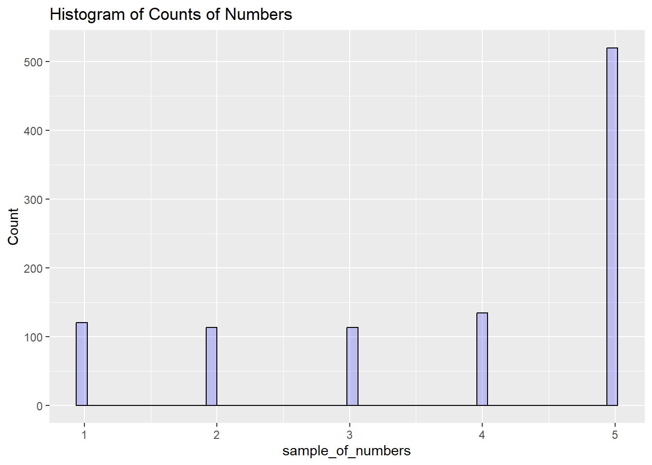
We are looking at lots of samples from our little gumball machine of numbers. We put more 5s in, and voila, more 5s come out of in our big sample of 1000.
2.2 The Uniform Distribution
We can sample random numbers between any range using the runif(n, min=0, max = 1) function for the uniform distribution. This type of distribution was discussed in your readings.
A uniform distribution is flat, and all the numbers between the min and max should occur roughly equally frequently. Let’s take 1000 random numbers between 0 and 1 and plot the histogram.
First, let’s create a new data frame called “uniform.” Then create the histogram of uniform.
CC5
uniform <- runif(1000,0,1)
hist(uniform)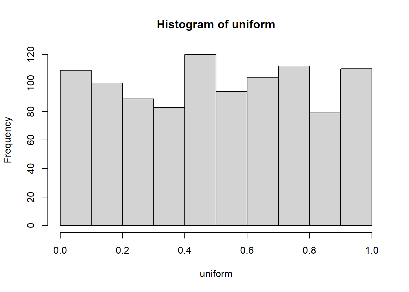
This is histogram is “flattish,” but not perfectly flat. After all we only took 1000 samples. What if we took many more, say 10,000 total samples?
This time, since we don’t really need to save the sample data for future use, we can collapse the code into just one line.
CC6
hist(runif(10000,0,1))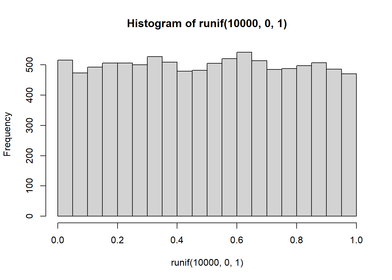
Now it looks more flat, each bin is occurring about 500 times each, which is pretty close to the same amount.
Note that using just one line of code is OK here since we are not trying to create a formal report. This results in the graph title and x-axis label being a bit “funky.” We could correct that using the “grammar of graphics” by adding more code, but we don’t need to do that in this lab.
2.3 The Binomial Distribution
The binomial distribution can be modeled as a coin flipping distribution.There are two possible outcomes: Heads or Tails, assuming we consider the coin never can land on its edge.
We can use an R function, rbinom(n, size, prob), to
simulate the binomial distribution. “n” gives the number of samples you
want to take. We’ll keep “size” = 1 for now, it’s the number of trials.
(you can forget about “trials” for now; it’s more useful for more
complicated things than what we are doing, if you want to know what it
does, try it out, and see if you figure it out).
“prob” is a list of probabilities that define how often certain things happen.
For example, consider flipping a coin. It will be heads or tails. And the coin, if it is fair, should have a 50% chance (probability} of being heads or tails.
Here’s how we flip a coin 10 times using rbinom.
CC7
coin_flips <- rbinom(10,1,.5)
coin_flips
[1] 0 1 1 1 0 1 0 0 0 0We get a bunch of 0s and 1s. We can pretend 0 = tails, and 1 = heads.
Great, now we can do coin flipping if we want. For example, if you flip 10 coins, how many heads do you get? We can can do the above again, and then sum(coin_flips). All the 1’s are heads, so summing them will tell us how many heads came up.
CC8
coin_flips <- rbinom(10,1,.5)
sum(coin_flips)
[1] 4Hold on to your seats for this next one. With R, we can simulate the flipping of a coin 10 times (you already know that, you just did it), and we can do that over and over as many times as we want.
For example, we could do it 1000 times over, saving the number of heads for each set (think “sample”) of 10 flips. Then we could look at the distribution of those sums. That would tell us about the range of things that can happen when we flip a coin 10 times.
We can do that in loop like this.
Again, don’t worry about having to create your own code to do loops, but try to see if you can understand what the loop, which begins with the “for”, is doing.
CC9
save_number_of_heads<-length(1000) # make an empty data object to save things in

for(i in 1:1000){
  save_number_of_heads[i] <- sum(rbinom(10,1,.5))
}

hist(save_number_of_heads)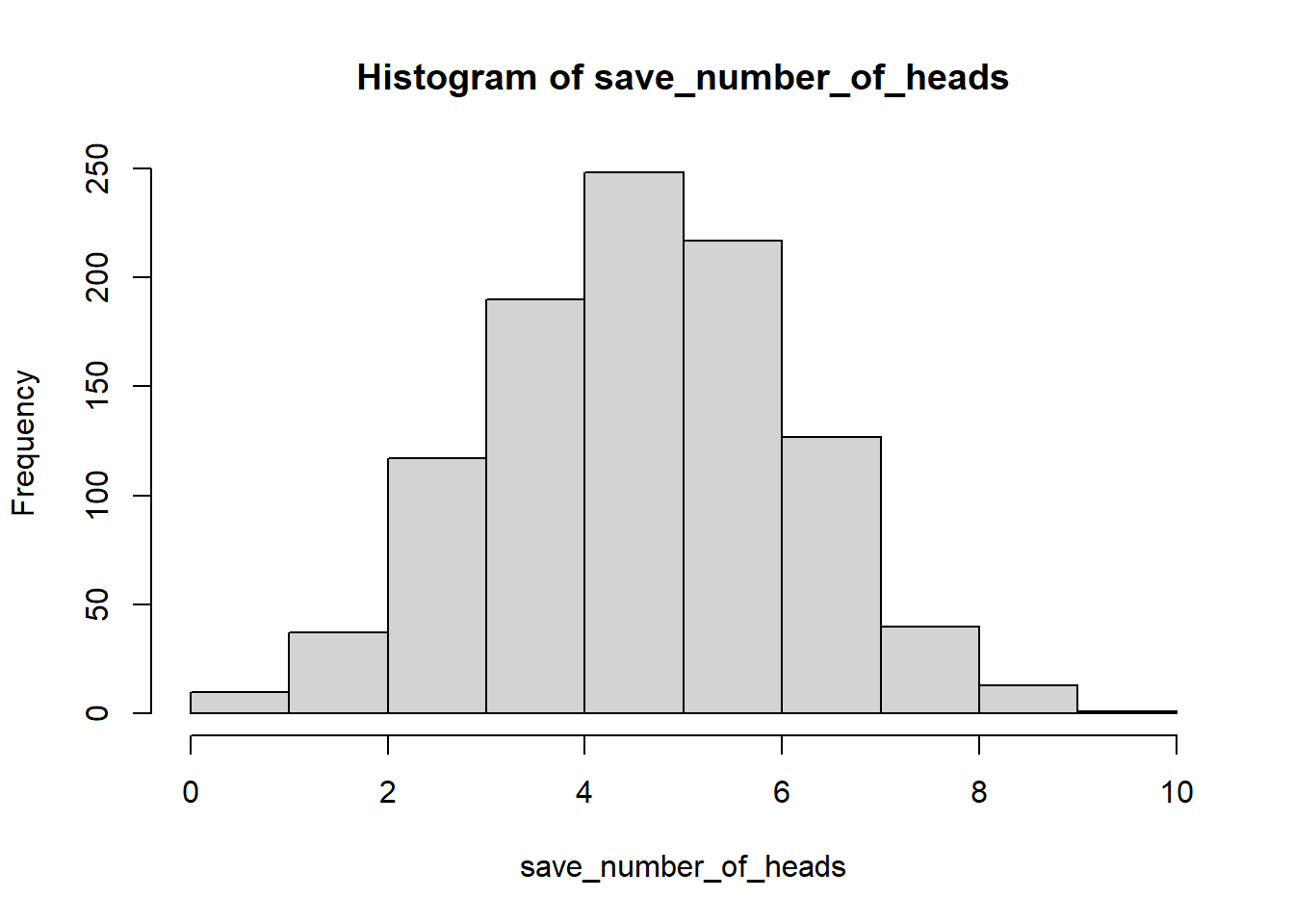
See, that wasn’t too painful. Now we see another histogram. The histogram shows us the frequency of observing different numbers of heads (for 10 flips) across the 1000 simulations. 5 happens the most, but 2 happens sometimes, and so does 8. All of the possibilities seem to happen sometimes, some more than others.
2.4 The Normal Distribution
We’ll quickly show how to use rnorm(n, mean=0, sd=1) to sample numbers from a normal distribution. And, then we’ll come back to the normal distribution later, because it is so important.
CC10
hist(rnorm(10000,0,1))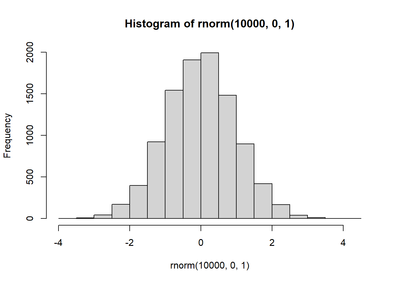
There it is, a bell-shaped normal distribution with a mean of 0, and a standard deviation of 1. You’ve probably seen things like this before. Now you can sample numbers from normal distributions with any mean or standard deviation, just by changing those parts of the rnorm function.
Try changing the mean and sd to 5 and 2.
CC11
hist(rnorm(10000,5,2))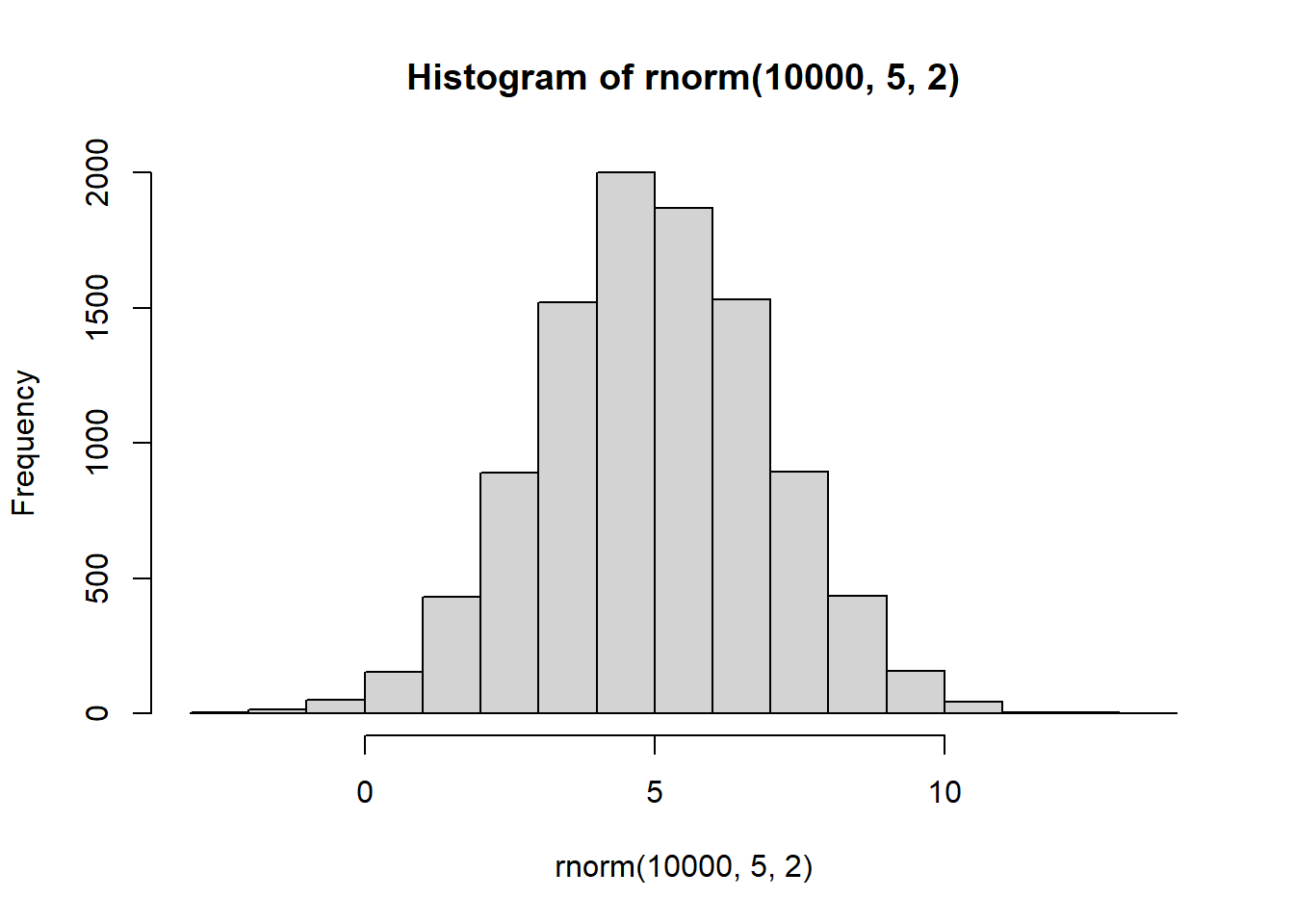
2.5 Mixing it up
The r functions are like Legos, you can put them together and come up with different things.
What if you wanted to sample from a distribution that looked like a two-humped camel’s back? Just sample from rnorm twice like this… mix away.
CC12
hist( c( rnorm(100,25,5), rnorm(100,50,5)) )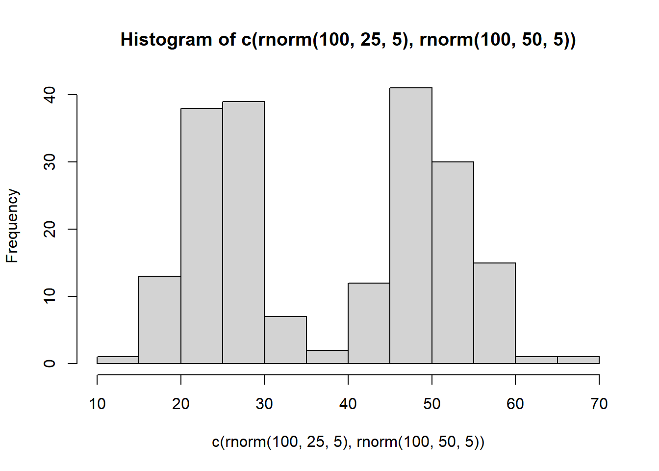
2.6 How big can the samples be?
You can generate as many numbers as your computer can handle with R.
PSA: Don’t ask R to generate a bajillion numbers or it will explode (or more likely just crash, probably won’t explode, that’s a metaphor).

Pause
If you need a break, this would be a good place. Be sure to save your worksheet!
Note: if you need to submit something to the Canvas course, you can copy your Worksheet using the More>Copy option. We suggest adding a “-p” to the name so you can more easily tell which was the Paused file you submitted.
Then when you restart this rehearse, use the original worksheet without the “-p”.
3 Sampling Distribution of the Mean.
Remember the sampling distribution of the sample means from the textbook? Now, you will see the R code that made the graphs from before. As we’ve seen, we can take samples from distributions in R. We can take as many as we want. We can set our sample size to be anything we want. And, we can take multiple samples of the same size as many times as we want.
3.1 Taking multiple samples of the same size
Let’s take 10 samples from a normal distribution (mean = 0, and SD = 1). Let’s set the sample size for each to be 20. Then, we’ll put them all in a data frame and look at 10 different histograms, one for each sample.
CC13
# take 10 samples of size 20 from a normal distribution  # with mean = 0 and standard deviation = 1

scores <- rnorm(10*20,0,1)

# next create a data object with the sample names from 1 to 10, each 20 times.

samples <- rep(1:10,each=20)

# create a data frame with "samples" and "scores" as the two variable names
my_df <- data.frame(samples,scores)

# display top 6 rows
head(my_df)
samples scores
1 1 0.8001645
2 1 2.1771818
3 1 -0.3961662
4 1 -0.9594107
5 1 -1.1639865
6 1 1.6123673First, look at the new my_df data frame. You can see there is a column with numbers 1 to 10, these are the sample names. There are also 20 scores for each in the scores column. Let’s make histograms for each sample, so we can see what all of the samples look like:
CC14
ggplot(my_df, aes(x=scores))+
  geom_histogram(color="white")+
  facet_wrap(~samples)+
  theme_classic()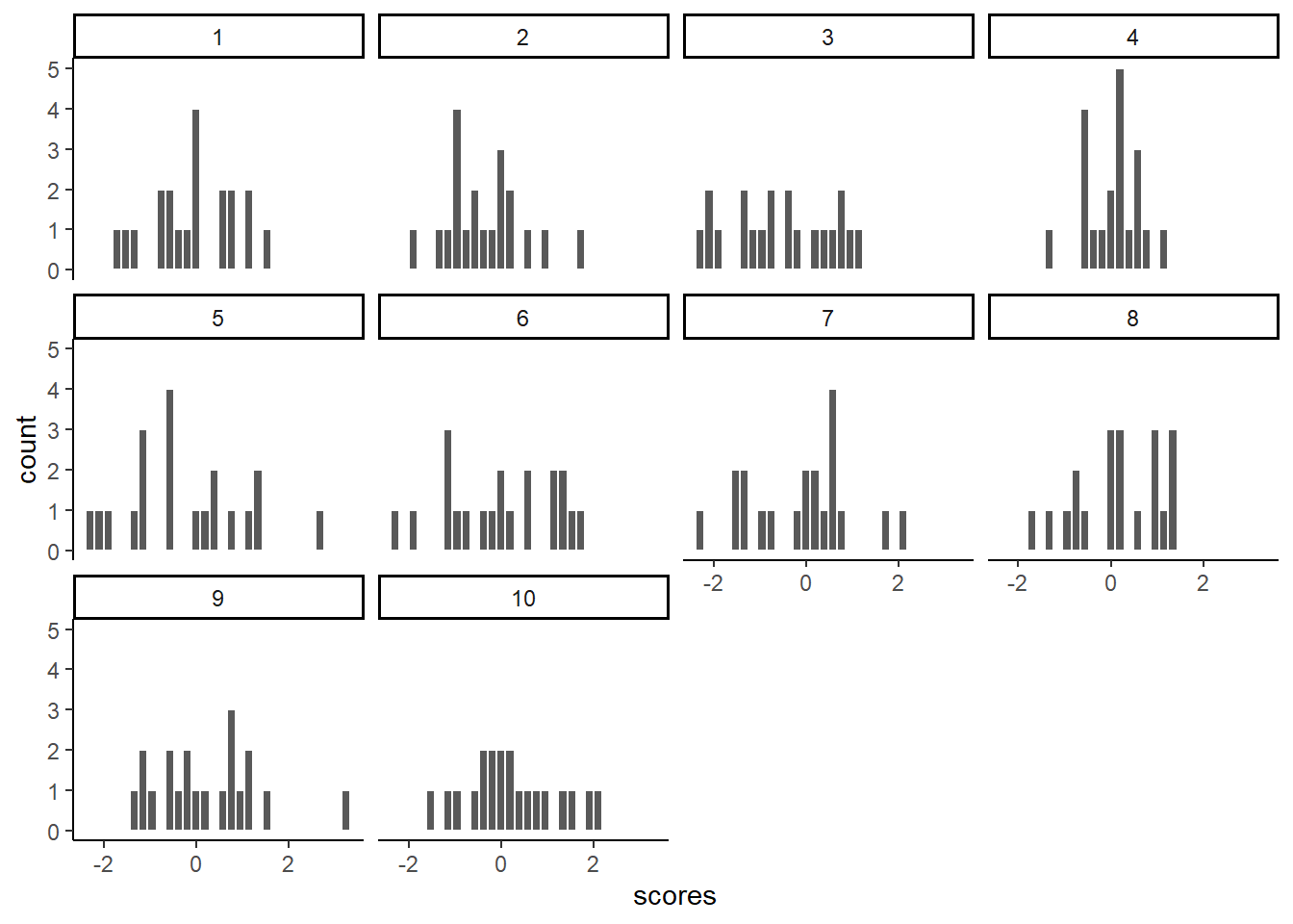
Notice, all of the histograms of the 10 samples look different. This is because of random sampling error. All of the samples are coming from the same normal distributions, but random chance makes each sample a little bit different (e.g., you don’t always get 5 heads and 5 tails when you flip a coin right)
3.2 Getting the Means of the Samples
Now, let’s look at the means of the 10 samples. We will use the
package dplyr which is automatically loaded in the library
by our loading the umbrella package tidyverse to get the
means for each sample, and put them in a table:
CC15
# Create new data frame "sample_means" using the "my_df" as  # the data source and then
sample_means <- my_df %>%

# use `group_by()`function with the "samples" variable to   # group all the samples with the same name together and then
        group_by(samples) %>%
# use the summarize() function with the argument
  # "means=mean(scores)" to produce one mean for each grouped sample
        summarise(means=mean(scores))

# Print "sample_means" data frame
sample_means
# A tibble: 10 × 2
samples means
<int> <dbl>
1 1 0.0141
2 2 -0.0380
3 3 0.0612
4 4 0.145
5 5 -0.0308
6 6 0.221
7 7 -0.155
8 8 0.169
9 9 0.0155
10 10 0.0673So, those are the means of our 10 samples.
What should the means be?
Well, we would hope they are estimating the mean of the distribution they came from, which was 0. Notice, the numbers are all not 0, but they are kind of close to 0.
3.3 Histogram for the Means of the Samples
What if we now plot these 10 means (of each of the 10 samples) in their own distribution?
CC16
ggplot(sample_means, aes(x=means))+
  geom_histogram(color="white")+
  theme_classic()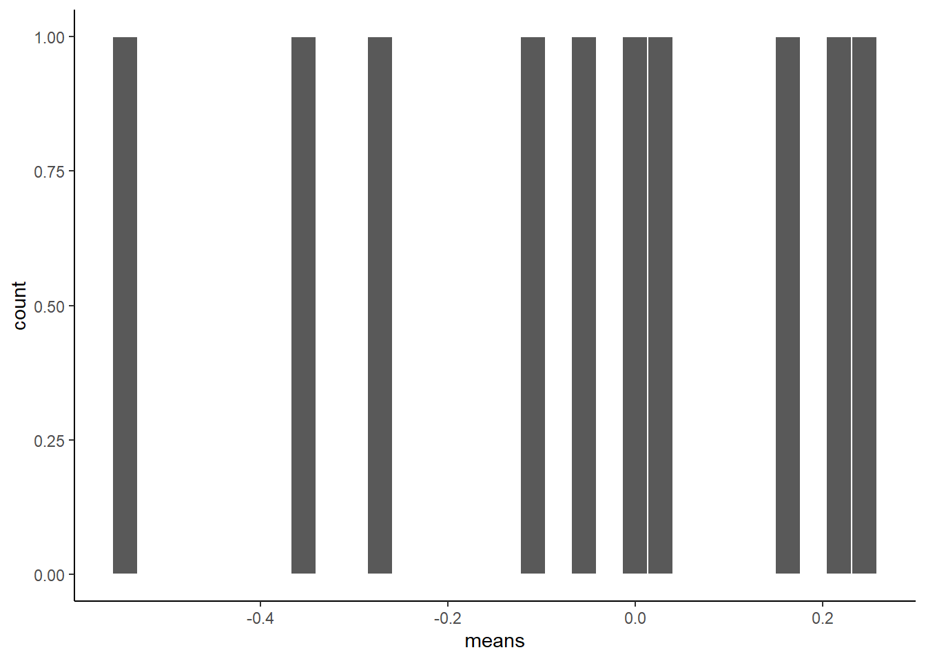
That is the distribution of the sample means.
It doesn’t look like much, eh? That’s because we only took 10 samples right.
Notice one more thing…What would the mean of our 10 sample means tell us?
This would tells us the mean of means. Remember that!
CC17
mean(sample_means$means)[1] 0.04701878
Remember you may get a different number since this is a new random sample every time the code chunk is run.
Well, that’s pretty close to zero, which was the original mean of our distribution. Which is good. When we average over our samples, they better estimate the mean of the distribution they came from. Here, we are talking about the distribution of the sample means.
3.4 Simulating the Distribution of Sample Means
Our histogram with 10 sample means looked kind of sad. Let’s give it some more friends. How about we repeat our little sampling experiment 1000 times.
Explanation: We take 1000 samples. Each sample takes 20 scores from a normal distribution (mean=0, SD=1).
CC18
# get 1000 samples with 20 scores each

scores <- rnorm(1000*20,0,1)
samples <- rep(1:1000,each=20)

# create a new data frame 'my_df'
my_df <- data.frame(samples,scores)
When you run this code chunk, you will see a new data frame in your Environment window. It will have 20,000 observations.
Next, we find the means of each sample (giving us 1000 sample means).
Those are stored in the sample_means data frame.
CC19
# get the means of the samples

sample_means <- my_df %>%
                group_by(samples) %>%
                summarise(means=mean(scores))
Then, we plot that distribution.
CC20
# make a histogram

 ggplot(sample_means, aes(x=means))+
  geom_histogram(color="white")+
  theme_classic()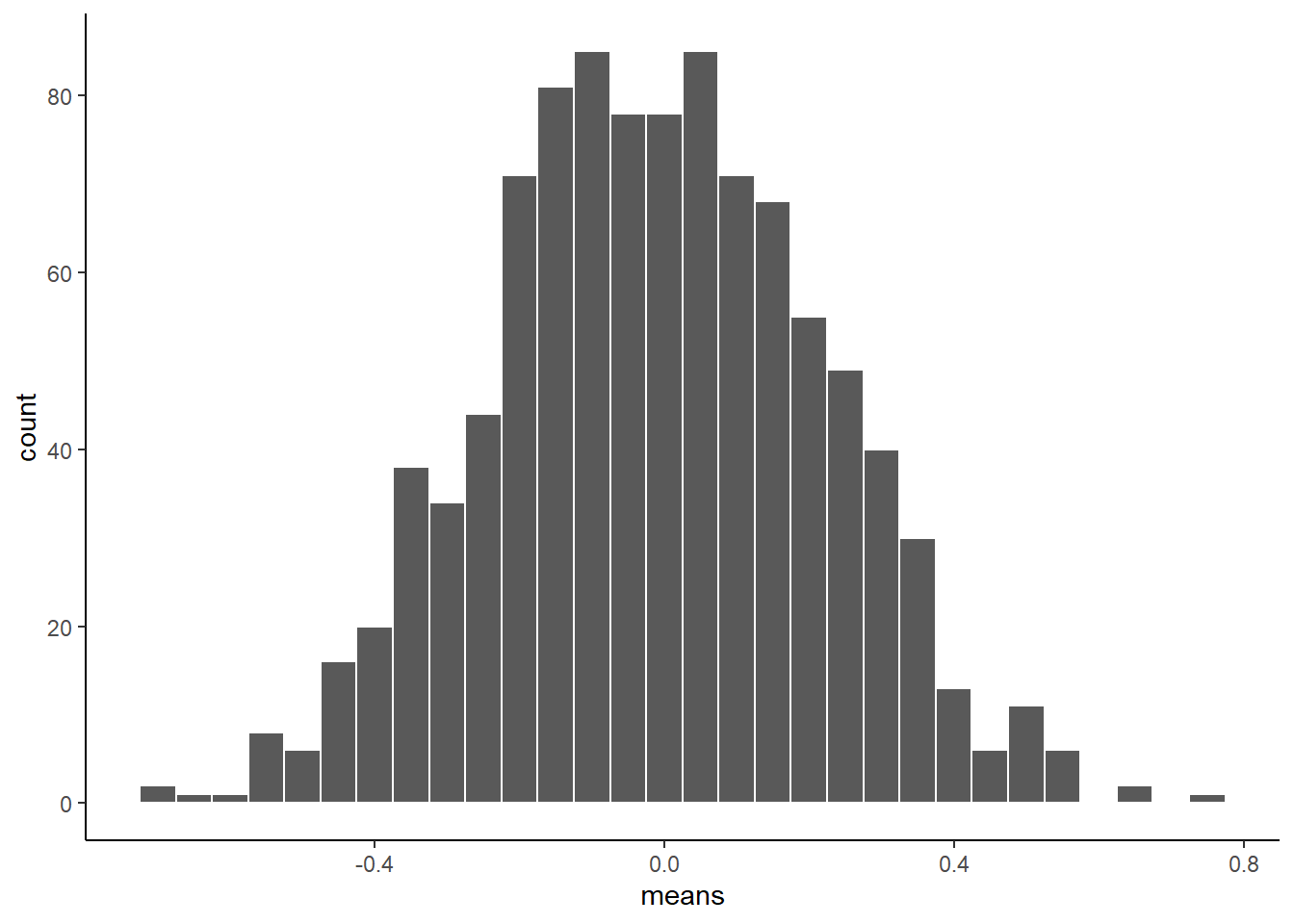
There, that looks more like a sampling distribution of the sample means. Notice its properties. It is centered on 0, which tells us that sample means are mostly around zero. It is also bell-shaped, like the normal distribution it came from. It is also quite narrow. The numbers on the x-axis don’t go much past -.5 to +.5.
We will use things like the sampling distribution of the sample means to make inferences about what chance can do in your data later on in this course.
3.5 Sampling distributions for any statistic
Just for fun here are some different sampling distributions for different statistics. We will take a normal distribution with mean = 100, and standard deviation =20. Then, we’ll take lots of samples with n = 50 (50 observations per sample). We’ll save all of the sample statistics, then plot their histograms. We do the sample means, standard deviations, maximum values, and medians.
That are four new variables we are creating! Let’s do it.
CC21
all_df<-data.frame()
for(i in 1:1000){
  sample<-rnorm(50,100,20)
  sample_mean<-mean(sample)
  sample_sd<-sd(sample)
  sample_max<-max(sample)
  sample_median<-median(sample)
  t_df<-data.frame(i,sample_mean,sample_sd,sample_max,sample_median)
  all_df<-rbind(all_df,t_df)
}
**You may be asking what the new function rbind does.
Here is an rbind
explanation by Stat0logy
In short, it combines all of the four data frames we created for the sample statistics into just one data frame for easier handling.
Look in the Environment pane and you should see the new data frame
all_df. It should have 5 variables (the columns) with 1000
observations (the rows) of each.
We can plot the distributions of the four sample statistics by creating four histograms.
CC22
a<-ggplot(all_df,aes(x=sample_mean))+
  geom_histogram(color="white")+
  theme_classic()
b<-ggplot(all_df,aes(x=sample_sd))+
  geom_histogram(color="white")+
  theme_classic()
c<-ggplot(all_df,aes(x=sample_max))+
  geom_histogram(color="white")+
  theme_classic()
d<-ggplot(all_df,aes(x=sample_median))+
  geom_histogram(color="white")+
  theme_classic()
# we can use the 'ggarance() function to display all four charts.

ggarrange(a,b,c,d,
          ncol = 2, nrow = 2)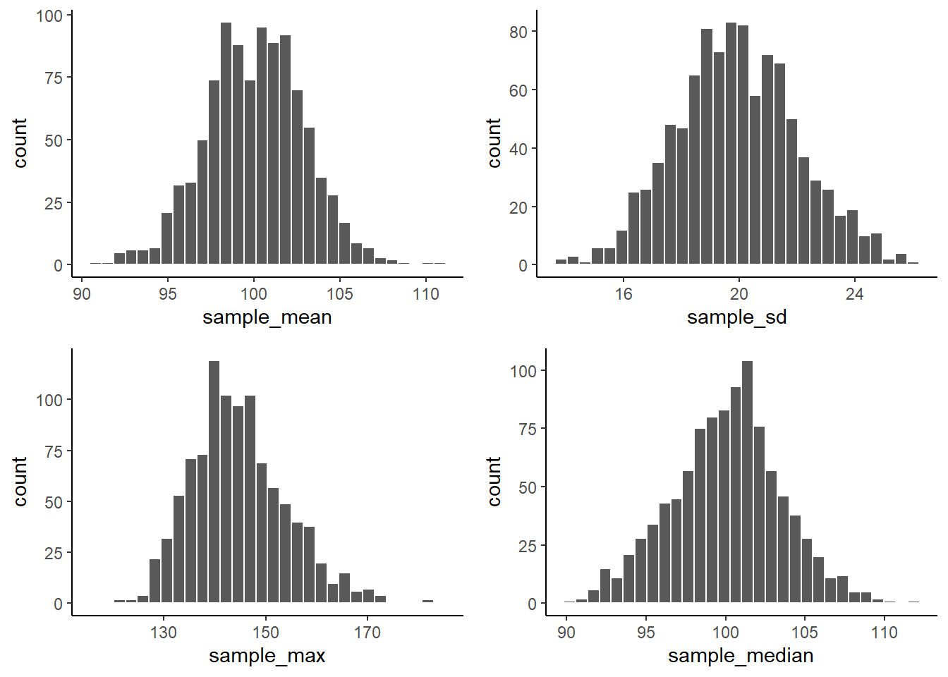
From reading the textbook, you should be able to start thinking about why these sampling statistic distributions might be useful.
For now, just know that you can make a sampling statistic for pretty much anything in R by simulating the process of sampling, measuring the statistic, doing it over a bunch of times, and then plotting the histogram. This gives you a pretty good estimate of the distribution for that sampling statistic.
4 Central Limit Theorem (CLT)
We have been building you up for the central limit theorem, described in the textbook.
The central limit theorem states that the distribution of sample means will be a normal curve.
We already saw that before.
But, the interesting thing about the CLT is that the distribution of your sample means will be normal, even if the distribution the samples came from is not normal.
To demonstrate this the next bit of code is modified from what we did earlier.
We create 100 samples. Each sample has 1000 observations. All of them come from a uniform distribution between 0 to 1. This means all of the numbers between 0 and 1 should occur equally frequently.
Below we plot histograms for the first 10 samples (out of the 100 total, 100 is too many to look at). Notice the histograms are not “bell-shaped” i.e., not normal, they are roughly flat.
CC23
scores <- runif(100*1000,0,1)
samples <- rep(1:100,each=1000)
my_df <- data.frame(samples,scores)

ggplot(my_df[1:(10*1000),], aes(x=scores))+
  geom_histogram(color="white", bins=10)+
  facet_wrap(~samples)+
  theme_classic()+
  ylim(0,200)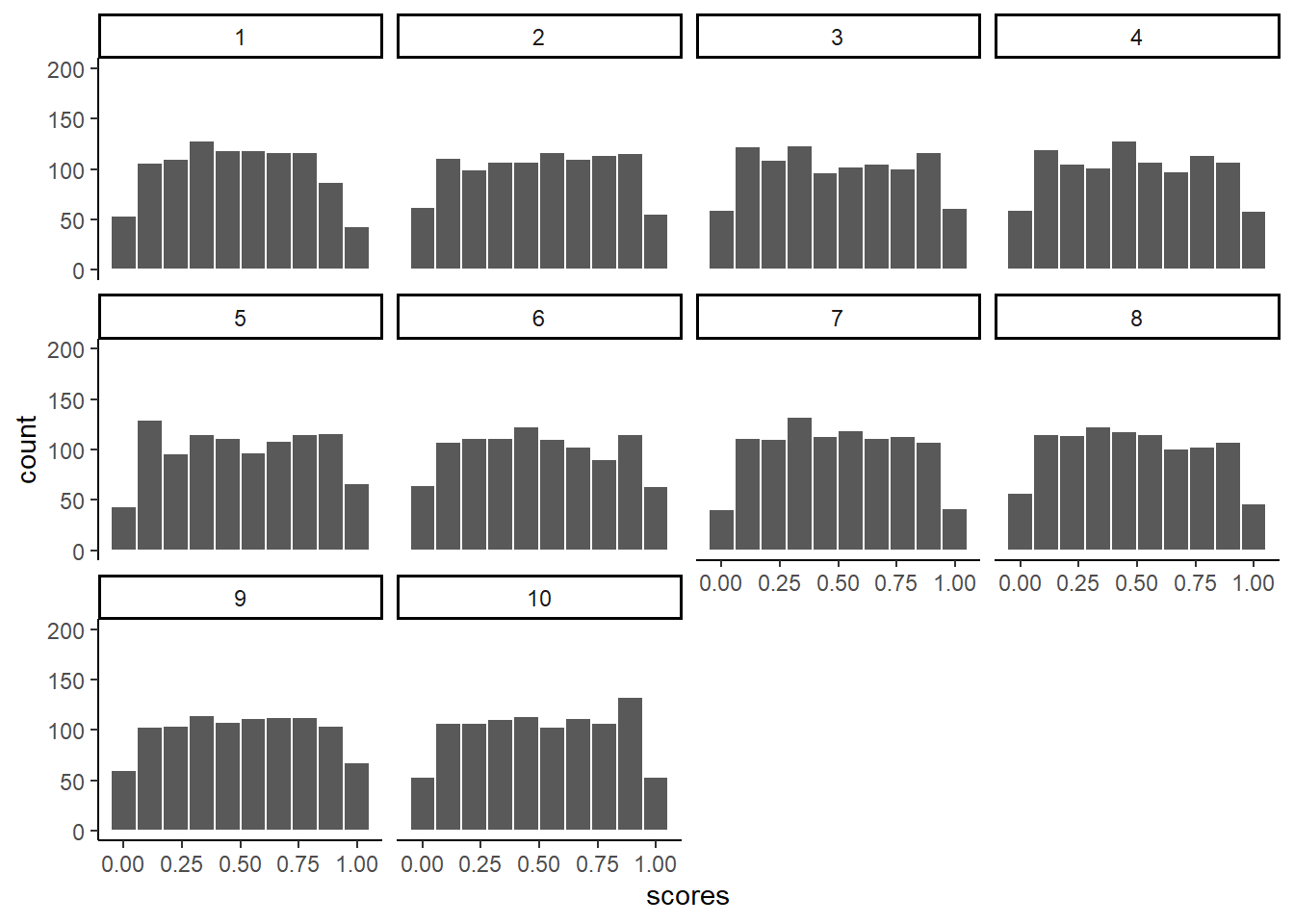
We took samples from a flat uniform distribution, and the samples themselves look like that same flat distribution.
HOWEVER, if we now do the next step, and compute the means of each of our 100 samples, we could then look at the sampling distribution of the sample means.
Let’s do that:
CC24
sample_means <- my_df %>%
                group_by(samples) %>%
                summarise(means=mean(scores))

# make a histogram

 ggplot(sample_means, aes(x=means))+
  geom_histogram(color="white", bins=15)+
  theme_classic()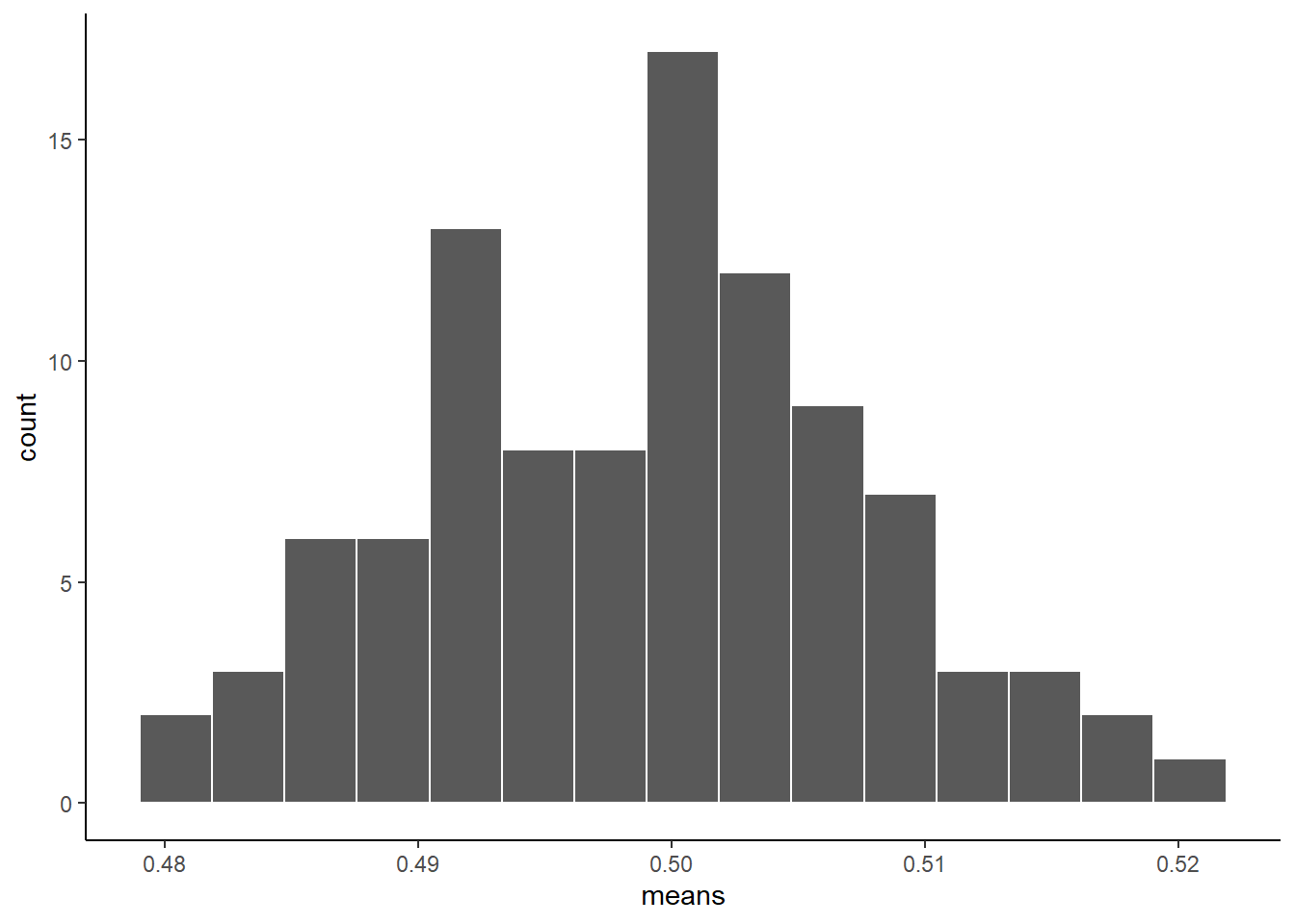
As you can see, the sampling distribution of the sample means is not flat. It’s shaped kind of normal-ish. If we had taken many more samples, found their means, and then looked at a histogram, it would become even more normal looking.
Because that’s what happens according to the central limit theorem.
5 The Normal Distribution
“Why does any of this matter, why are we doing this?”.
We are basically just repeating what was said in the textbook, so that you get the concept explained in a bunch of different ways. It will sink in.
The reason the central limit theorem is important is because researchers often take many samples and then analyze the means of their samples. That’s what they do.
An experiment might have 20 people. You might take 20 measurements from each person. That’s taking 20 samples. Then, because we know that samples are noisy, we take the means of the samples.
So, what researchers are often looking at, (and you too, very soon) are means of samples. Not just the samples. And, now we know that means of samples (if we had a lot of samples) look like they are distributed normally (the central limit theorem says they should be).
We can use this knowledge. If we learn a little bit more about normal distributions, and how they behave and work, we can take that and use it to understand our sample means better. This will become more clear as head into the topic of statistical inference in a future module. This is all a build up for that.
To continue the build-up we now look at some more properties of the normal distribution.
5.1 Graphing the Normal Distribution
“Wait, I thought we already did that”.
We sort of did. We sampled numbers and made histograms that looked like normal distributions. But a “normal distribution” is more of an abstract idea. It looks like this in the abstract:
CC25
normal_dist <- dnorm(seq(-4,4,.1), 0, 1)
values <-seq(-4,4,.1)
normal_df <-data.frame(values,normal_dist)

ggplot(normal_df, aes(x=values,y=normal_dist))+
  geom_line()+
  theme_classic() +
  ggtitle("The Normal Distribution")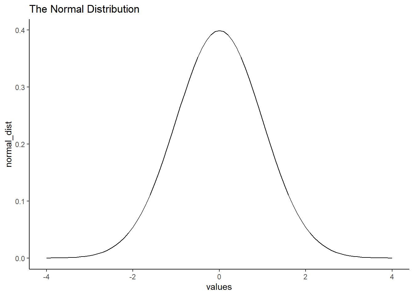
You may have noticed we used a new function “seq” in this code chunk. What does seq function do? See here
A really nice shaped bell-like thing. This normal distribution has a mean of 0, and standard deviation of 1. The heights of the lines tell you roughly how likely each value is. Notice, it is centered on 0 (most likely that numbers from this distribution will be near 0), and it goes down as numbers get bigger or smaller (so bigger or smaller numbers get less likely). There is a range to it. Notice the values don’t go much beyond -4 and +4. This is because those values don’t happen very often. Theoretically, any value could happen, but really big or small values have really low probabilities.
5.2 Calculating the probability of specific ranges.
We can use R to tell us about the probability of getting numbers in a certain range. For example, when you think about. It should be obvious that you have a 50% probability of getting the number 0 or greater. Half of the distribution is 0 or greater, so you have a 50% probability.
We can use the pnorm function to confirm this. We give
it our value of interest, x, here x = 0; then the mean of the normal
distribution we are interested in as well as its standard deviation,
sd.
For a standard normal distribution, the mean is 0 and the sd is 1.
CC26
pnorm(0, mean = 0, sd= 1, lower.tail=FALSE)[1] 0.5What does the “lower.tail=False” parameter do?
The “lower.tail” is a logical or “Boolean” parameter. It is either True or False.
If the logical parameter is set to TRUE, which is the default value, the probability returned by the pnorm function is P(X <= x).
If FALSE, it is P(X > x).
P(X <= x) is a way of saying “What is the probability of getting a value of a random variable X less than or equal to our x value of interest?”
P(X > x) is asking for the probability of getting a value of X greater than our value of interest x?
pnorm tells us the probability of getting a value of X of 0 or greater is .5.
Well, what is the probability of getting a 2 or greater?
That’s a bit harder to judge, obviously less than 50%. Use R like this to find out:
CC27
pnorm(2, mean = 0, sd= 1, lower.tail=FALSE)[1] 0.02275013The probability of getting a 2 or greater is .0227 (not very probable)
What is the probability of getting a score between -1 and 1?
CC28
ps<-pnorm(c(-1,1), mean = 0, sd= 1, lower.tail=FALSE)
ps[1]-ps[2]
[1] 0.6826895About 68%. About 68% of all the numbers would be between -1 and 1. So naturally, about 34%, half of 68%, of the numbers would be between 0 and 1 and also between -1 and 0.
Notice, we are just getting a feeling for this, you’ll see why in a bit when we do z-scores (some of you may realize we are already doing that.)
What about the numbers between 1 and 2?
CC29
ps<-pnorm(c(1,2), mean = 0, sd= 1, lower.tail=FALSE)
ps[1]-ps[2]
[1] 0.1359051About 13.5% of numbers fall in that range, not much.
How about between 2 and 3?
CC30
ps<-pnorm(c(2,3), mean = 0, sd= 1, lower.tail=FALSE)
ps[1]-ps[2]
[1] 0.02140023Again a very small amount, only 2.1 % of the numbers, not a lot.
5.3 Summary of pnorm
You can always use pnorm to figure how the probabilities of getting certain values from any normal distribution. That’s great, but let’s dig a bit deeper.
5.4 z-scores
We just spent a bunch of time looking at a very special normal distribution, the one where the mean = 0, and the standard deviation = 1. We said this special normal distribution is called the Standard Normal Distribution which always has a mean of 0 and a sd of 1.
Then we got a little bit comfortable with what those numbers mean. 0 happens a lot.
Numbers between -1 and 1 happen a lot. Numbers bigger or smaller than 1 also happen fairly often, but less often. Numbers bigger than 2 don’t happen a lot; numbers bigger than 3 don’t happen hardly at all. Same for numbers smaller than -2 and -3.
We can use this knowledge for our convenience. Often, we are not dealing with numbers exactly like these in the Standard Normal Distribution.
For example, someone might say, I got a number, it’s 550. It came from a distribution with mean = 600, and standard deviation = 25. So, does 545 happen a lot or not? The numbers don’t tell you right away.
If we were talking about our handy distribution with mean = 0 and standard deviation = 1, and I told I got a number 4.5 from that distribution. You would automatically know that 4.5 doesn’t happen a lot. Right? Right!
z-scores are a way of transforming one set of numbers into our standard normal distribution, with mean = 0 and standard deviation = 1.
Here’s a simple example:
If you have a normal distribution with mean = 550, and standard deviation 25, then how far from the mean is the number 575?
It’s a whole 25 away (550 + 25 = 575). How many standard deviations is that? It’s 1 whole standard deviation. So does a number like 575 happen a lot? Well, based on what you know about normal distributions, 1 standard deviation of the mean isn’t that far, and it does happen fairly often. This is what we are doing here.
You don’t have to memorize this, but here is the formula for calculating a z-score written in “math” terms.
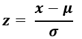
“x” is the value we are considering;
 This is the Green letter “mu” which
stands for the population mean.
This is the Green letter “mu” which
stands for the population mean.
 This is the Green letter “sigma”
which stands for the population standard deviation.
This is the Green letter “sigma”
which stands for the population standard deviation.
A z-score tells us how many standard deviations a value of x is above or below the mean for things that are normally distributed.
5.4.1 Calculating z-scores
- Get 20 numbers using rnorm from a normal distribution with a mean of 50 and a sd of 25.
CC31
some_numbers <- rnorm(20,50,25)- Calculate the mean and standard deviation
CC32
my_mean <- mean(some_numbers)

print(my_mean)
[1] 52.99156CC33
my_sd <-sd(some_numbers)

print(my_sd)
[1] 18.30211- Subtract the mean from your numbers to give you a difference.
CC34
# using the `round()` function to round off the number of decimals
differences<- round(some_numbers-my_mean, 3)
print(differences)
[1] -26.755 20.171 -14.073 -6.998 5.756 -36.102 7.240 3.380 -11.153
[10] 18.140 -1.894 -19.123 20.434 -5.194 11.593 21.103 -29.777 22.130
[19] 1.962 19.161- Divide by the standard deviation.
CC35
z_scores<-round(differences/my_sd,3)
print(z_scores)
[1] -1.462 1.102 -0.769 -0.382 0.314 -1.973 0.396 0.185 -0.609 0.991
[11] -0.103 -1.045 1.116 -0.284 0.633 1.153 -1.627 1.209 0.107 1.047Done. Now you have converted your original numbers into what we call standardized scores or Z-scores. They are standardized to have the same properties (assumed properties) as a normal distribution with mean = 0, and SD = 1.
You could look at each of your original scores, and try to figure out if they are likely or unlikely numbers. But, if you make them into z-scores, then you can tell right away. Numbers close to 0 happen a lot, bigger numbers closer to 1 happen less often, but still fairly often, and numbers bigger than 2 or 3 hardly happen at all.
Here is an image that summarizes z-scores and the standard normal distribution.
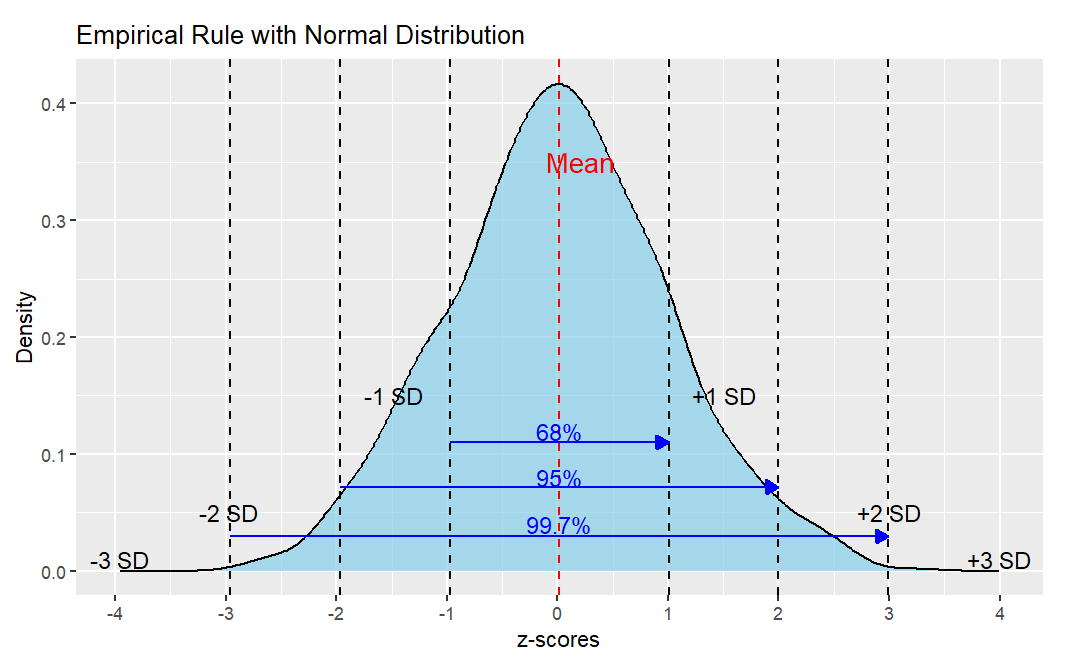
You can see that about 68% of all the data falls within +1 and -1 z. About 95% of the data falls within +2 and -2 z. And about 99.7% of all the data falls within +3 and -3 z. And because the normal curve never quite touches the x-axis, there is area under the curve beyond + and -3 and even beyond +4 and -4 z.
This is called the Empirical Rule and you can use it to quickly estimate probabilities of things happening once you know their z-score.
But when you have your R code, you can calculate the exact probabilities.
Lab Assignment Submission
Important
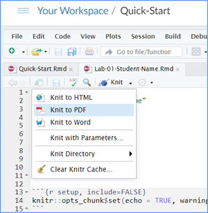
When you are ready to create your final lab report, save the Lab-03-Rehearse1-Worksheet.Rmd lab file and then Knit it to PDF or Word to make a reproducible file. This image shows you how to select the knit document file type.
Note that if you have difficulty getting the documents to Knit to either Word or PDF, and you cannot fix it, just save the completed worksheet and submit your .Rmd file.
Ask your instructor via course email to help you sort out the issues if you have time.
Submit your file in the M3.2 Lab 3 Rehearse(s): Sampling, Distributions and Central Limit Theorem assignment area.
The Lab 3 Hypothesis Tests Part 2 Grading Rubric will be used.

You have completed the first rehearsal in Lab 3. Now on to Rehearse 2!
 Previous: Lab 3 Overview
Next: Lab 3 Rehearse 2
Sampling 

This
work was created by Dawn Wright and is licensed under a
Creative
Commons Attribution-ShareAlike 4.0 International License.
V2.2, date 1/14/26
Last Compiled 2026-01-15